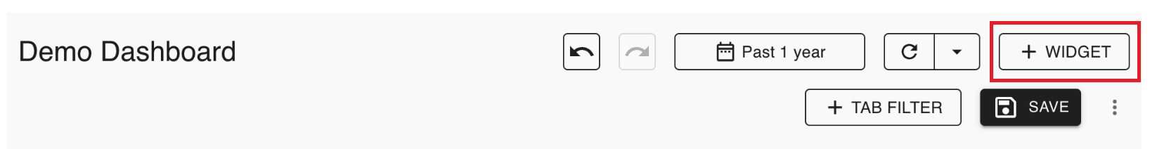
Create dashboard
1. Click Dashboards on the left menu:
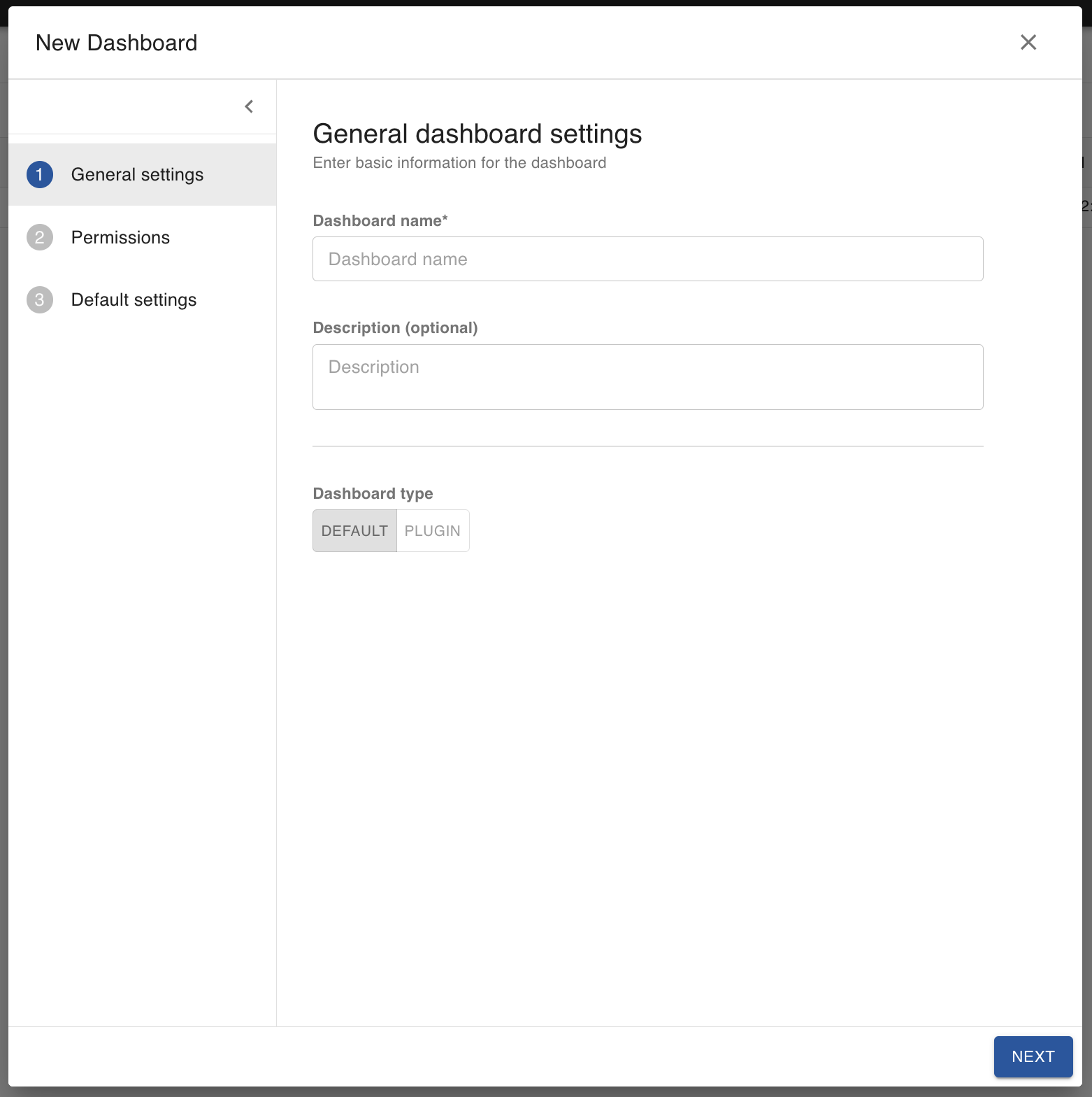
2. Click the plus button on the top right of the screen.
3. Fill out the information and click Save:
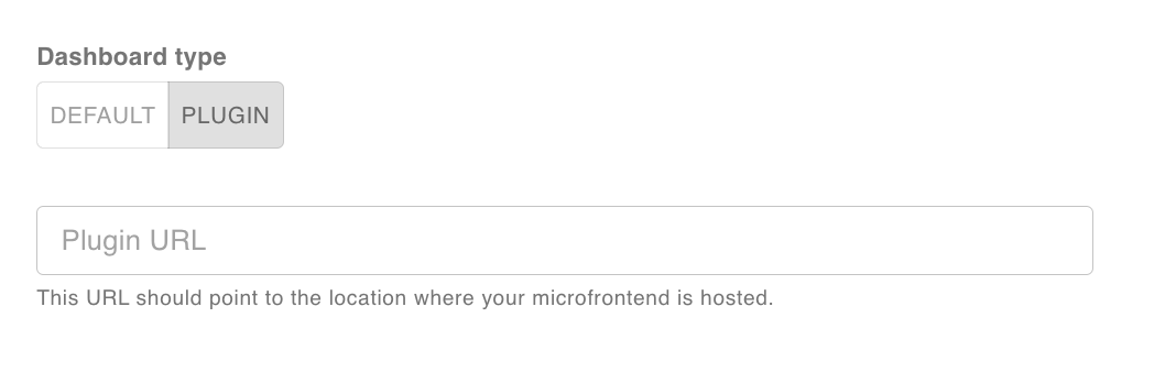
You can customize your dashboard by clicking the PLUGIN tab within the Dashboard type. This will display your standalone app within the dashboard. Please see this page for more details.
View dashboard
1. Click Dashboards on the left menu:
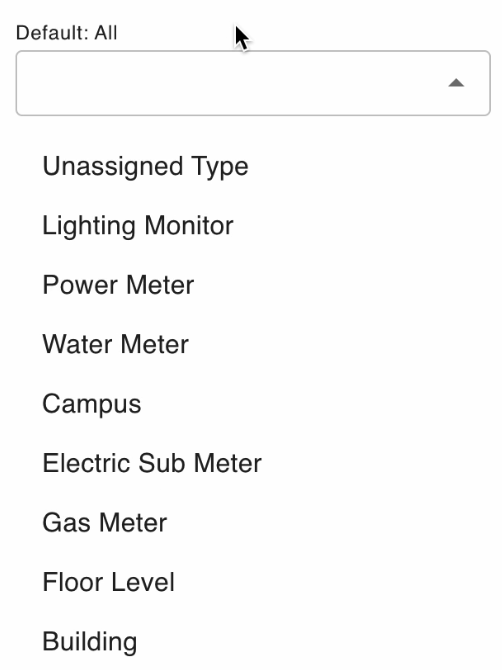
2. Search or use the filter to find the dashboards you seek.
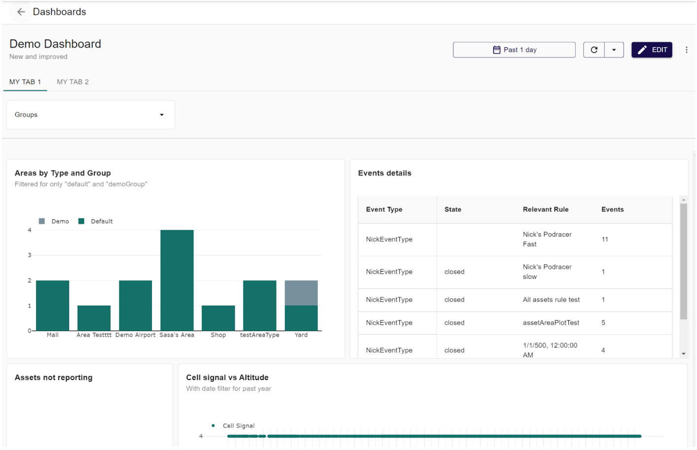
3. Here is a dashboard example:
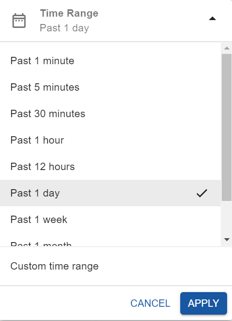
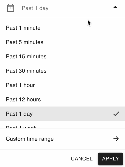
4. Click on the Past 1 day button on the top right of the page to view information from a different time:
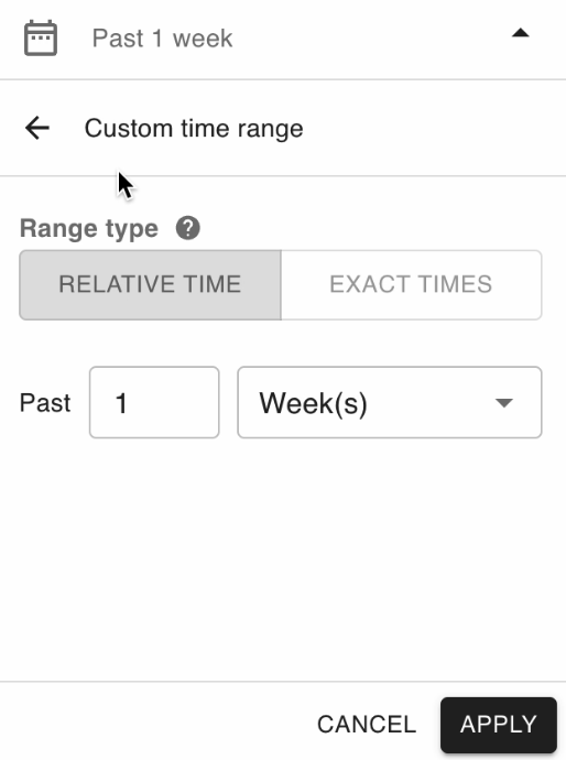
5. Specify the range and click apply:
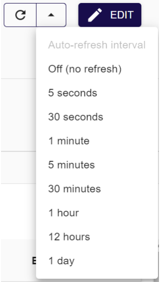
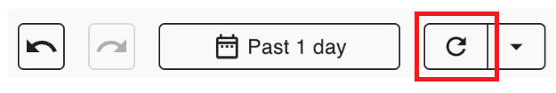
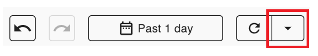
6. Click the refresh button on the top right of the page to refresh the dashboard:
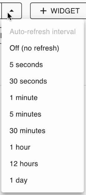
7. You can specify the auto-refresh interval by clicking the arrow button next to it:
8. You can specify the dashboard groups by clicking the Groups dropdown:
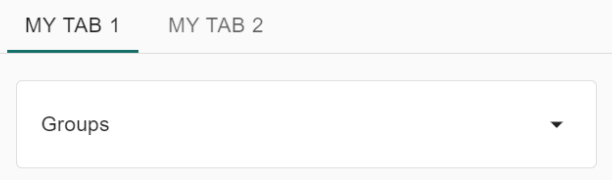
Note: You won’t have a groups dropdown unless you create a tab filter for it.
9. Click on My Tab 2 to see different dashboard information.
Note: You won’t have this second tab unless you created it.
10. Click the ellipsis icon on the top right of the page to delete the dashboard or view its settings.
-
This is an example of what appears when you click settings:
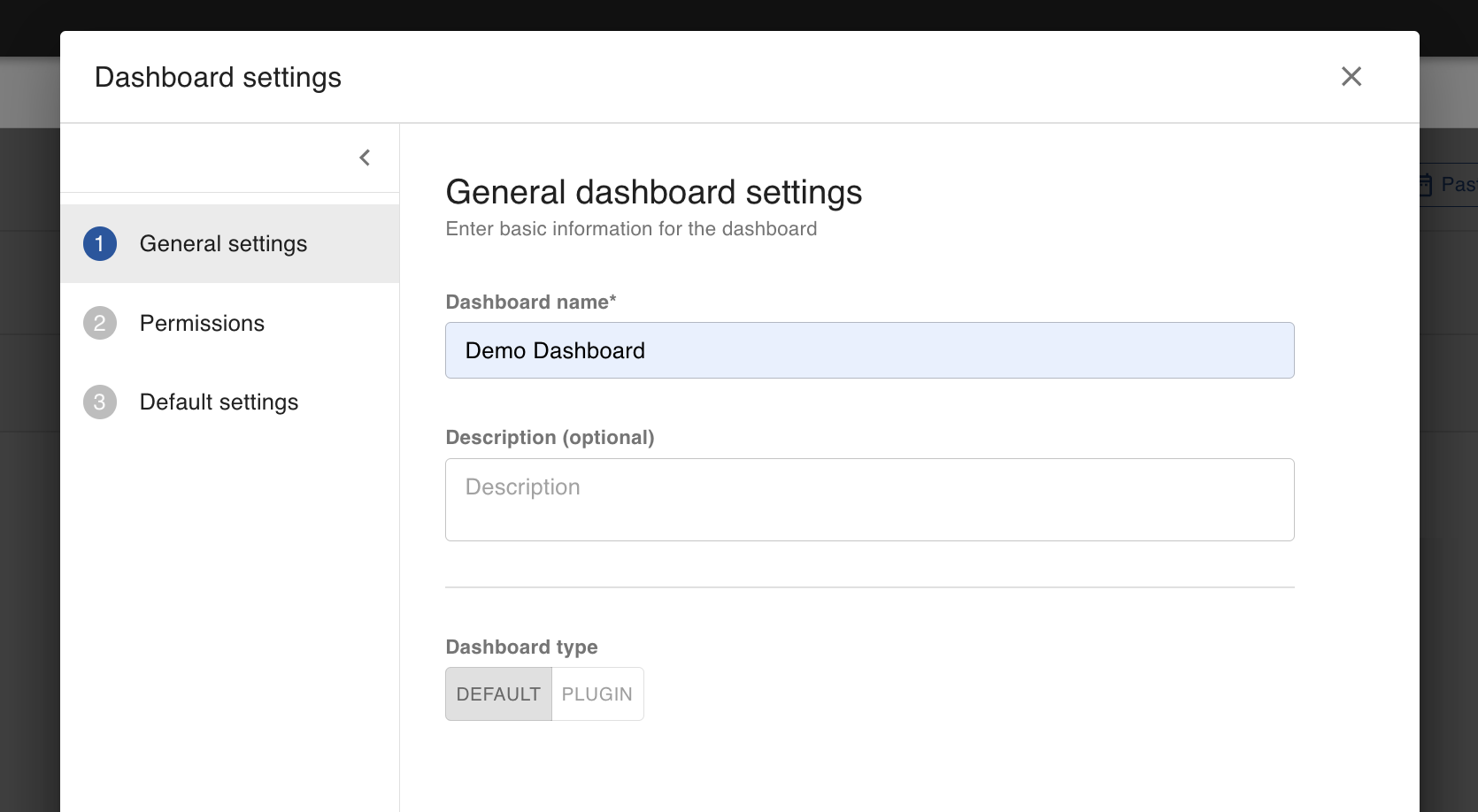
You can modify what is on this page and click the Save button when done.
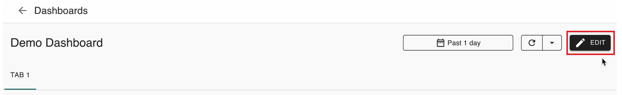
Edit dashboard
1. Click the edit button to edit a dashboard:
2. You can make changes to your widgets' settings, add new widgets, and add new tab filters:
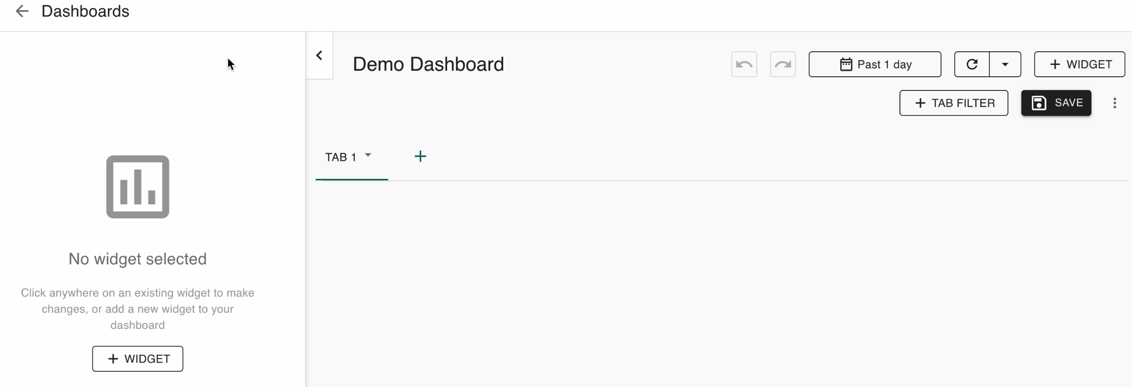
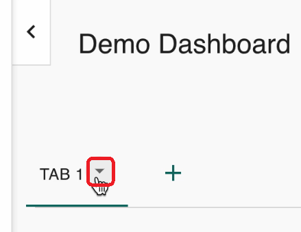
3. Click the dropdown to edit your tab name:
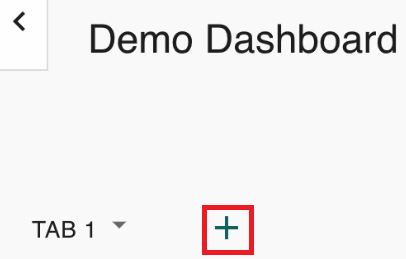
4. Click the plus icon to add another tab:
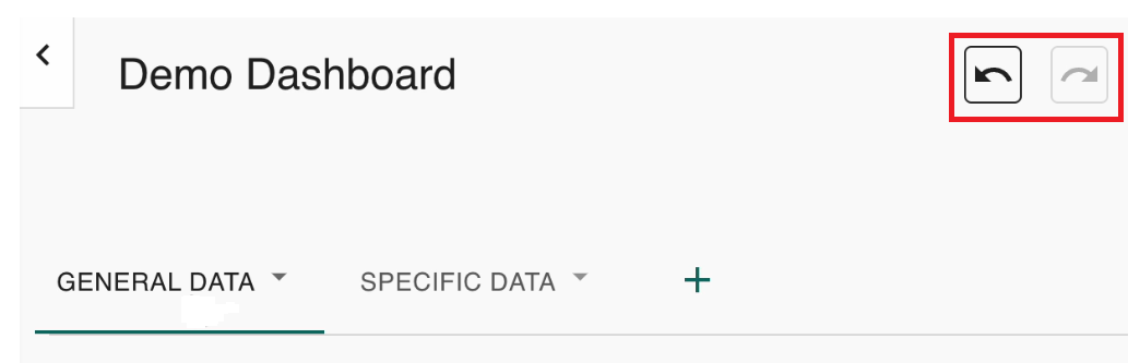
5. Click undo or redo if you want to undo or redo anything:
6. This is the time range for the entire dashboard:

Click it to modify the time range:
This is what the custom time range options look like:
7. Click the refresh button to see updated data:
8. Click the dropdown button to have the data automatically updated at certain time intervals:
Time widgets
Add time widget
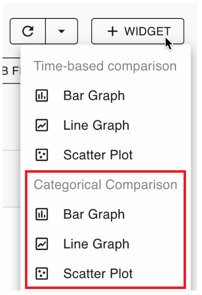
Click the Widget button to add a time widget:
These options appear:
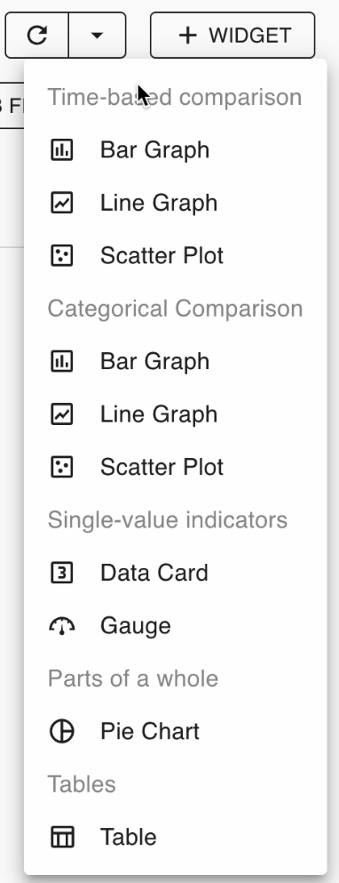
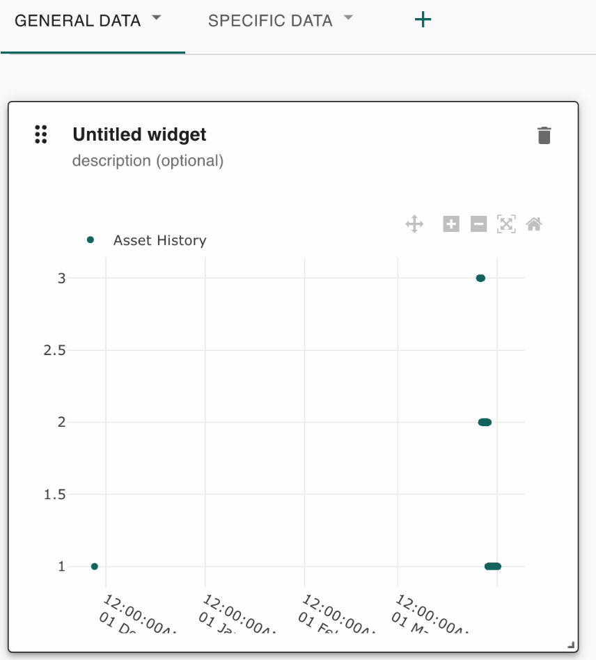
The first three are for time-based comparison (for instance, asset history).
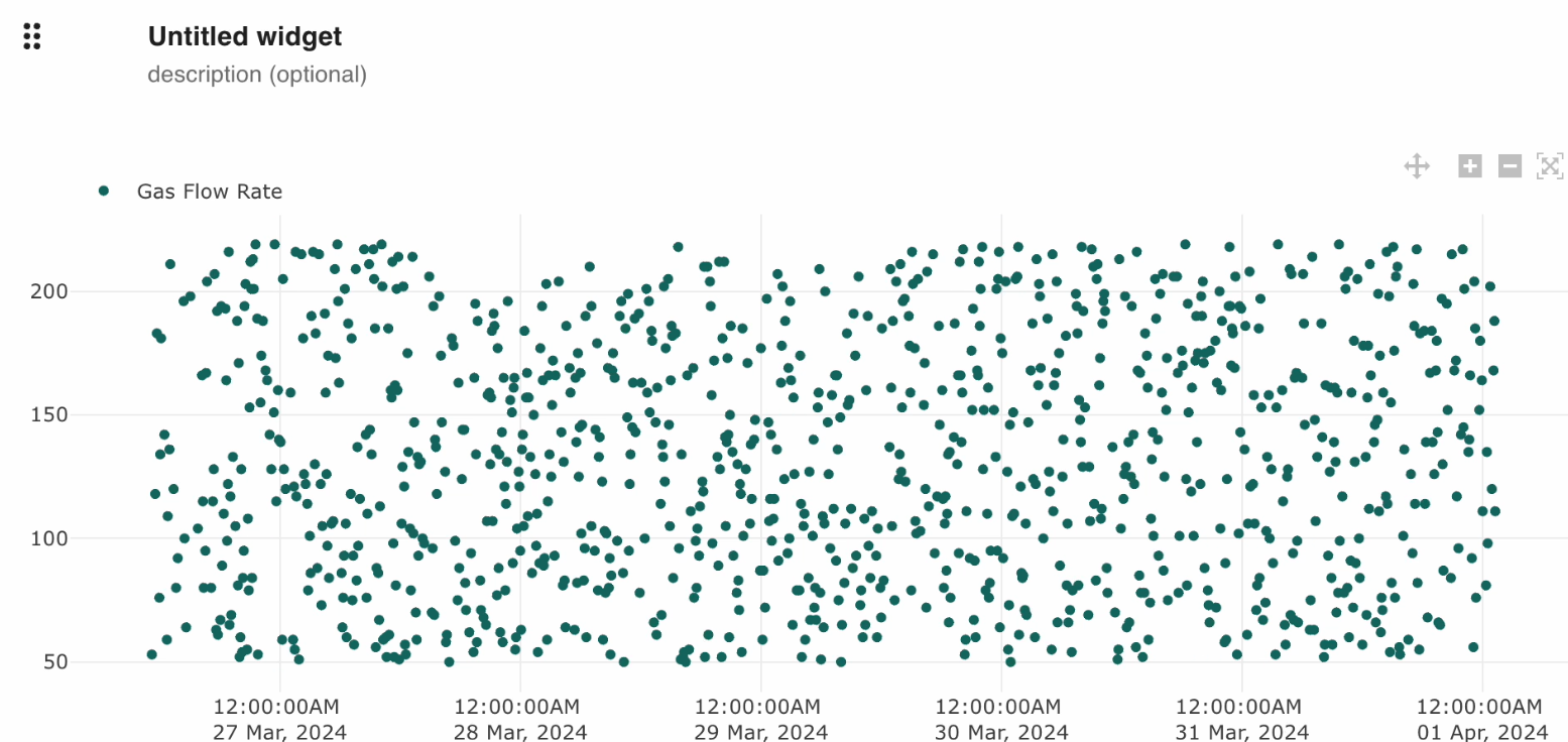
This appears when you select Scatter Plot:
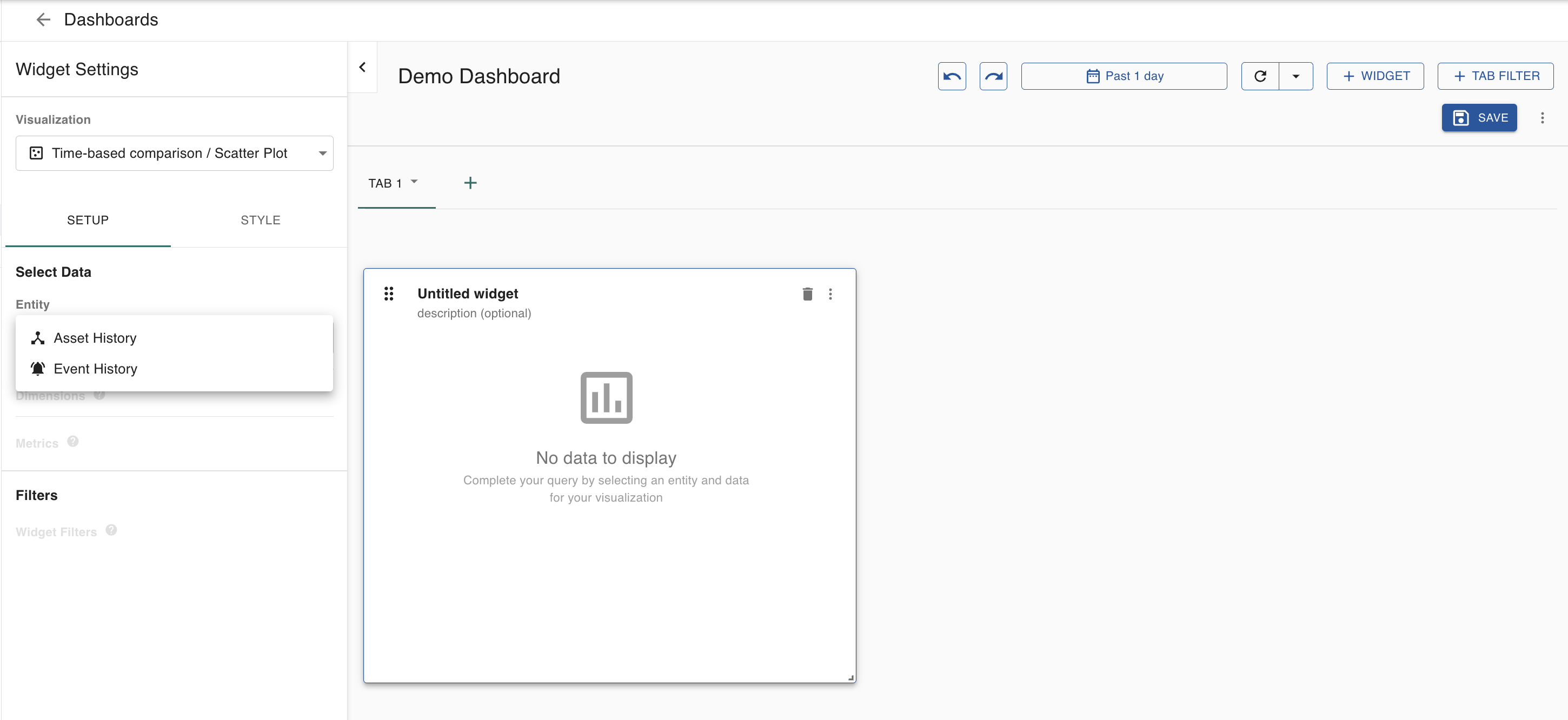
History
Select the history you want to view:
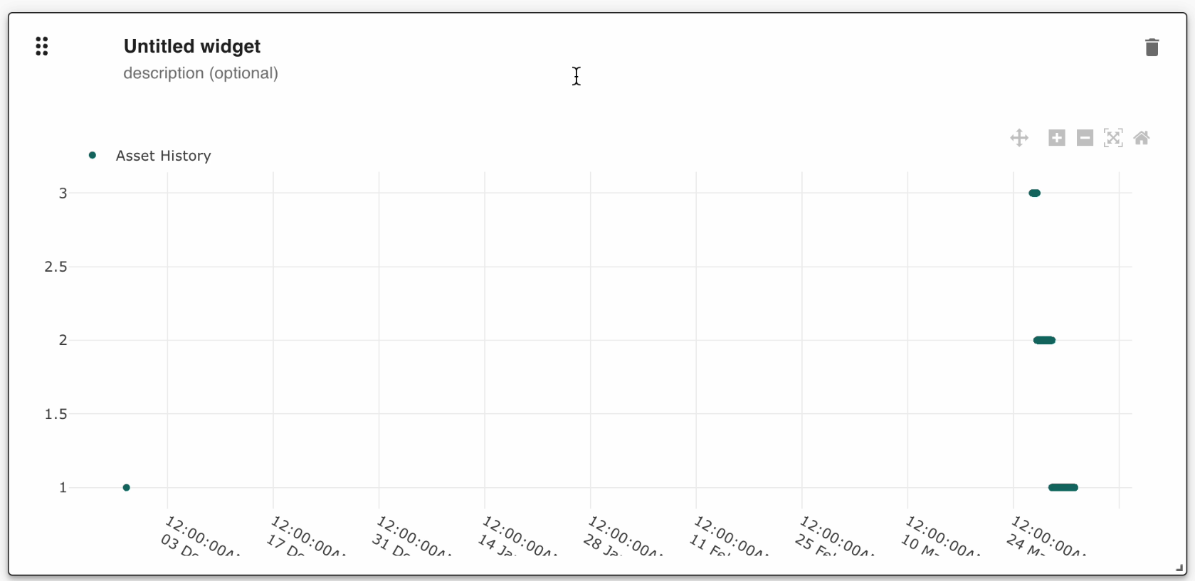
This is what appears when you select Asset History:
Altering widget size
Click and drag the bottom right of the widget to alter its size:
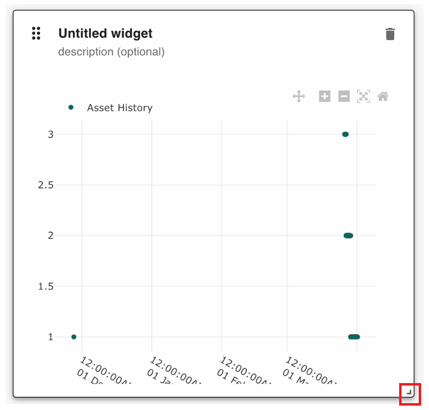
This is an example of how it looks like after you alter its size:
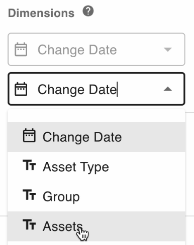
Dimensions and metrics
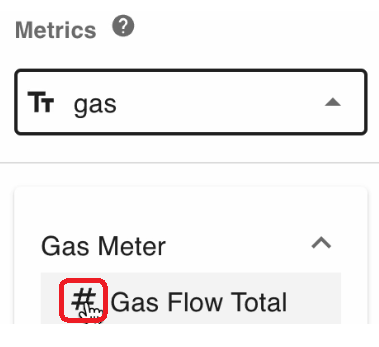
You can create dimensions to determine which assets created a particular history:
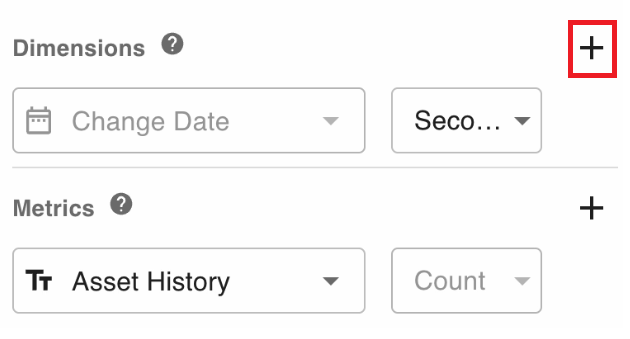
Dimensions group your data. They allow you to divide the data points into specific groupings to see where the data comes from. Metrics are the numerical measurements that will be displayed.
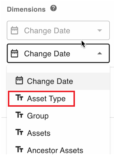
Asset types
Click Asset Type to group asset history items by asset type:
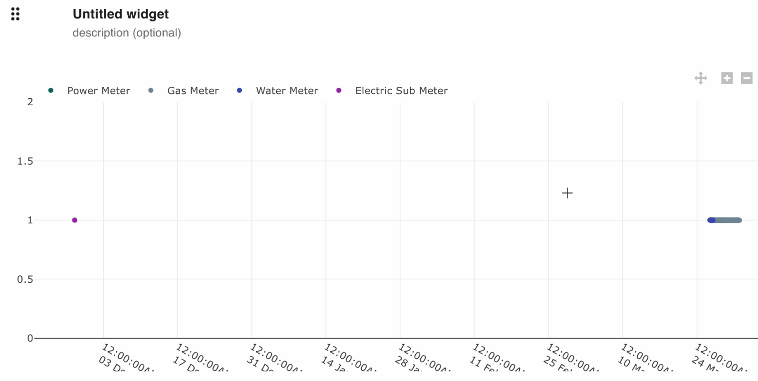
Here is an example of asset types providing history:
Groups
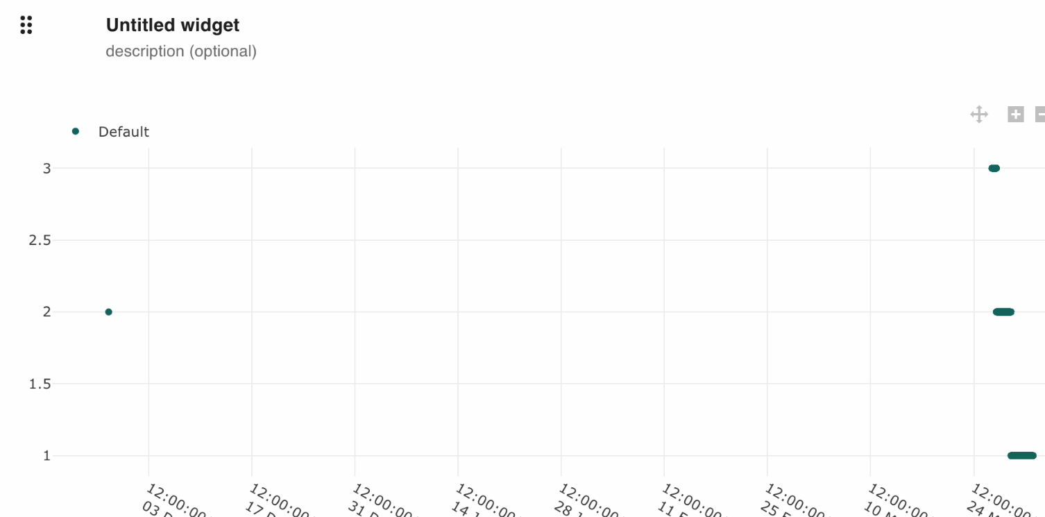
Select Group to see which groups have history:
Here is an example of what appears:
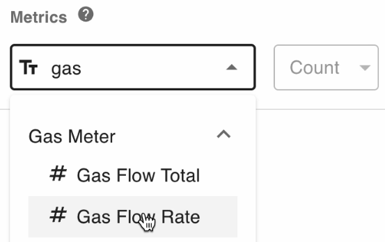
Attributes
You can type in the attribute for which you want to find its history. Here is an example:
Here is an example of what appears:
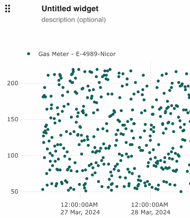
Select Assets to have the assets appear in the diagram:
Here is an example where an asset appears in the diagram:
Asset history grouped by assets
Here is an example of asset history grouped by assets:
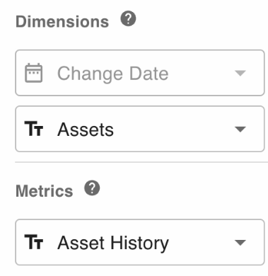
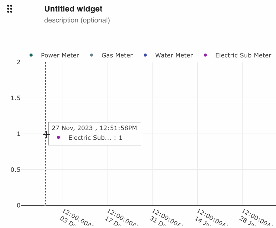
As can be seen, the dots are color-coded for each asset:
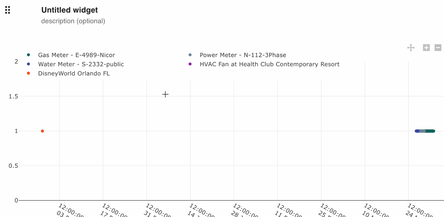
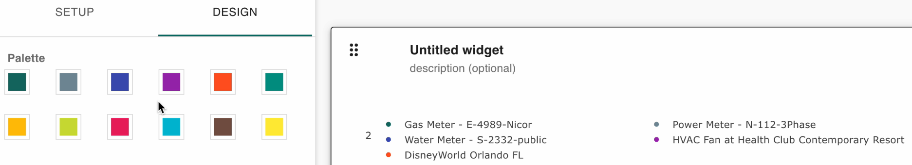
Asset color
Each asset’s color can be changed within the design tab:
Asset type
The icon next to assets indicates its type. This icon means number type:
Boolean and date are examples of other types.
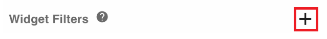
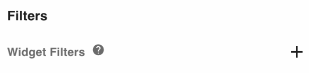
Widget filters
Here are widget filters:
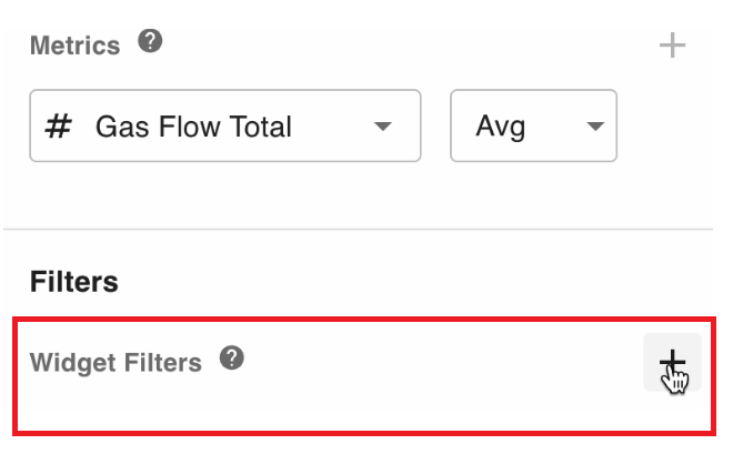
Widget filters specify a filter for the widget that displays on the dashboard. Widget filters override tab filters. Widget filters are typically set once, while tab filters can be changed while looking at a particular dashboard.
Widget filter example
Here is an example of a widget filter that displays after clicking on the plus icon:
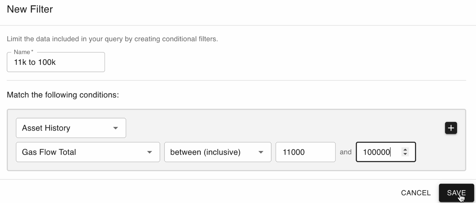
This widget will only display values between 11,000 and 100,000. The entity field is where the values come from.
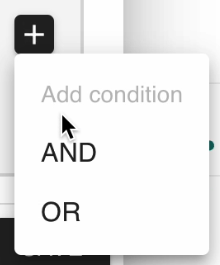
You can click the plus button to add AND or OR filters:
Categorical widgets
These are the categorical widgets you can choose from:
Asset bar graph example
The settings on the left generated the asset bar graph on the right:
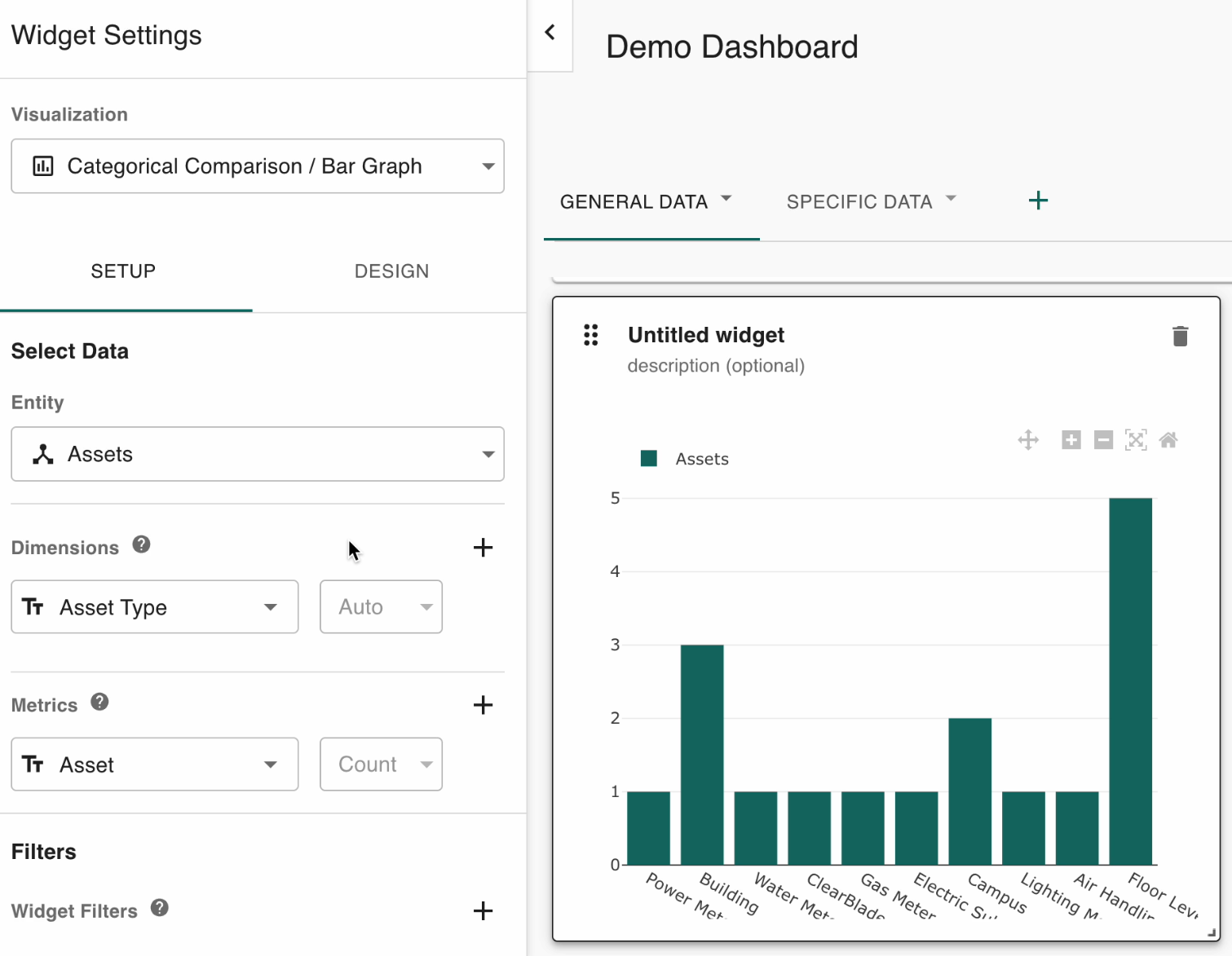
The dimensions and metrics above group the assets by type. The count is indicated next to the asset metric.
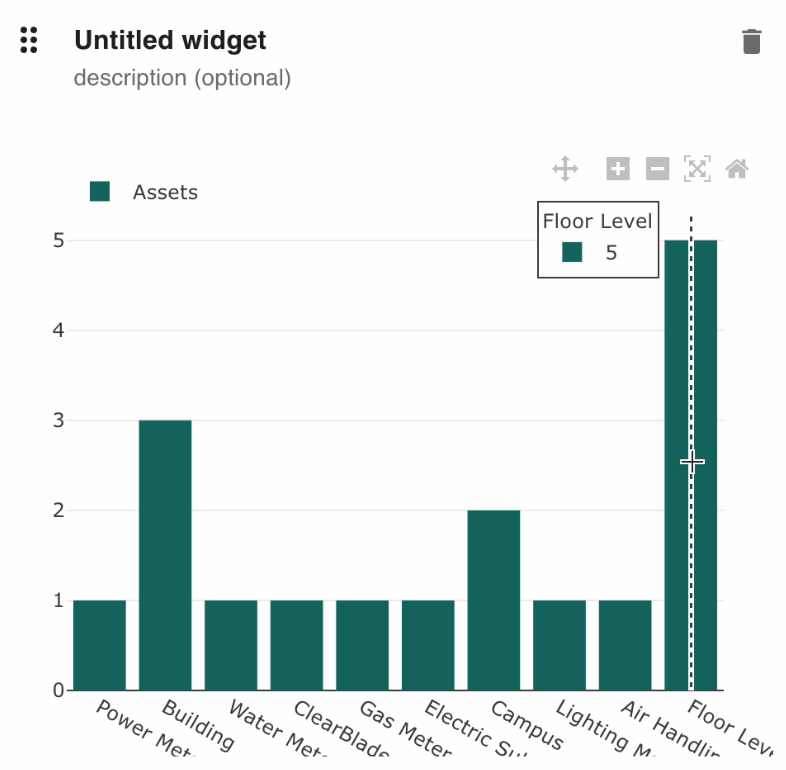
The chart indicates there are five floor-level type assets:
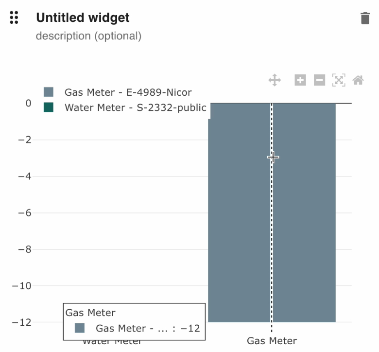
Assets that have a particular attribute example
The dimensions and metric on the left generate the graph on the right:
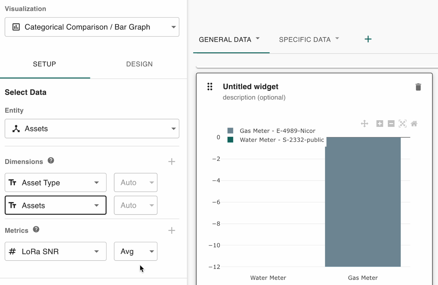
There is one asset of each type:
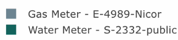
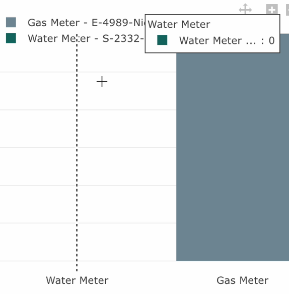
For the gas meter, the value of this asset is -12:
Whereas the value of the water meter’s asset is 0:
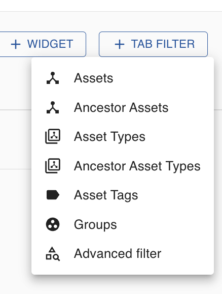
Tab filters
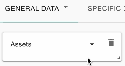
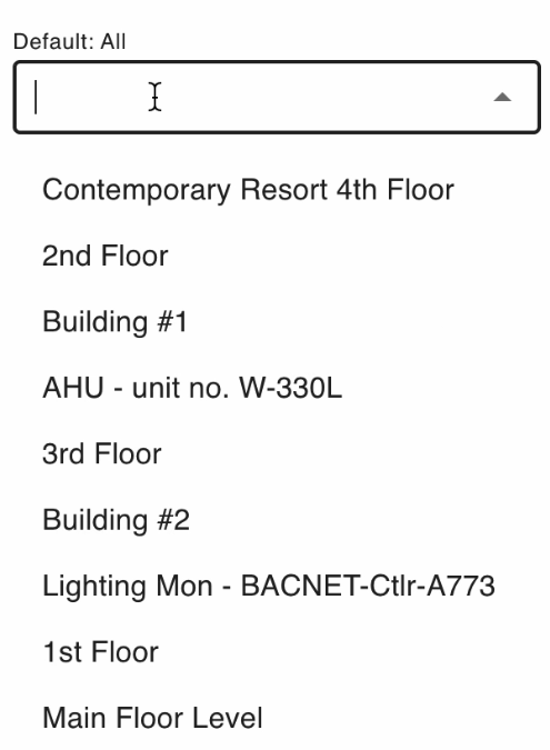
Click Assets if you’re only concerned with particular assets:
Click the dropdown to filter by a particular asset:
Select the asset you want to filter by to only see data of it:
The tab filter is only temporary, even after you save the dashboard. Unlike the tab filter, the widget filter, which appears on the bottom left of the page, will persist after you save.
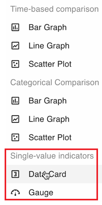
Single-value indicators
Click the Add Widget button on the top-right of the screen and choose a single-value indicator.
Asset data card example
This display after selecting data card for your single-value indicator:
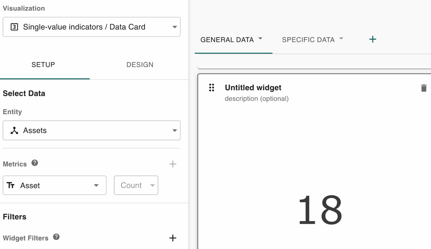
Note the values on the left side of the screen.
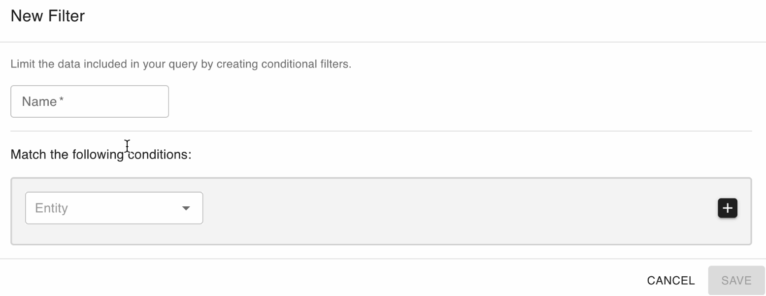
Asset gauge example
This displays after selecting gauge for your single-value indicator:
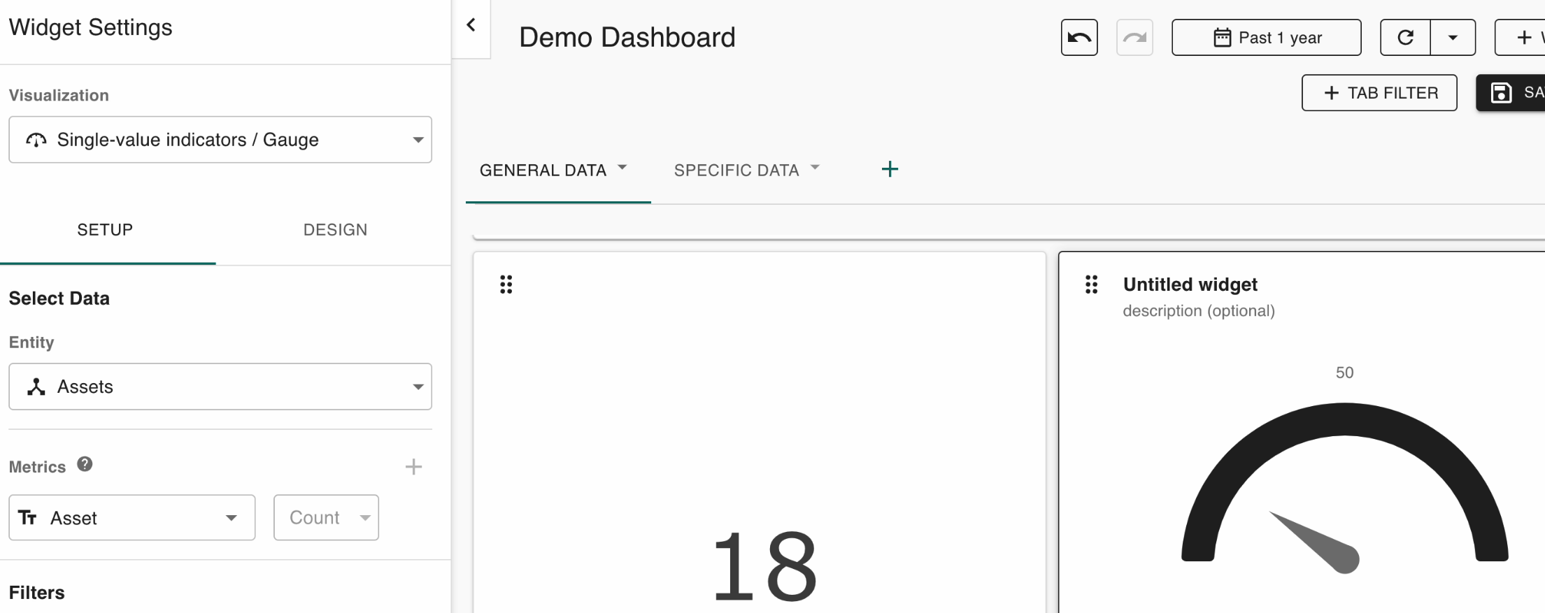
This displays the total asset count in the whole system. The values in each widget are the same (18) but are displayed differently.
Average asset temperature example
The revised metrics on the left side of the page updated the value on the right of the page:
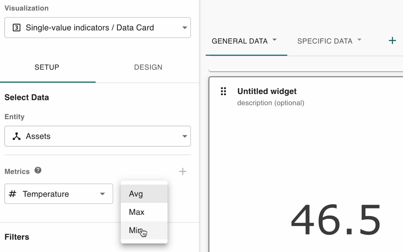
You also have options to display the maximum and minimum temperatures. The values on the left of the page only update whatever widget you selected on the right.
Utilize filters to filter by a particular time range, for instance:
Events in system example
Update the entity to events to see the events in the system:
This just updates the widget on the right, as that is the one selected.
Here is an example filter that you can apply to events:
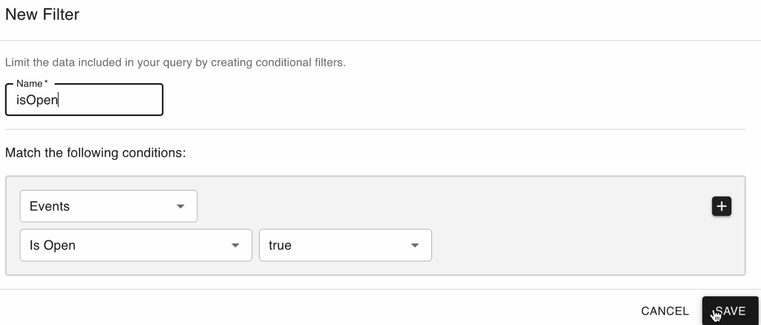
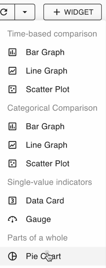
Pie charts
Click the Add Widget button and Pie Chart towards the bottom:
Here is an example of what displays:
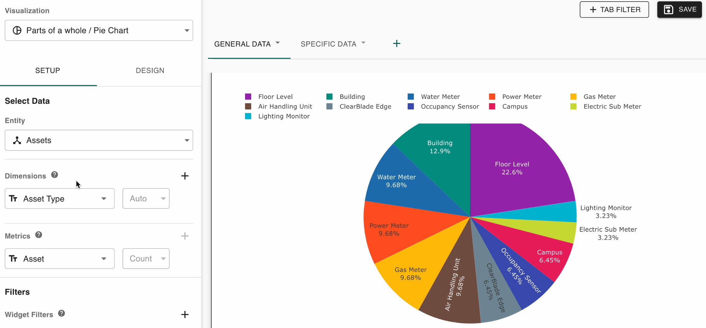
All of the assets in the system are grouped by asset type.
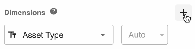
Click the plus icon to add additional dimensions:
This is what appears when the Group dimension is added:
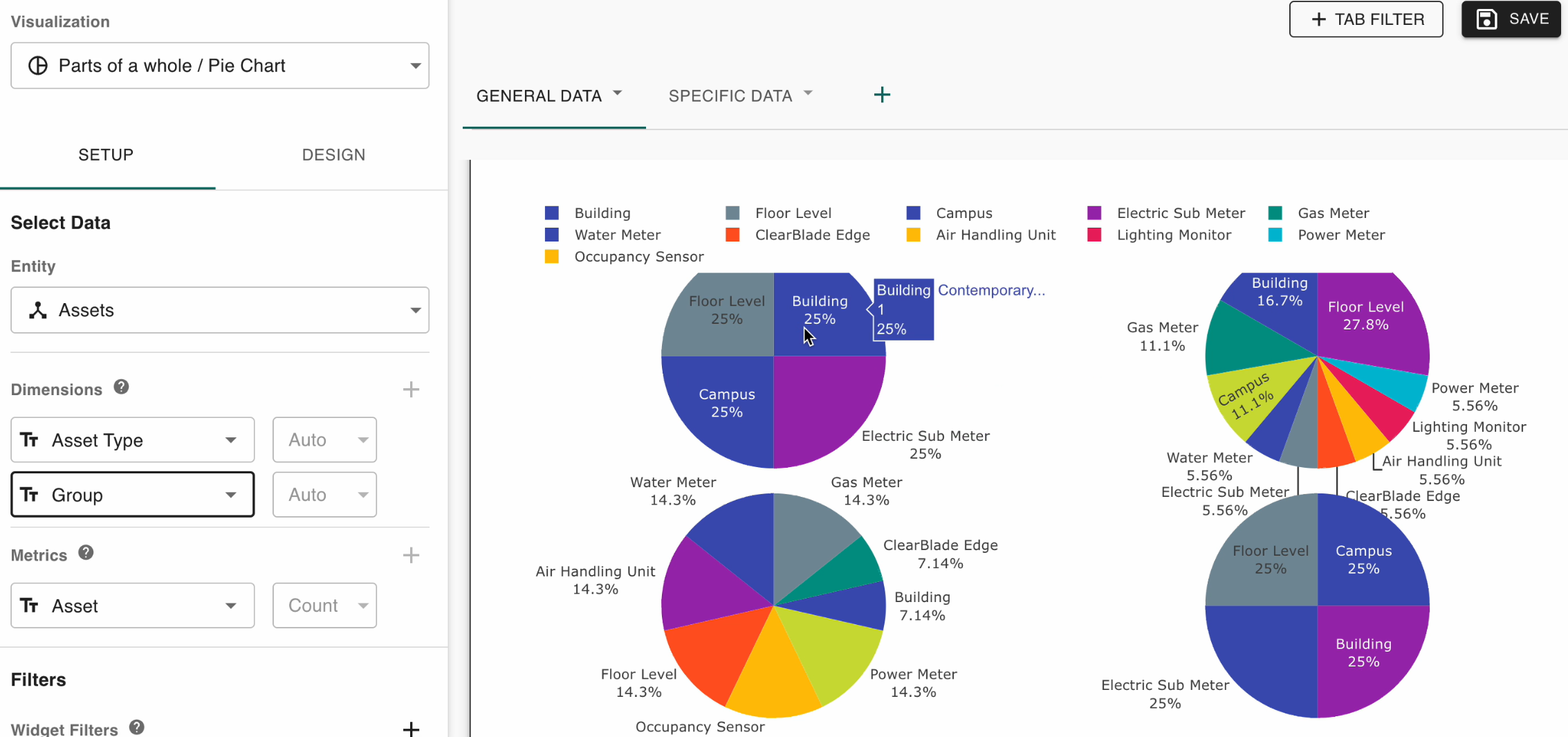
In this example, the system has four groups, each divided by the percentage of different asset types that make up that group.
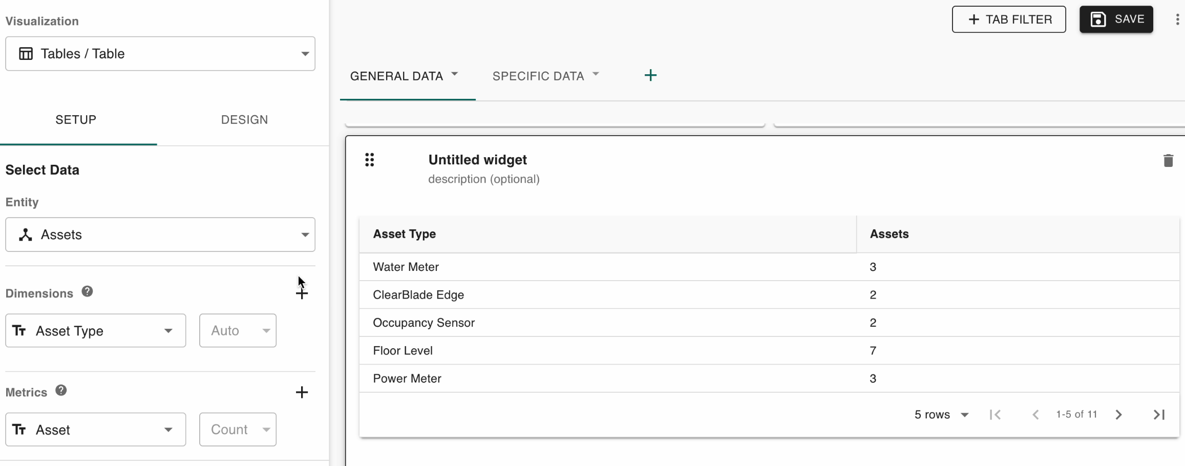
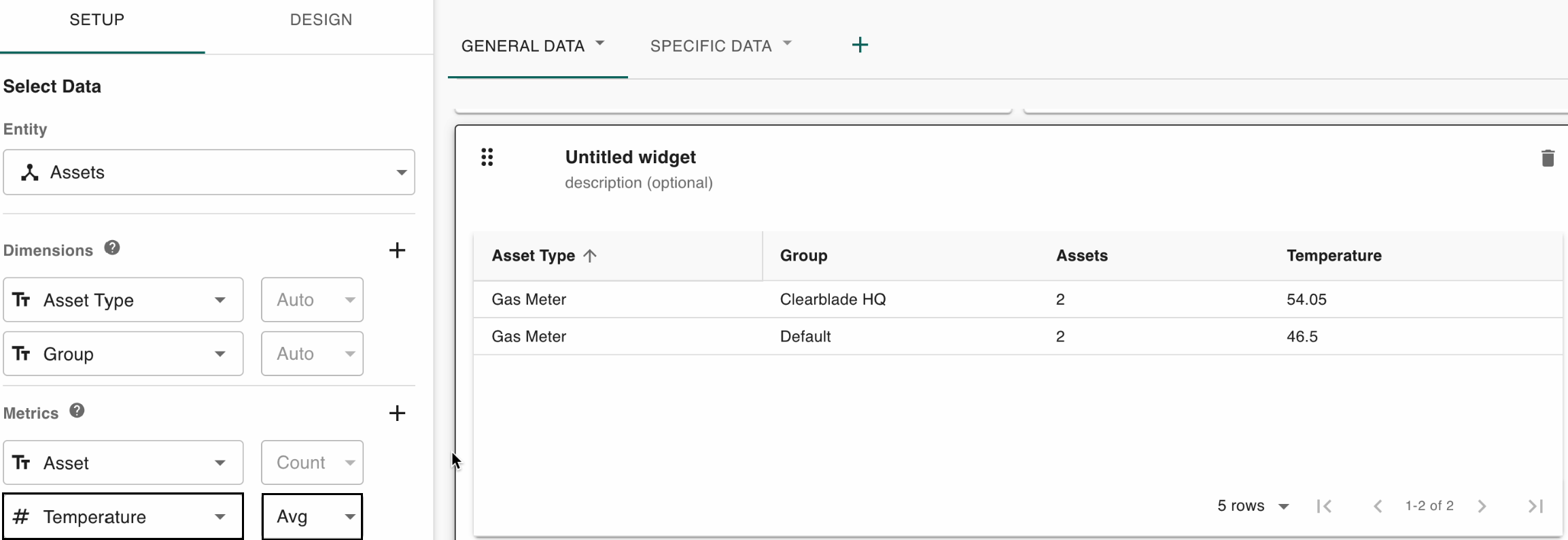
Tables
Click the add widget button and table at the very bottom to add a table:
This table shows asset types and how many assets belong to each of them:
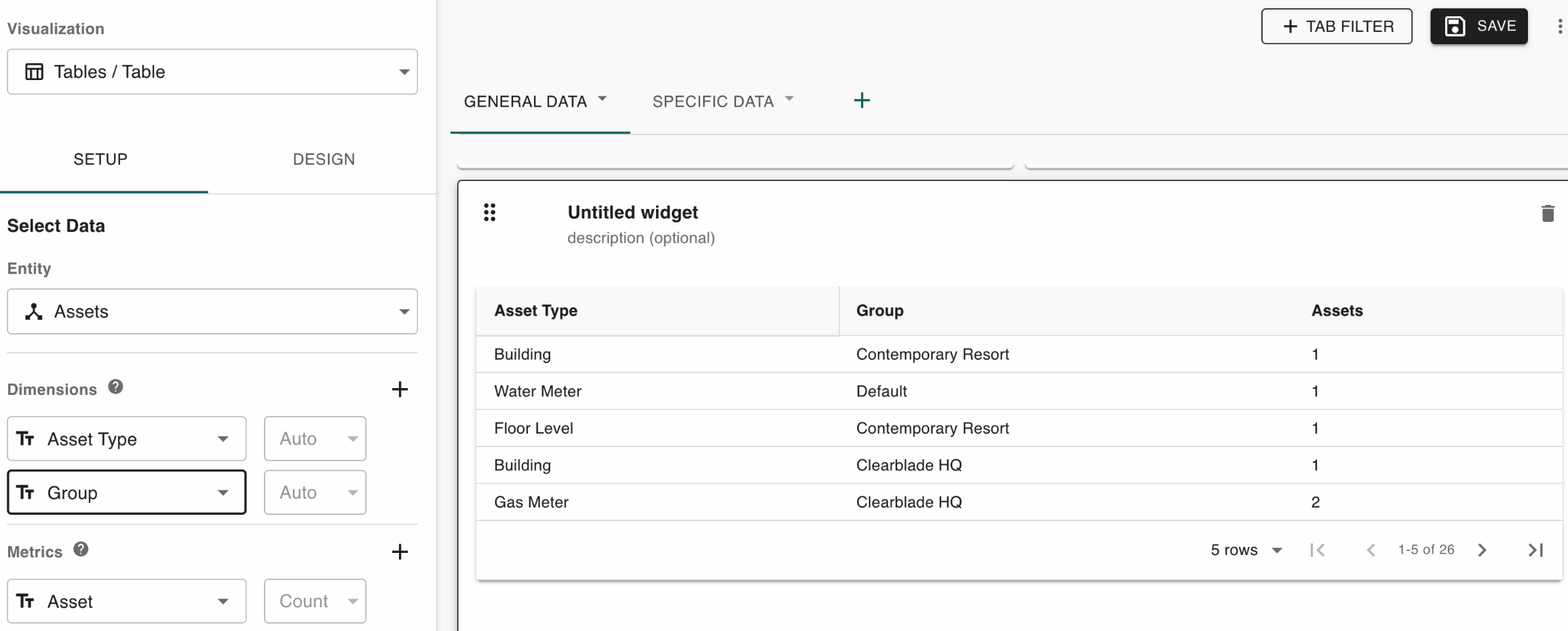
This table displays when you add another dimension to show assets within groups within asset types:
Add the average temperature metric to only display asset types that have it:
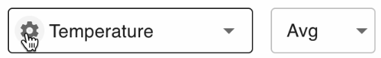
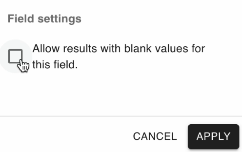
Click the icon next to the Temperature and Asset metrics to show asset types regardless of whether they have a temperature or not:
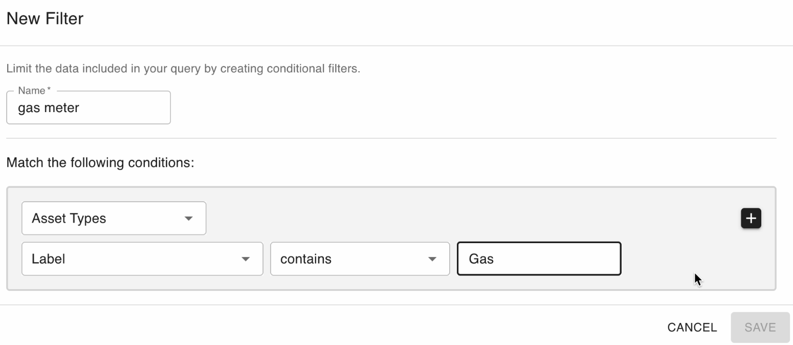
Use filters as appropriate.
Here is an example of only showing gas asset types:
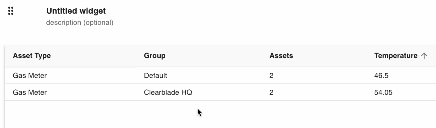
This is what displays after saving:
Alternatively, you can do this with tab filters by clicking Asset Types:
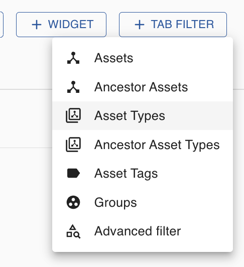
You would then filter by asset types: