
Widget types
Basic
|
Widget |
Example |
|---|---|
|
Text |
|
|
Button |
|
|
Input |
|
|
HTML |
See video |
Charts
|
Widget |
Example |
|---|---|
|
Bar Chart |
See video |
|
Line Chart |
|
|
Pie Chart |
|
|
Scatter Plot |
|
Utility
|
Widget |
Example |
|---|---|
|
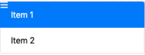
List |
|
|
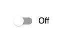
Toggle |
|
|
Color Picker |
See video |
|
Grouping List |
|
|
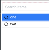
Filterable List |
|
|
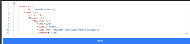
JSON Editor |
|
|
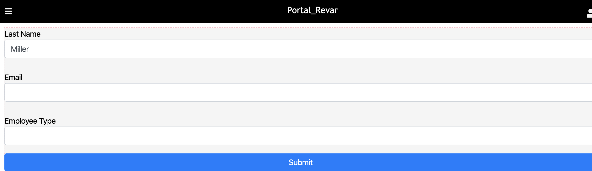
Form |
|
Gauges
|
Widget |
Example |
|---|---|
|
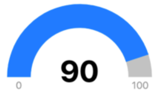
Radial Gauge |
|
|
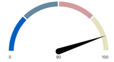
Speedometer |
|
Other widgets
|
Widget |
Example |
|---|---|
|
Google Map |

|
|
Rule Builder (Advanced) |
|
|
CRUD Grid |
Parsers
Data types
All widgets will require you to choose an incoming data type to render.
Static: Data will be loaded as is and unchanged unless code is written to listen and force changes.
Calculated: Can reference a datasource, and the parser’s JavaScript can be customizable.
Dynamic: The datasource is added, and data gets updated as changes are made in the datasource. This will appear in content as datasources.
Data parsers
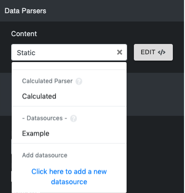
The widget’s parser can be edited in this section. Datasources can also be added.
Editing the parser
Click Edit next to the data type to edit the parser.
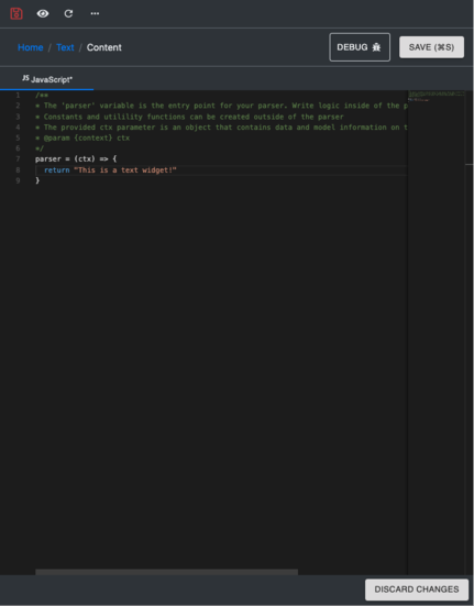
The parser includes:
-
Debug button: Debugs your parser.
-
Save button: Save changes you make to your parser. Do not close the parser without saving your changes.
-
Discard Changes button: Restores the parser to its default state.
To return to the widget editing page, click the widget’s name.
Event parsers
It appears the same as the data parser.
Advanced
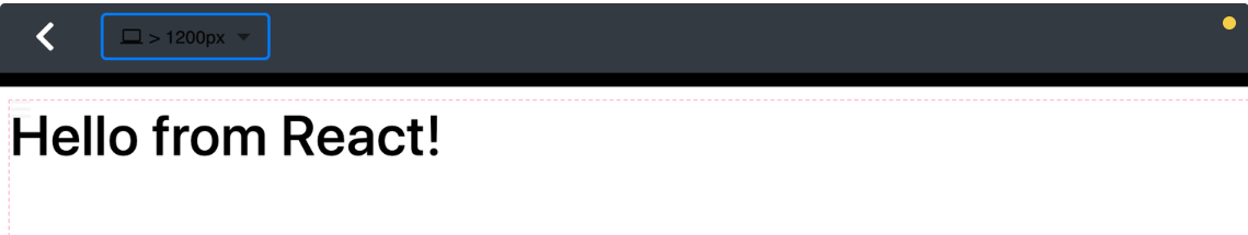
Using React components
React components can be used in the HTML widget. This can be applied by marking the React Component? checkbox in the HTML widget settings' Other section. When a React component is used inside an HTML widget, it will be placed into the portal’s React tree. It can use lifecycle methods such as componentWillUnmount. The componentWillUnmount method will be called whenever the user navigates away from the widget page. JSX must be transpiled beforehand. In most cases, cb-dev-kit will do this.
Here is a code sample that can be used to test React in the HTML widget parser:
<div id="my-react-container">
    </div>
//js
parser = (ctx) => {
    class MyReactComponent extends React.Component {
        render () {
            return React.createElement("h1", null, "Hello from React!");
        }
        componentWillUnmount() {
            console.log('on unmount!');
        }
    }
  return {
      element: React.createElement(MyReactComponent, null),
      container: document.getElementById('my-react-container')
  }
}
This should return the Hello from React! text.
FAQ
1. How do I use onUpdate in the form widget?
onUpdate is a callback function invoked in the Form Source when any form fields get updated. It gives users access to currentValues following the change to update other values and the form’s fieldSettings. currentValues are already inputted in the available fields.
Ex.
onUpdate: function (arg) {
   if (arg.currentValues.state) {
        var cityOptions = stateToCity[arg.currentValues.state]
        arg.fieldSettings.city.dropdownOptions = cityOptions
     }
    return arg
},