
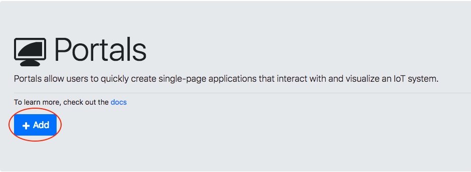
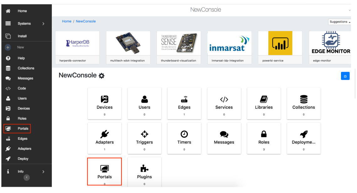
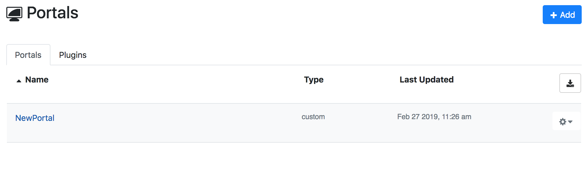
Create a portal
1. Navigate to the portal's sidebar tile or the developers console menu’s portal button.
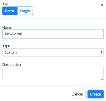
2. Create a new portal by clicking + Add.
3. Enter your portal’s name and description.
Assign roles
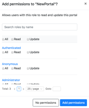
Click the gear next to your new portal and select Edit Roles to permit users to access and edit the portal.
If you do not have users, add them in Users. Setting the authenticated role access to read will allow them to sign in and operate a portal. This is the default role when a user signs up on the portal page. By giving administrator roles CRUD access, they can modify the portal to reflect in the public view.
Access a portal
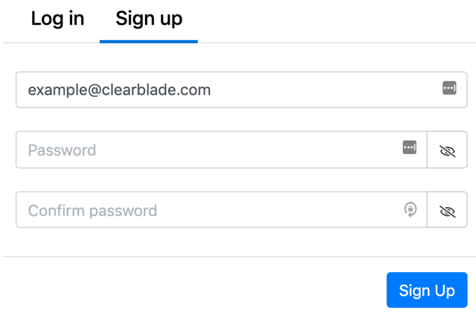
Click the portal’s link and sign in with an administrator’s credentials.
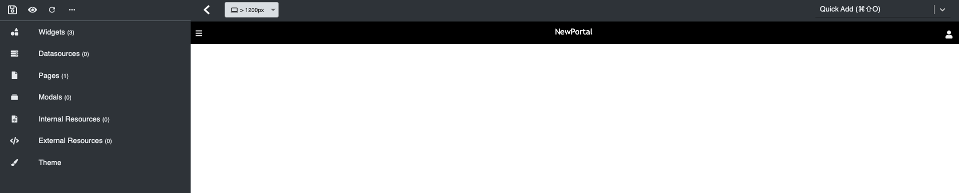
Welcome to your portal!
Delete a portal
1. Click the gear next to your new portal and select Settings.
2. Click Delete Portal.
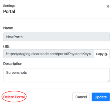
Confirm the deletion when prompted.
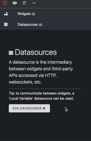
Datasources
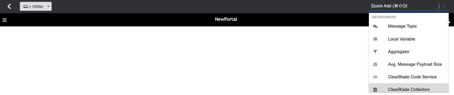
Datasources can be added from:
1. The left side navigation bar by hovering over the Datasource tab
2. Scrolling to Datasource on Quick Add at the top and selecting the datasource type
Complete the datasource information in the popup window.
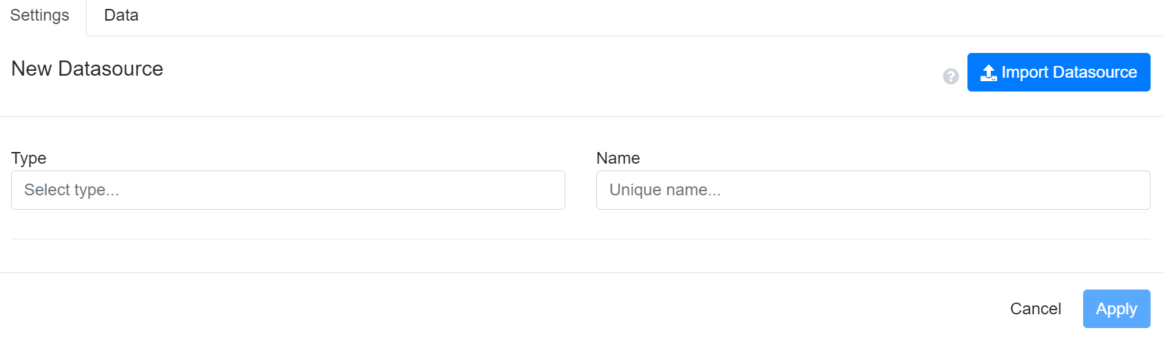
Below are the standard datasource fields.
Settings
|
Field |
Description |
|---|---|
|
Name |
The portal’s datasource label |
|
Type |
Where the data is coming from |
|
Name |
The datasource name where the data is coming from |
|
Refresh Interval(s) |
How long the datasource should update |
|
Call on load |
Datasource auto invocation when starting up the portal |
|
Suppress Errors |
Do not show network errors, if any |
|
Parse incoming data |
Parses data for the results to be in a desired format |
Data
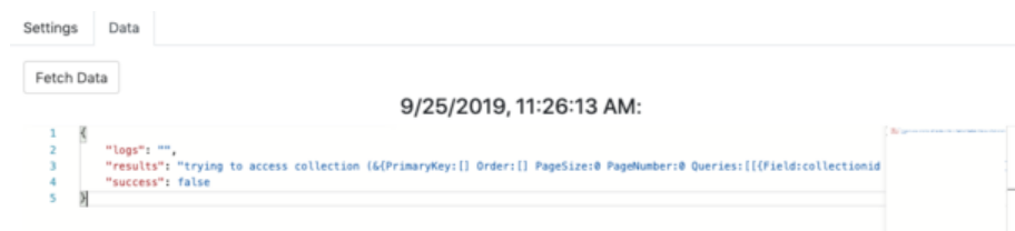
Manually fetch data from the datasource using Fetch Data.
-
Click Apply, and the datasource and its last update appear in the side editor. It can also be used in a widget under Dynamic.
Widget
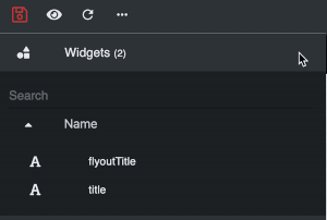
Adding widgets
You can add widgets via:
-
The left side navigation bar by hovering over the Widgets tab and dragging the widget of choice to the portal
-
Scrolling to Widgets on Quick Add at the top and selecting the widget type
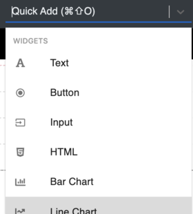
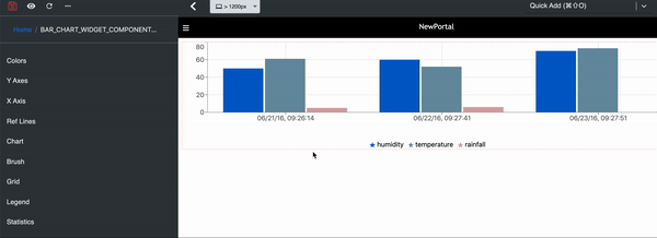
Widget types
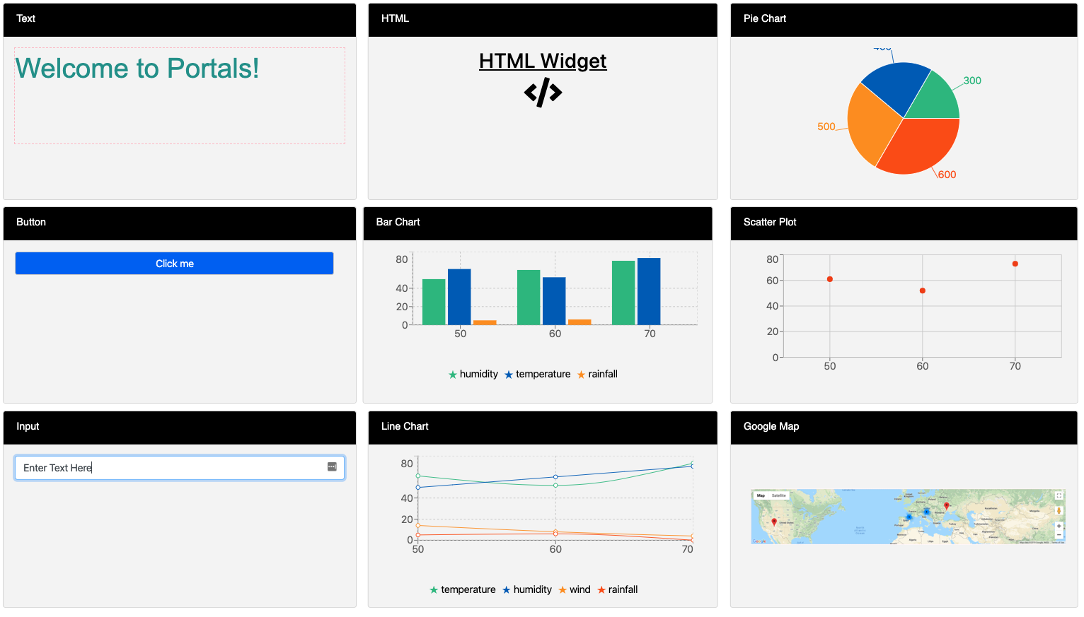
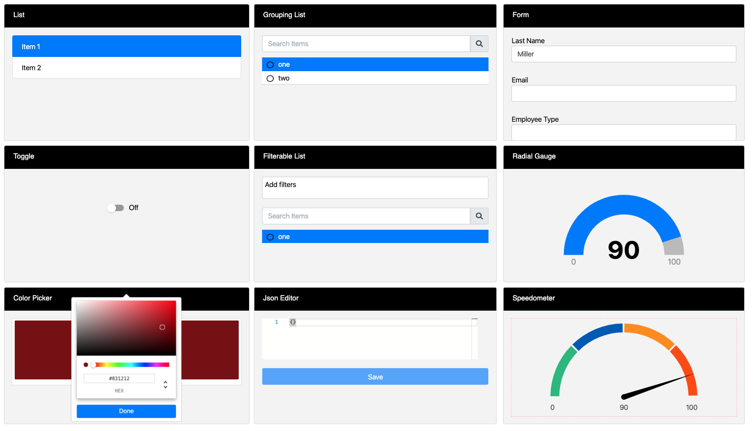
Example widgets
Data types
All widgets will require you to choose an incoming data type to render.
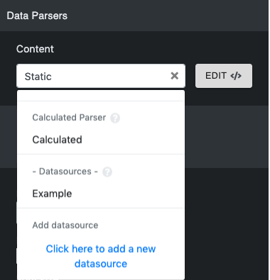
Static: Data will be loaded as is and unchanged unless code is written to listen and force changes.
Calculated: Can reference a datasource, and the parser’s JavaScript can be customizable.
Dynamic: The datasource is added, and data gets updated as changes are made in the datasource. This will appear in Content as datasources.
Parsers
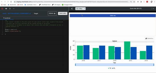
To edit the parser, click Edit next to the data type.
The parser includes:
-
Debug button: Debugs your parser.
-
Apply button: Save changes you make to your parser. Do not close the parser without saving your changes.
-
Discard Changes button: Restores the parser to its default state.
Debug example
An error message should appear at the bottom of the page after clicking the debug button.
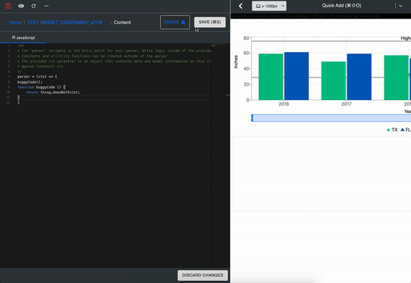
Try it out with this example:
buggyCode();
function buggyCode () {
    return thing.doesNotExist;
}
Widget API
-
widgetData
-
overrideSettings: programmatically overrides the setting that is manually set on the widget.
Ex:
return {
    overrideSettings: {
      dropdownOptions: [
        {name: 'manager', value: '1'},
        {name: 'employee', value: '2'},
      ]
    },
    widgetData: 'manager'
  }
To return to the widget editing page, click the widget’s name.
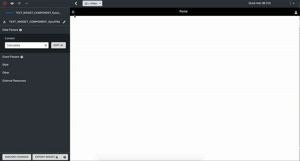
Data parsers
The widget parser can be edited in this section. Datasources can be added.
Event parsers
Event parsers trigger a widget action, but not all widgets have an event parser. It appears the same as the data parser.
Try it out with this button widget example:
alert('clicked button!');
Edit/delete widget
Click a widget to edit it, or click the trash can icon next to it to delete it.
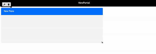
Panes
Panes are used to group widgets in a more logically organized way.
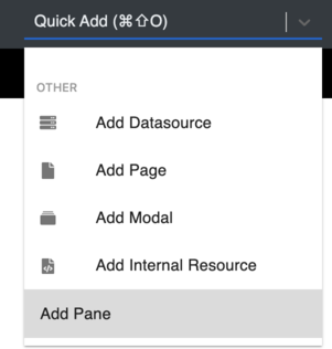
Where can panes be added from?
1. The left side navigation bar by hovering over the Widgets tab. Scroll down to Containers and drag the pane to the portal.
2. Scrolling to and clicking Add Pane on Quick Add at the top.
Edit pane
Hover over the pane and click the wrench:
|
Field |
Description |
|---|---|
|
Title |
The pane’s label |
|
Hide header |
Hides pane header |
|
Hide borders |
Hides pane outlines |
|
Tabbed pane |
Adds tabs to the pane |
|
Theme type |
Changes the pane’s color theme |
|
Custom Pane ID |
The pane’s unique ID. It’s useful when switching tabs programmatically |
|
Grid container padding |
Adds padding between pane and widgets |
Resize pane
Click the resize handle on the pane’s bottom right corner and drag it to the desired shape.
Delete pane
1. Hover over the pane and click the trashcan.
2. Confirm deletion when prompted.
Flyout pane
Click the hamburger icon on the header’s left-hand side:
The menu title defaults to the portal name but can be configured like a widget.
Widgets can be added to the flyout pane.
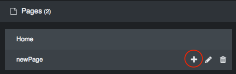
Pages
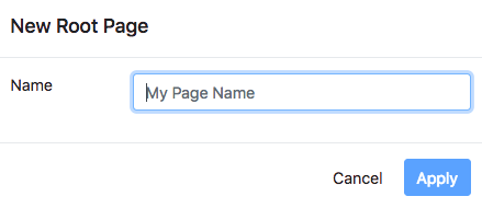
Create a page
Hover over Pages on the side editor and click +.
Fill in the page’s name and click Apply.
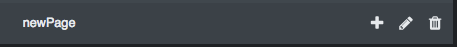
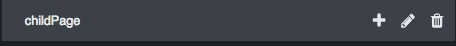
Edit/delete page
Click the pencil icon of the page you wish to edit.
Click the trash can icon of the page you wish to delete.
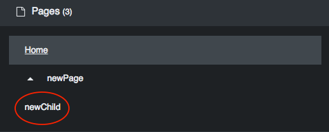
Adding children to the page
1. Click the plus button of the page you wish to add a child page.
2. Add name and parameters.
3. Save the child page by clicking Apply.
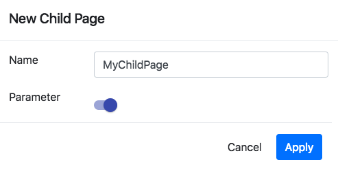
The parameter’s default value will be used when navigating to the page.
Programmatic interaction
The portal provides an interface via the CB_PORTAL object for interacting with pages from within a parser, widget, or datasource.
Selecting a page programmatically
CB_PORTAL.selectPage("/states/TX/city/Austin")
Example use case:
Users select a state so the portal navigates to a new page.
Retrieving the current path parameters
CB_PORTAL.getPathParams() // will return {"state": "TX", "city": "Austin"} if the current path is "/states/TX/city/Austin"
Example use cases:
1. The current page changes, so the portal should display data relevant to the URL parameters.
2. The portal must load the correct state on initial startup when the URL is /states/TX/city/Austin.
Edit/delete page
Click the pencil icon of the page you wish to edit.
Click the trash icon of the page you wish to delete. Confirm deletion when prompted.
Modals
1. Hover over Modals on the side editor and click the +.
2. Give it a name and size and fill out the remaining information.
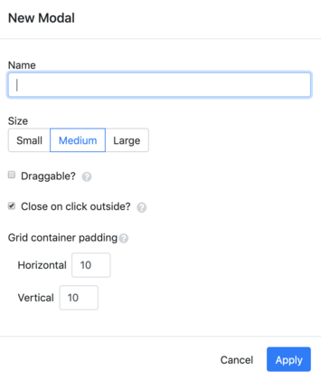
|
Field |
Description |
|---|---|
|
Name |
The datasource’s portal label |
|
Size |
Where is the data coming from |
|
Draggable? |
Gives the ability to drag the modal around the portal |
|
Close on click outside? |
Allows modals to close when the user clicks away from them |
|
Grid container padding |
Adds padding between the pane and widgets |
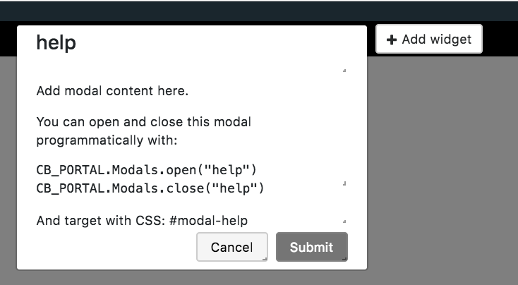
You cannot select close on click if you make the modal draggable. There will be tips in the modal as a default. You can hover over these and edit the widget by clicking the wrench. You can add more widgets by clicking + Add Widget next to the modal. To delete or edit the modal, hover over the name in the side editor and click the pencil or trash can, respectively.
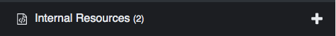
Internal resources
Internal resources can be added in the toolbar on the left of the portal.
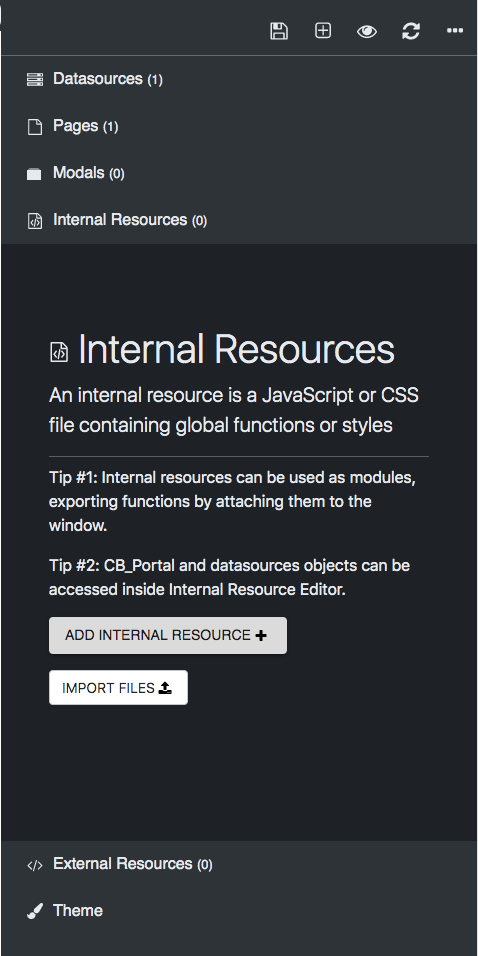
There are two ways to add an internal resource:
-
In the internal resource parser
-
Importing a file
Parser
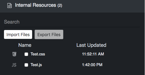
Click Add Internal Resource, and a new file modal will appear. Give your file a unique name, choose whether it is a JS or CSS file, and type in the code. There is an option to test before saving the changes.
Import file
Click Import Files and choose the file(s) from your device.
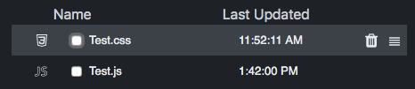
After being created, they should be listed in the Internal Resources section. From there, the file(s) can be exported and searched.
Add more files
To add more files, hover over Internal Resources and click +.
Export files
Mark the checkbox of the file(s) you want to export and click Export Files.
Delete files
To delete files, hover over the file you want to remove and click the trashcan icon.
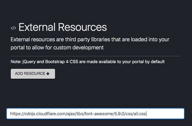
External resources
External resources can be added in the toolbar to the left of the portal.
In the example, we will use a CSS URL from Font Awesome Icons. The icons can be found here.
Add the HTML widget to the portal before continuing with the example.
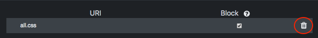
Copy the URL (https://cdnjs.cloudflare.com/ajax/libs/font-awesome/5.9.0/css/all.css) and add it to the box after clicking Add Resource +.
Hit the enter key to add the resource.
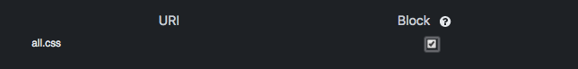
The resource should be added to the list.
Mark the Block checkbox if there is an error while importing the external resource.
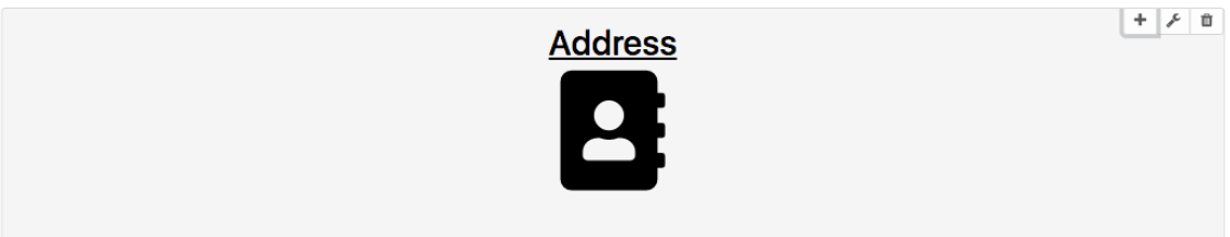
Go to the HTML widget and edit and copy/paste the code below into the HTML parser:
<div class="text-center underline">
  <h2>Address</h2>
  <i class="fas fa-address-book fa-7x"></i>
</div>
This should appear in the widget:
To delete, hover over the resource and click the trash can icon.
Screen size editor
This guide assumes that panes and widgets have already been added to your portal.
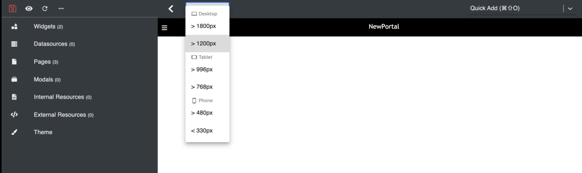
1. Select the screen size you’d like to change the layout by choosing from the dropdown.
2. Adjust the layout by resizing your panes and widgets.
Theme editor
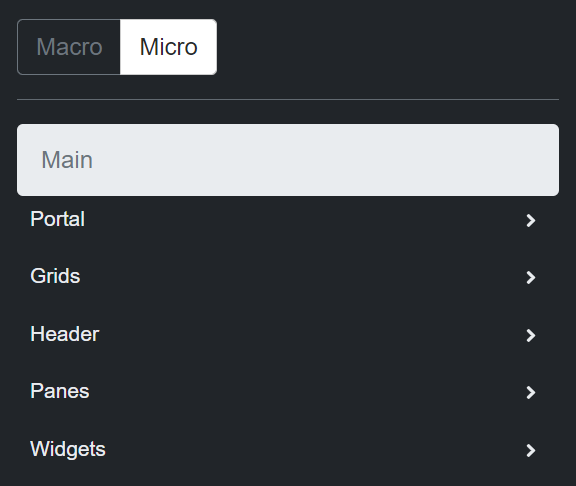
The theme editor can be found in the toolbar on the left of the portal. When you click it, you can change the theme on a macro (general) or micro (specific) level.
Macro
-
Choose between a standard or night-based theme.
-
Choose different color themes using a palette.
-
Change the graph element colors.
Micro
Change the color palette by portal element.
Plugins
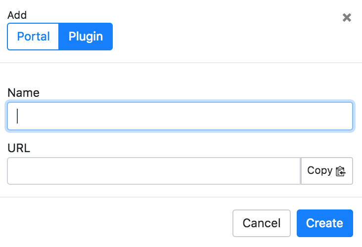
Create a plugin
Plugins can be created on the portals page. Click + Add.
Enter your plugin’s name and URL.
The plugin should appear under the Plugins tab.
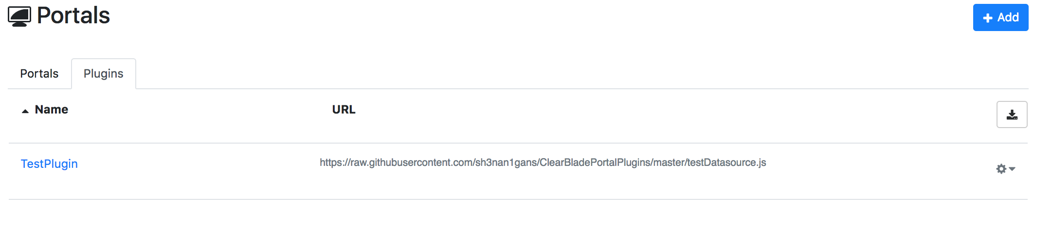
Clicking the plugin will take you to the URL.
Settings
Go to the gear next to the plugin and click Settings.
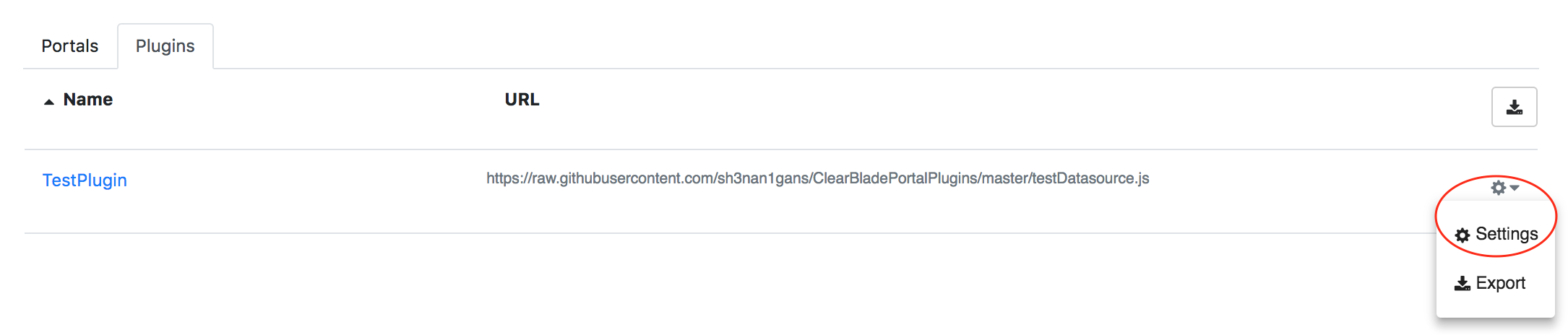
The name cannot be edited, but the URL can be copied.
The plugin can also be deleted from this window.
To save changes, click Update.
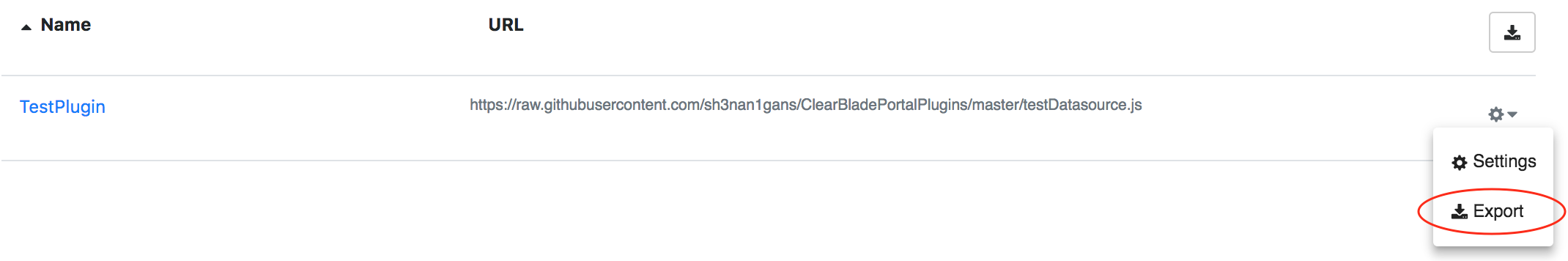
Export
Plugins can be exported all at once or one at a time.
All at once:

One at a time:
Go to the gear next to the plugin and click Export:
Click Export as JSON.
Download the plugin and a ZIP file will be downloaded to your device.
Click Done when finished.