
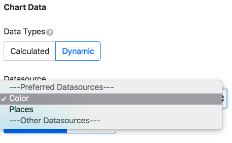
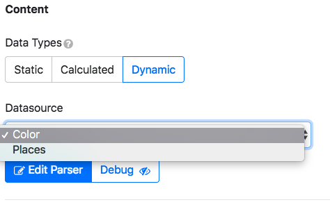
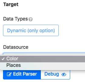
Data types
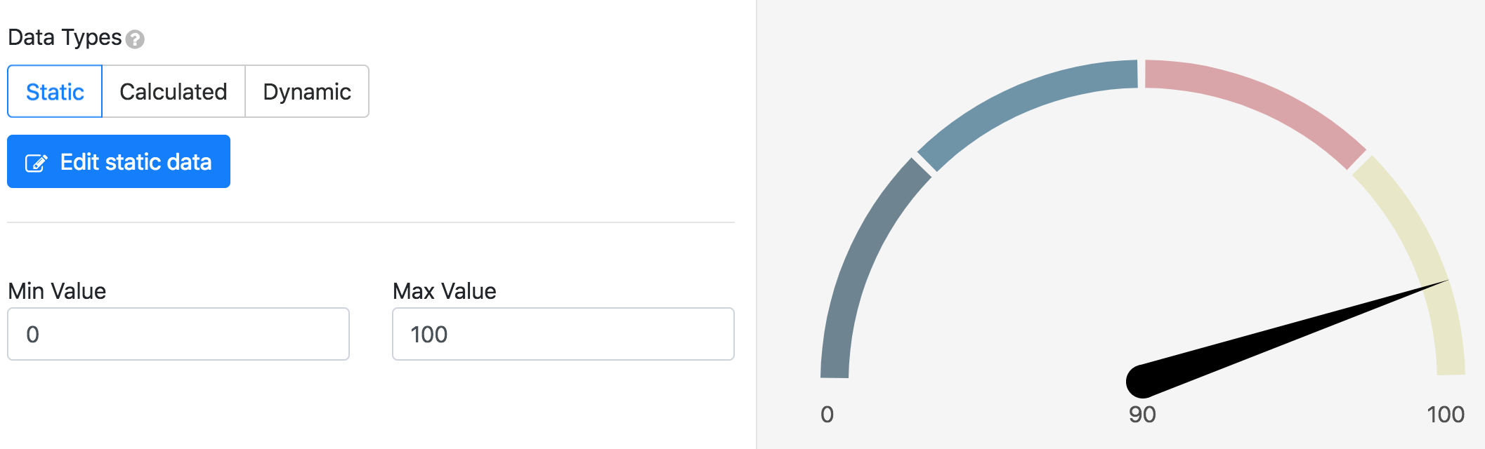
All widgets will require you to choose an incoming data type to render.
Static: Data will be loaded as is and unchanged unless code is written to listen and force changes.
Dynamic: The datasource is added, and data gets updated as changes are made in the datasource.
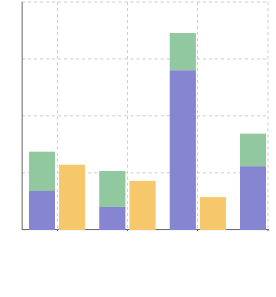
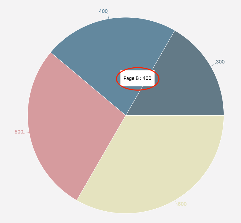
Bar chart
Creating a new bar chart
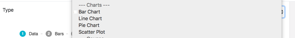
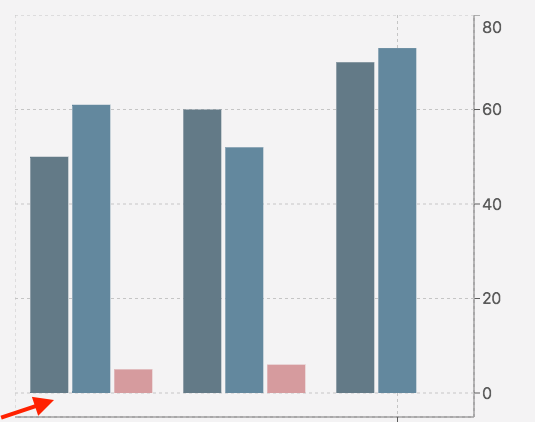
1. Change the type to Bar Chart.
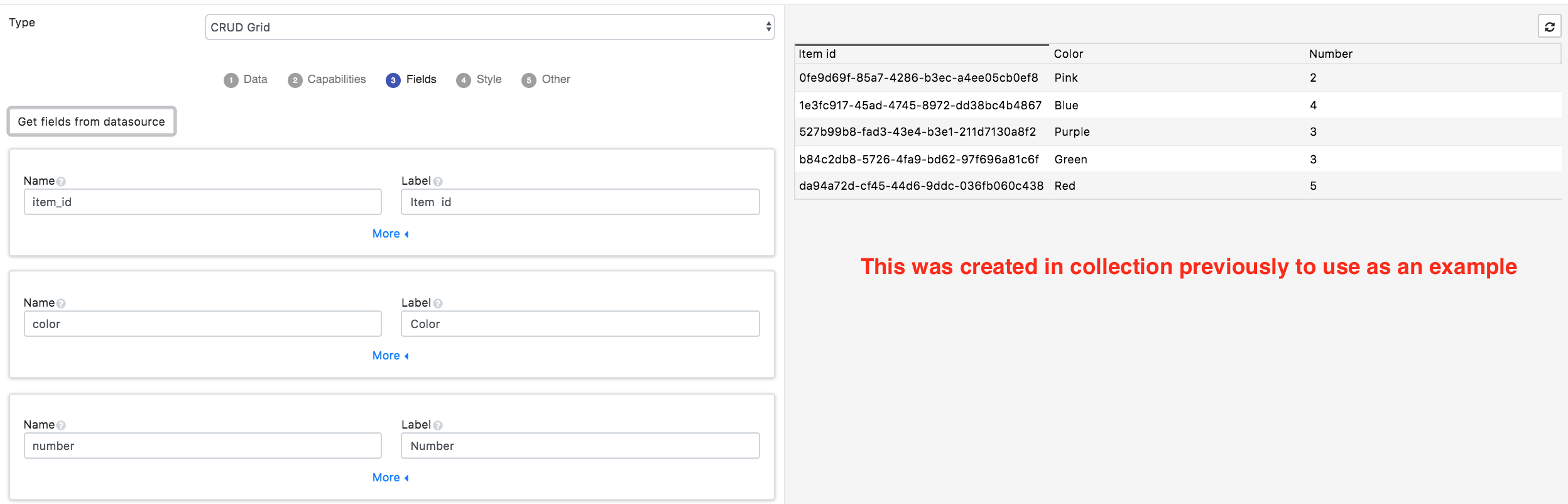
2. Choose your data type and datasource. The datasources in the example below were created previously and not by default.
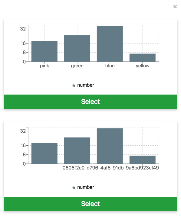
3. Click to automatically populate the graph with generated recommendations based on the data types.
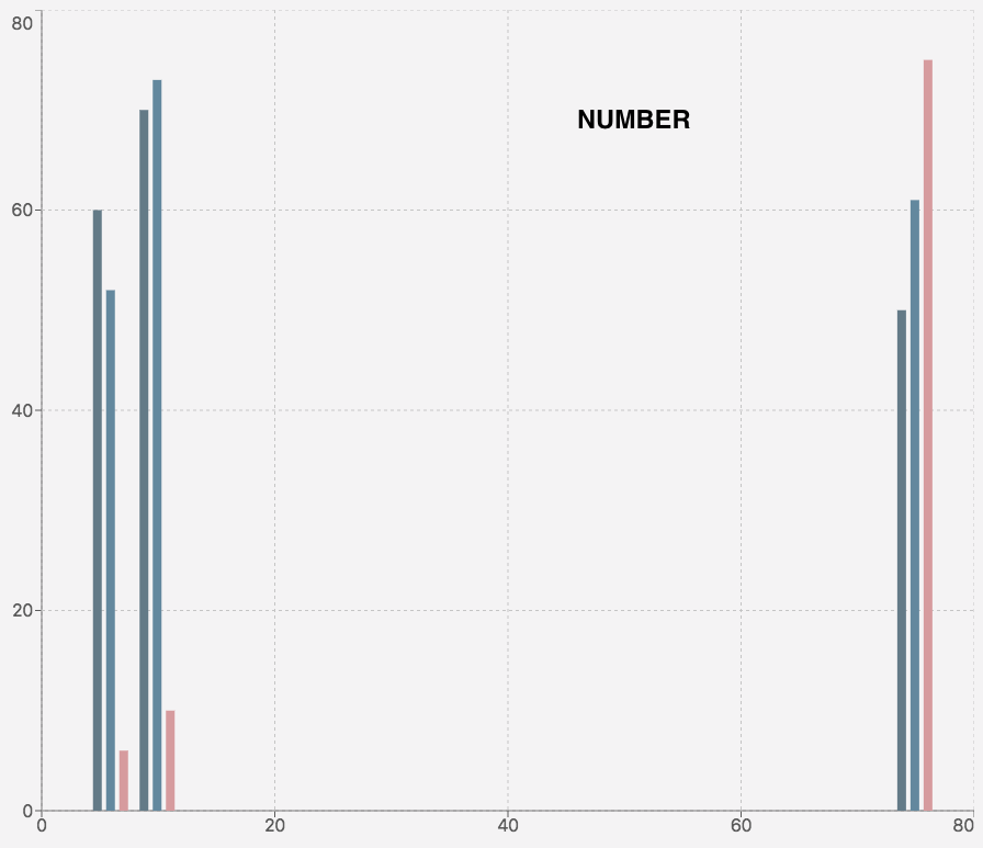
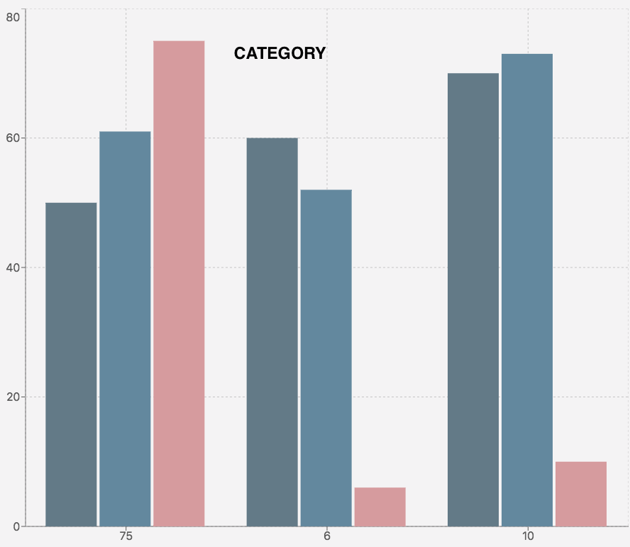
The rest of the tabs are for editing the graph.
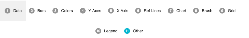
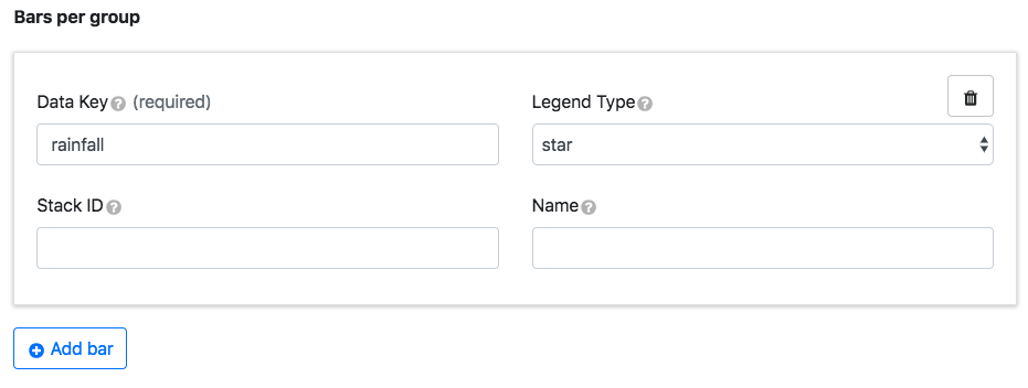
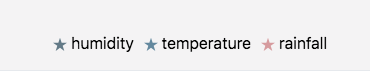
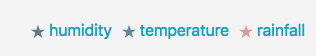
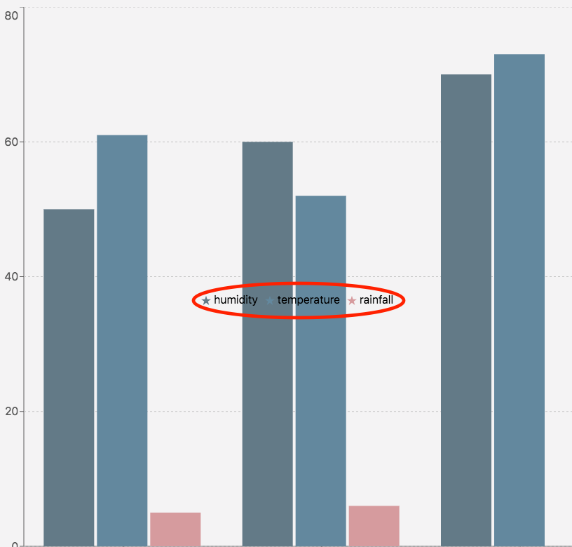
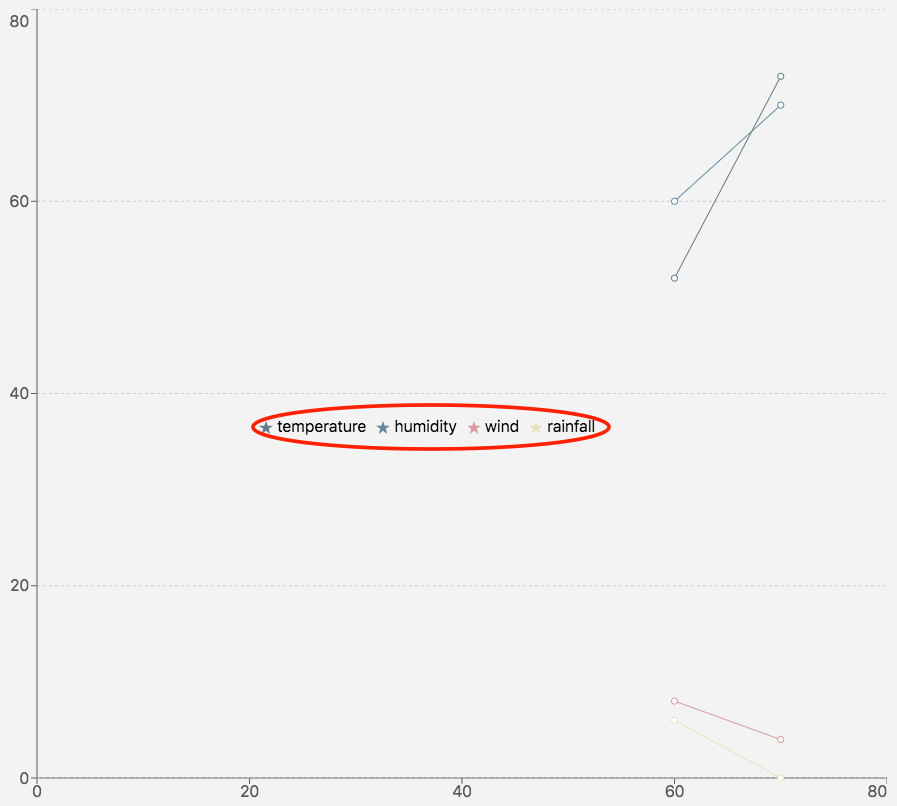
Bars
|
Key |
Description |
Example |
|---|---|---|
|
Data Key |
Property from the data object corresponding to a bar on the graph |
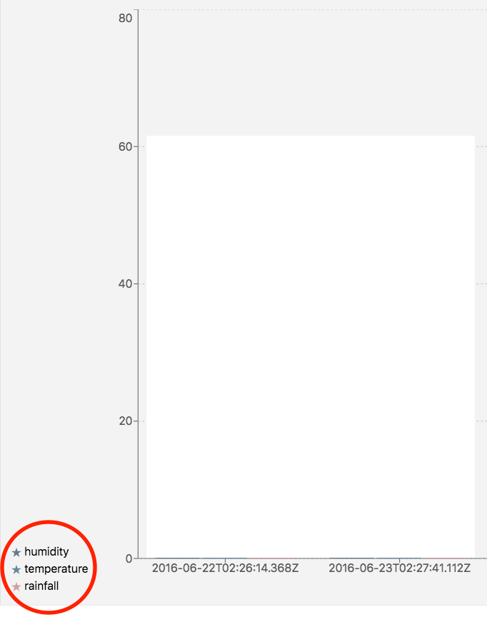
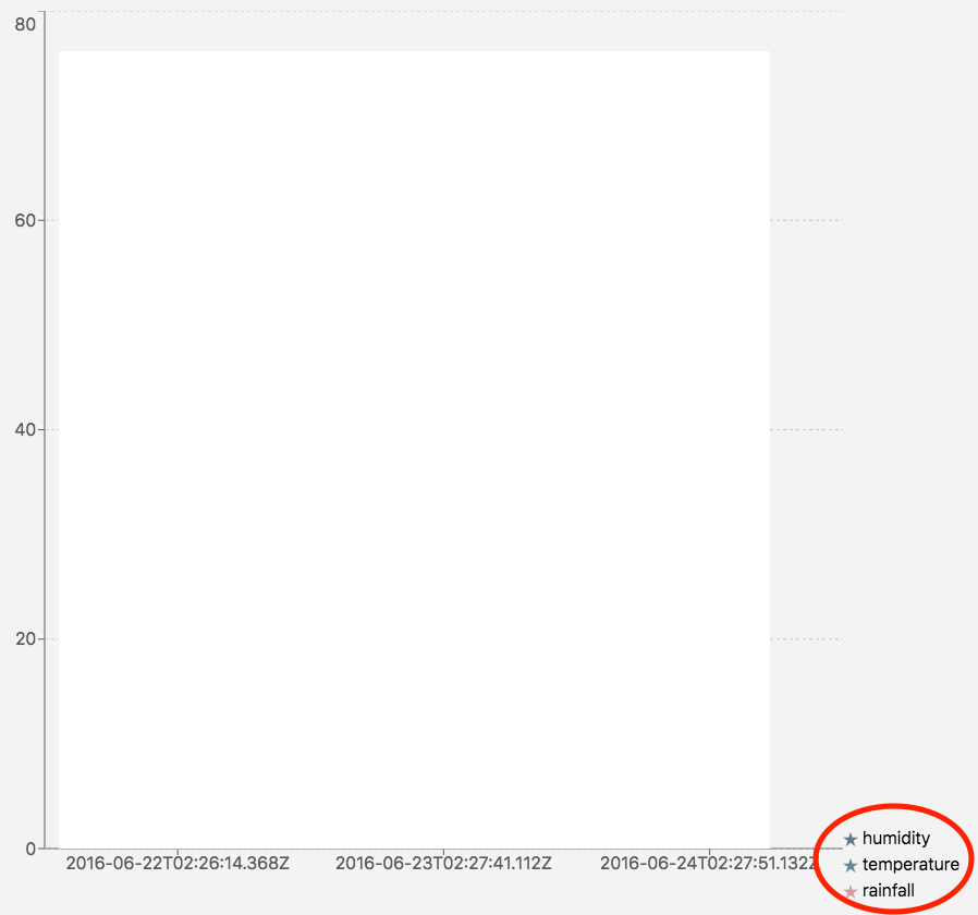
{“dataKey”:“humidity”} |
|
Legend Type |
The icon associated with the data key |
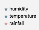
stars |
|
Stack ID |
Two bars with the same ID and value axis will be stacked |
|
|
Name |
The bar label if it’s different from the data key |
hum (in the legend)=humidity |
Click Add bar to add more bars. Hover over the bar data entry window to reveal the trash can for deletion.
Colors
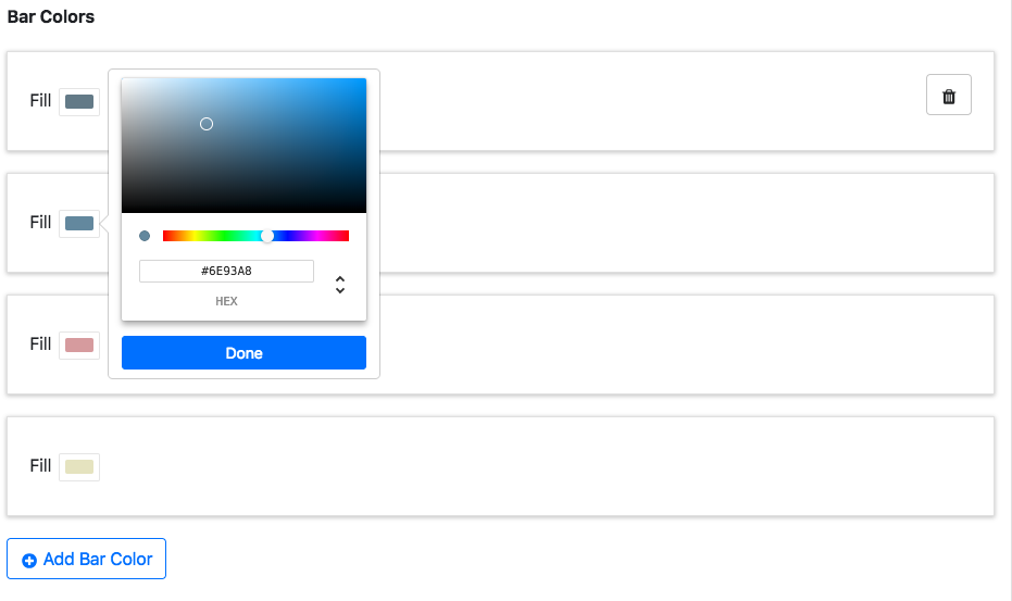
This is used to give each bar a fill color. Click Add Bar Color to add more colors. Hover over colors to reveal the trash can for deletion.
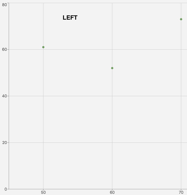
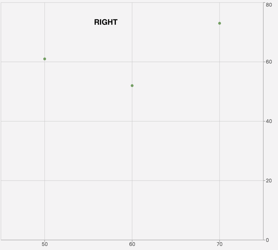
Y-axes
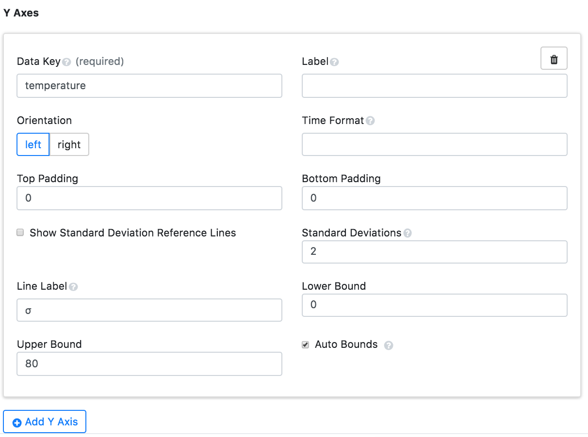
The multiple y-axes appear once each bar has matching y-axis data.
|
Key |
Description |
Example |
|---|---|---|
|
Data Key |
Data object property whose values correspond to the y-axis ranges |
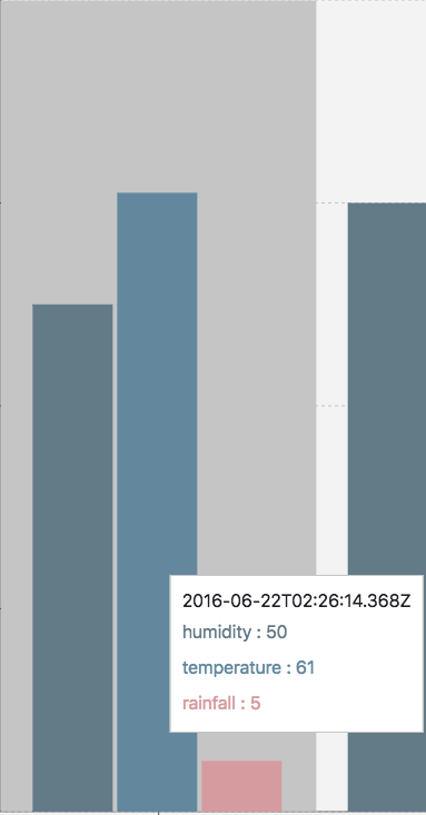
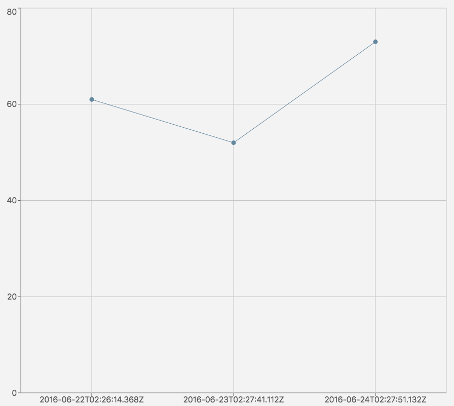
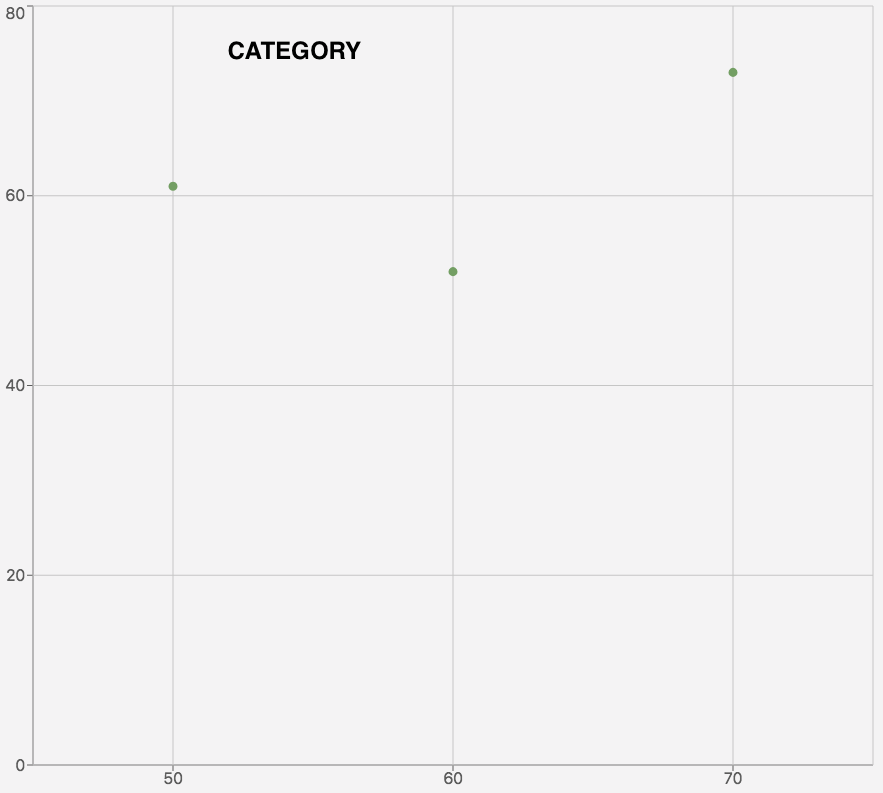
return [{“temperature”:61,“humidity”:50,“wind”:14,“rainfall”:5,“timestamp”:“2016-06-22T02:26:14.368Z”}]; |
|
Label |
Y-axis name |
|
|
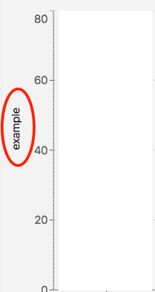
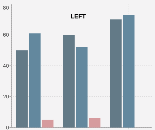
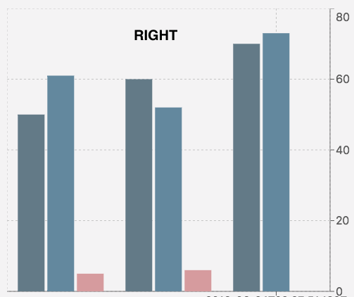
Orientation |
Changes the side the y-axis is on |
|
|
Time Format |
Edits the time and date format |

|
|
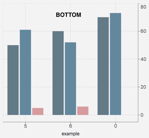
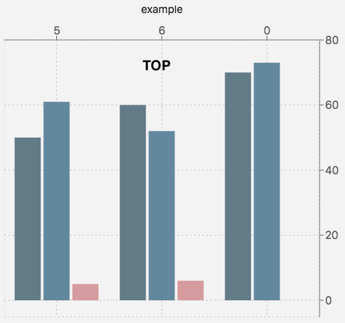
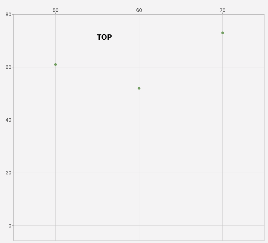
Top Padding |
Creates extra spacing for the graph on the top |
|
|
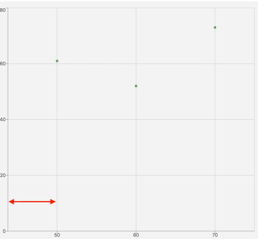
Bottom Padding |
Creates extra spacing for the graph on the bottom |
|
|
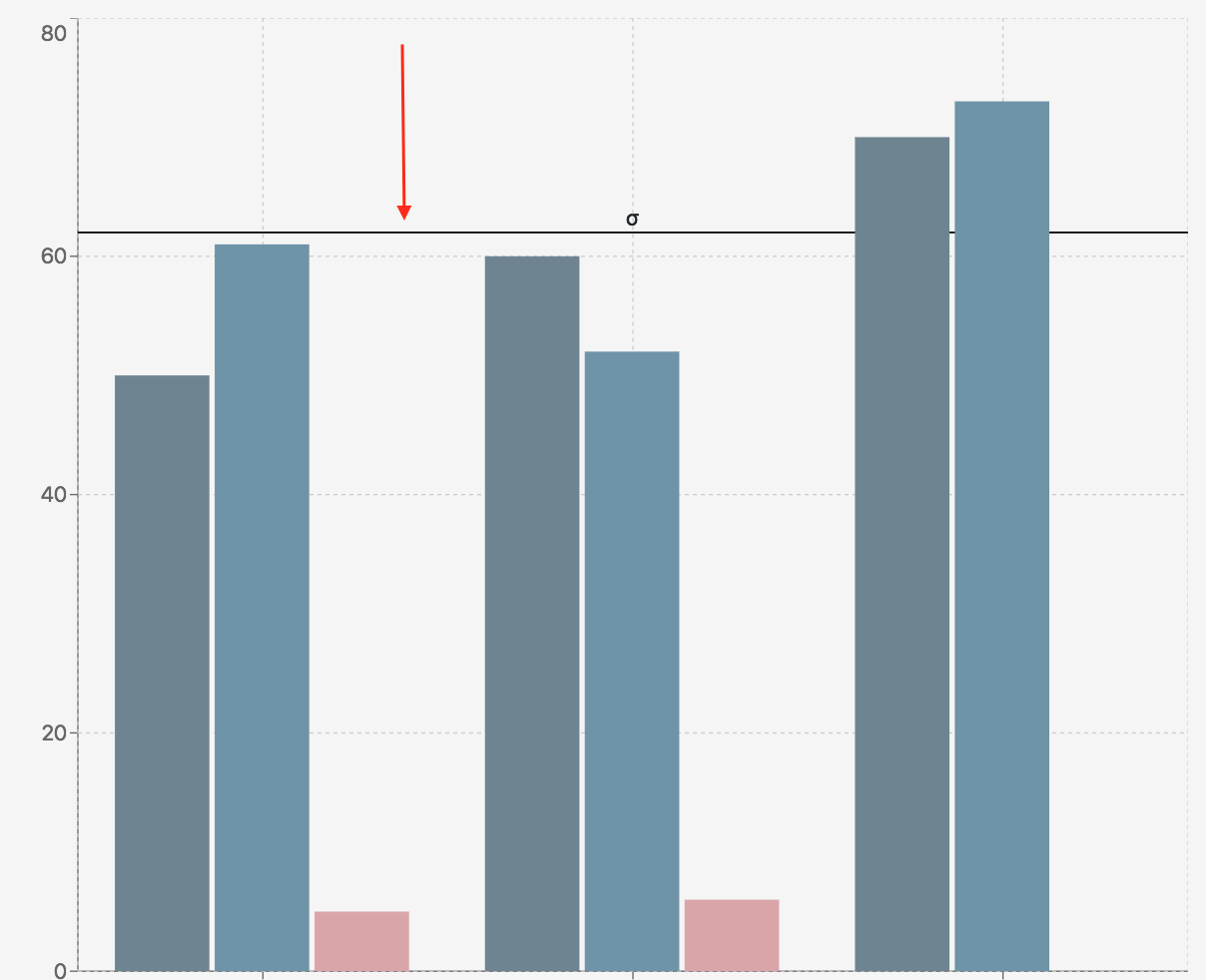
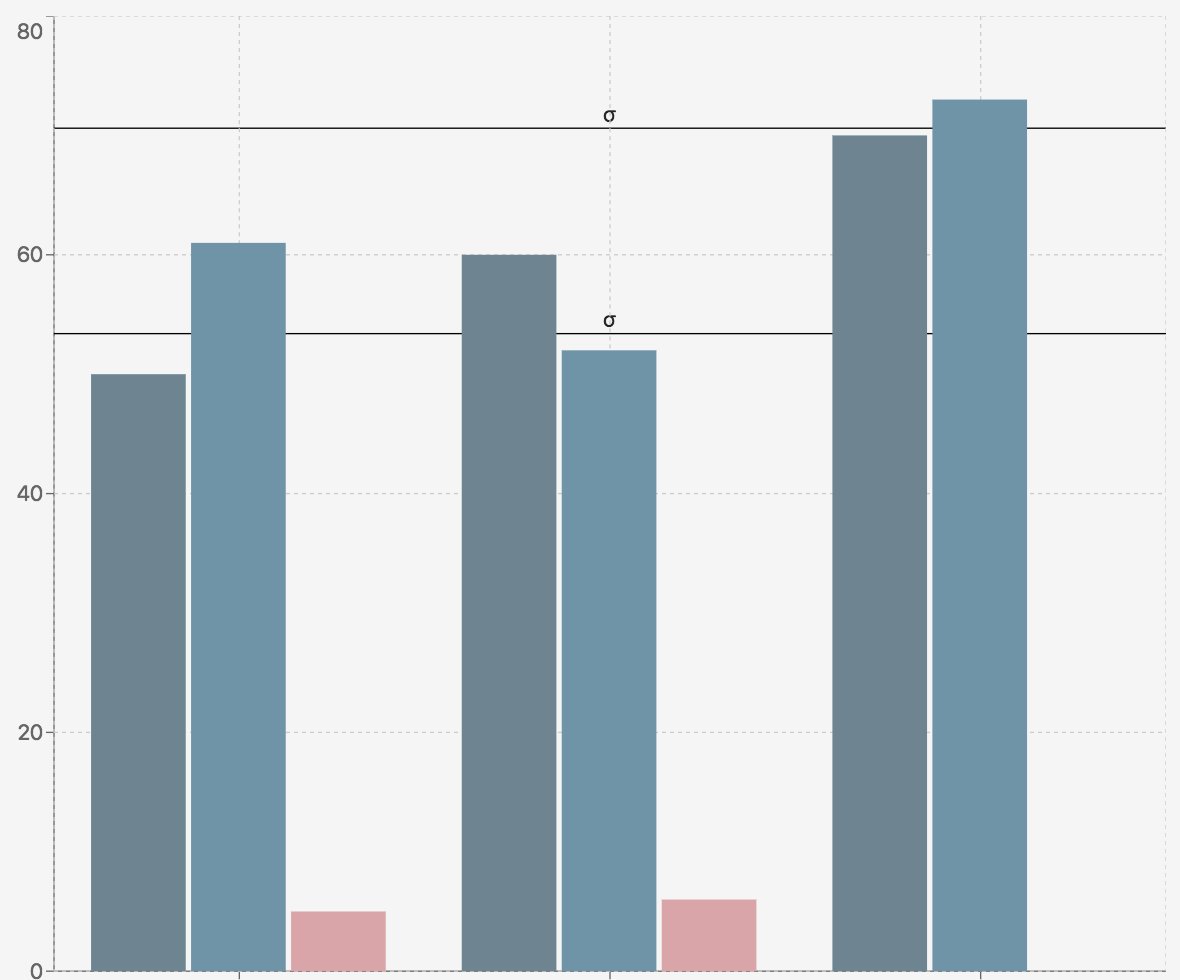
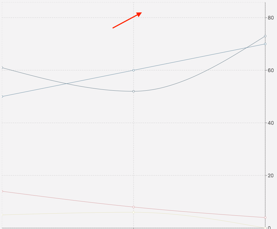
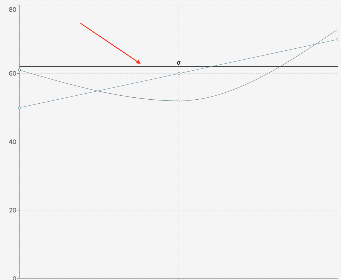
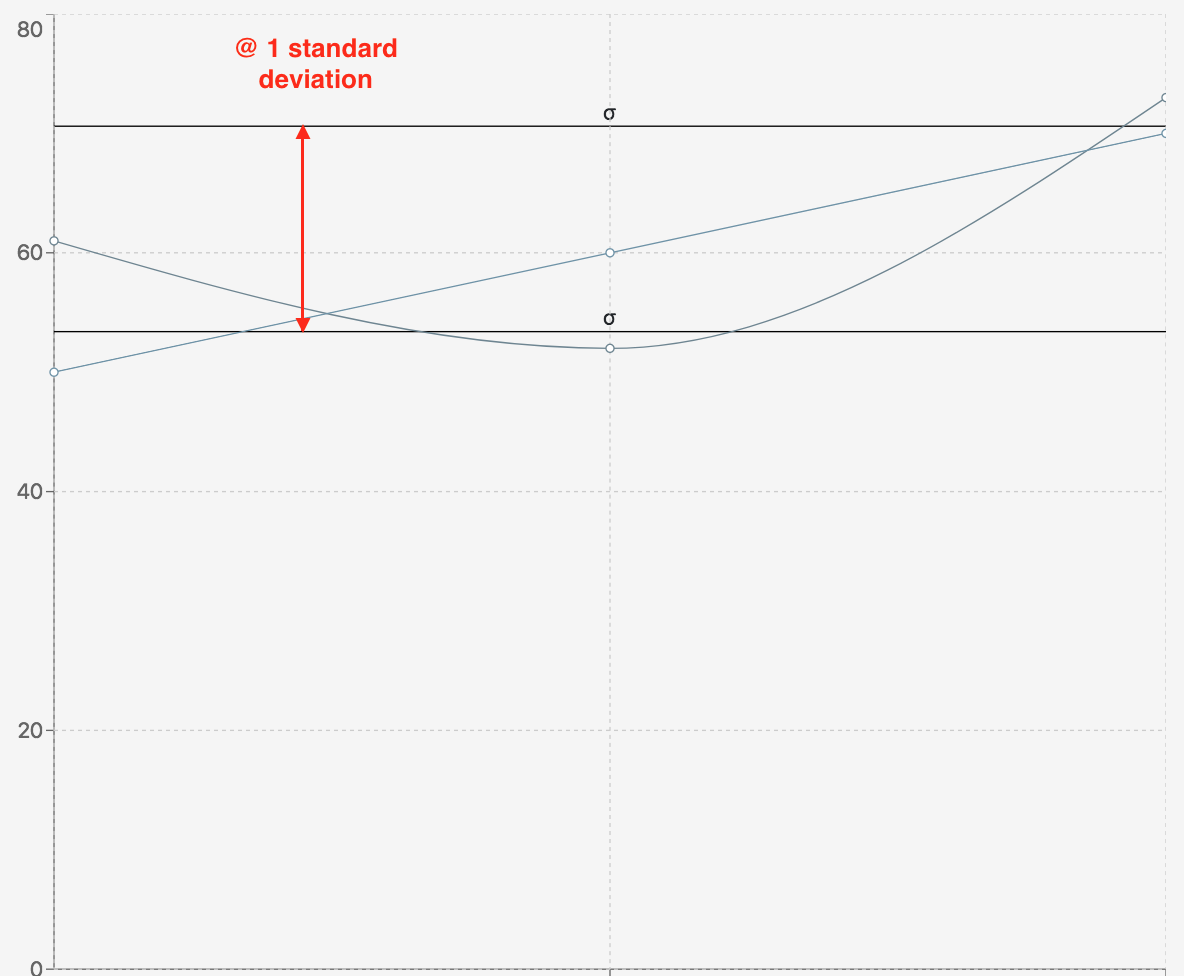
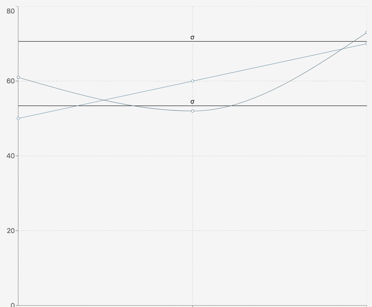
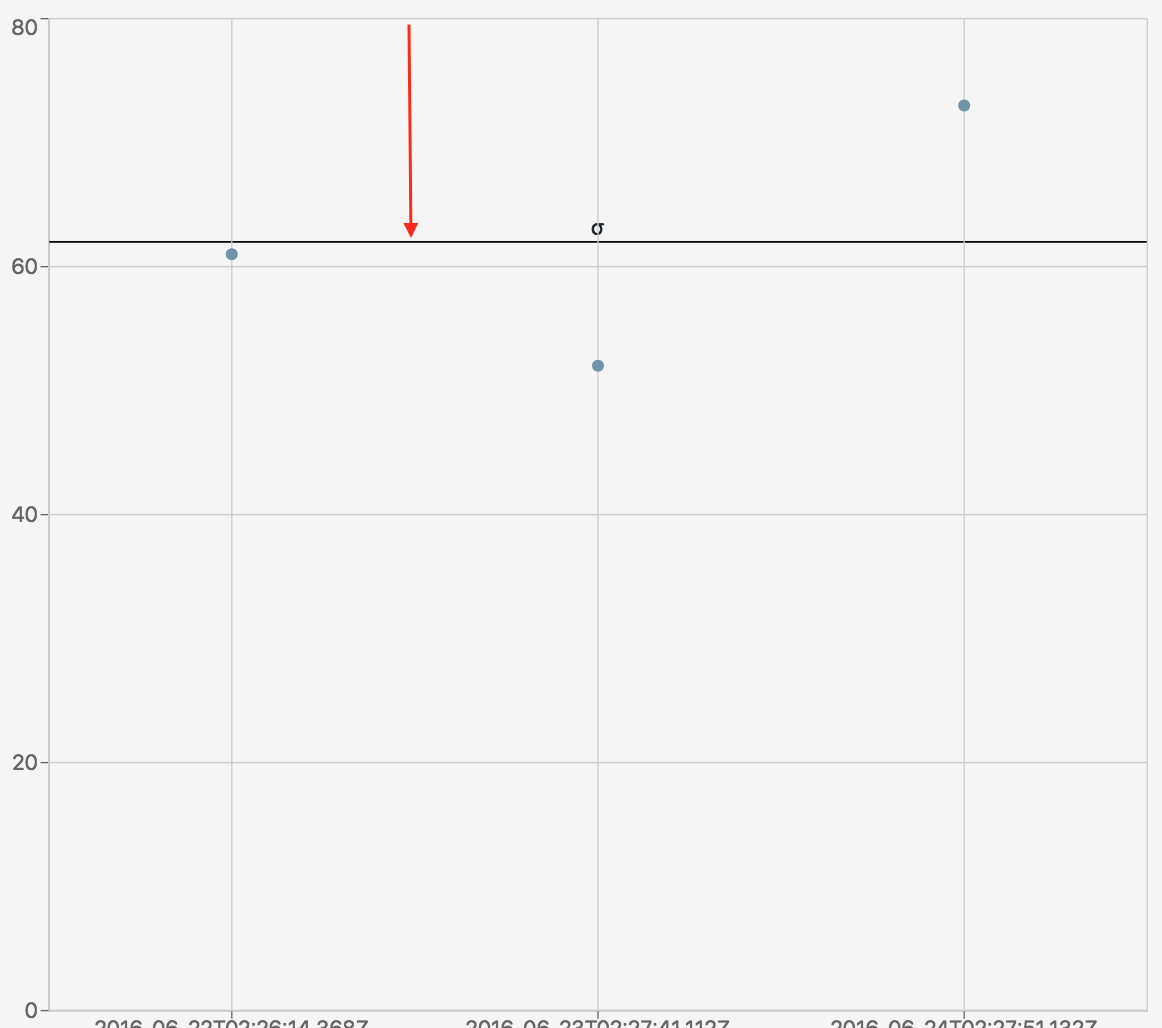
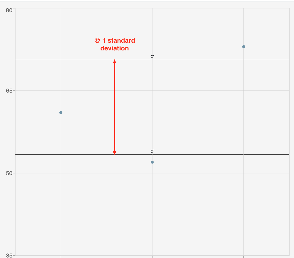
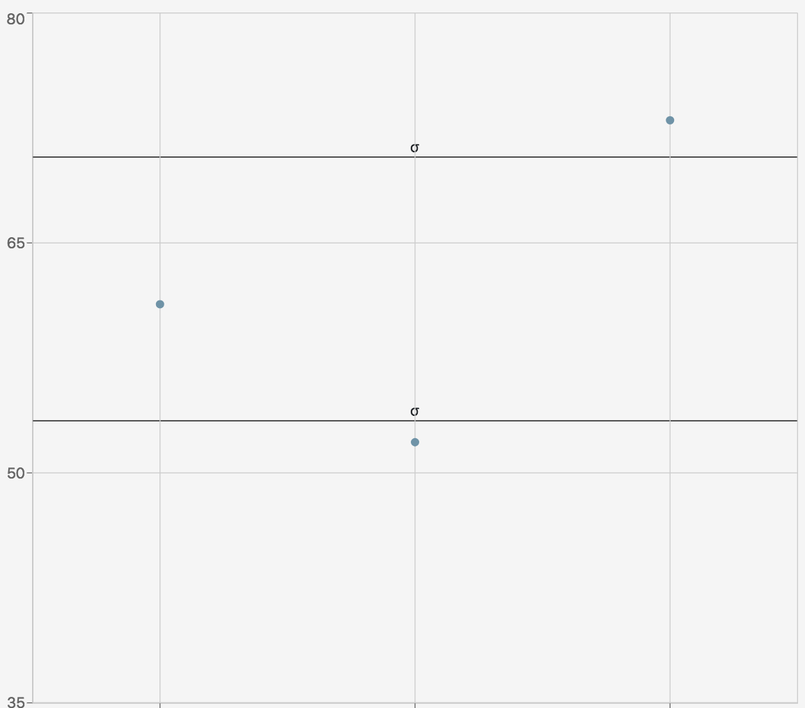
Show Standard Deviation Reference Lines |
Shows standard deviation bounds |
|
|
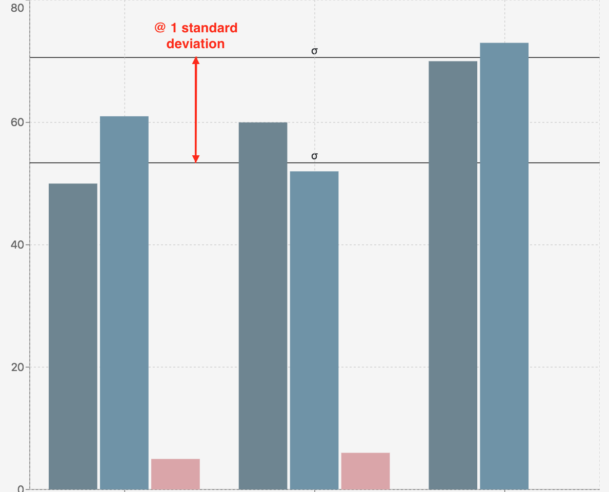
Standard Deviations |
Number of standard deviations from the mean to render the reference line |
|
|
Line Label |
Standard deviation line name |

|
|
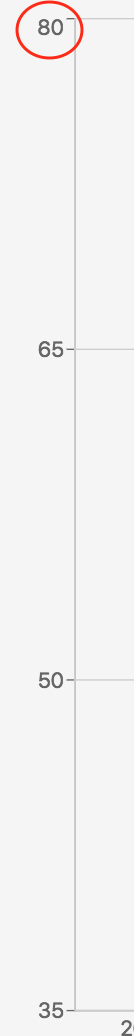
Lower Bound |
The lowest number on the y-axis range |
|
|
Upper Bound |
The highest number on the y-axis range |
|
|
Auto Bounds |
If marked, the bounds will automatically adjust based on the data |
|
Click Add Y-Axis to add more axes. Hover over the Y-axis data entry window to reveal the trash can for deletion.
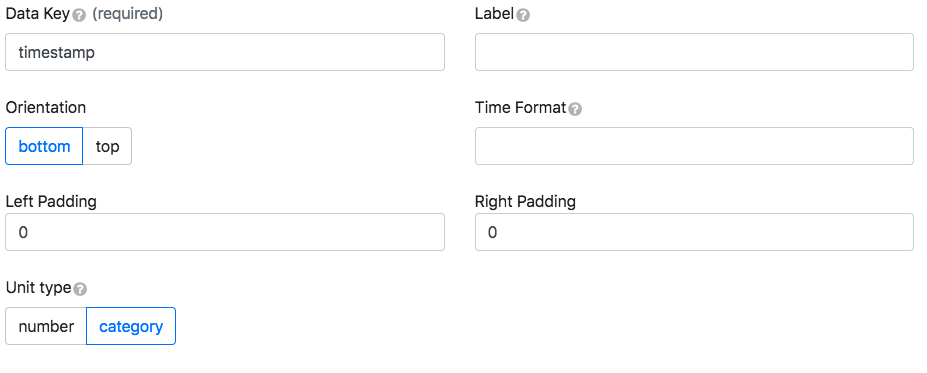
X-axis
|
Key |
Description |
Example |
|---|---|---|
|
Data Key |
Property from the data object whose values correspond to the x-axis ranges |
{“dataKey”:“rainfall”} |
|
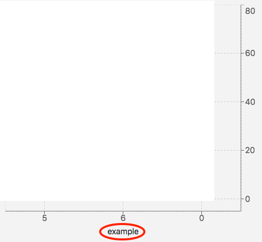
Label |
X-axis name |
|
|
Orientation |
Changes the side the x-axis is on |
|
|
Time Format |
Edits the time and date format |
|
|
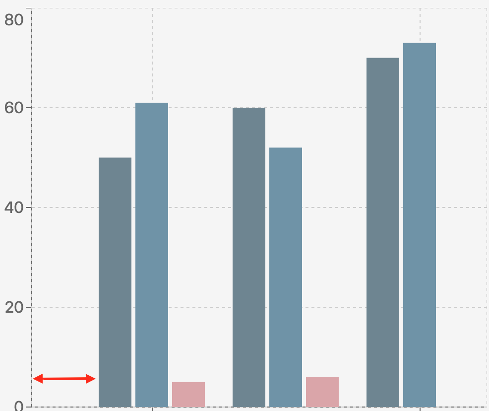
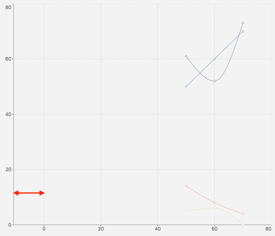
Left Padding |
Creates extra spacing for the graph on the left |
|
|
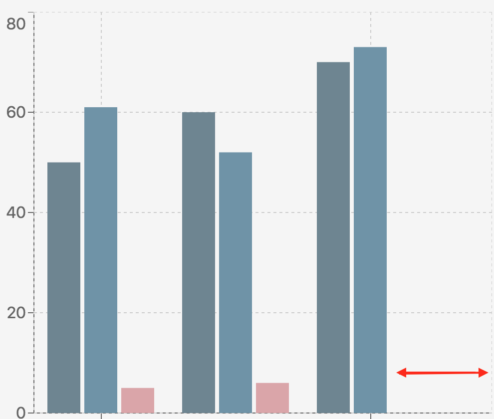
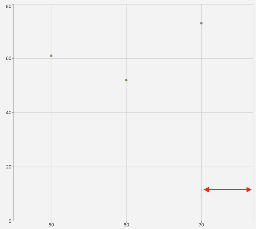
Right Padding |
Creates extra spacing for the graph on the right |
|
|
Unit Type |
The unit type used to scale data on the x-axis. The graph will not appear with a number if it is a string |
|
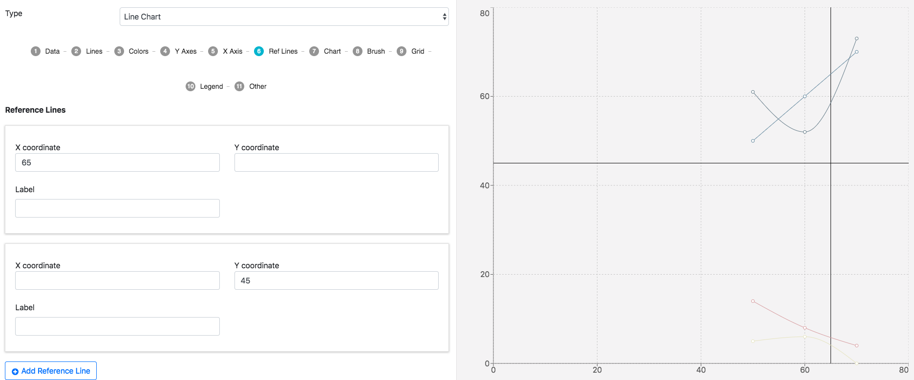
Reference lines
X and y-axis lines can be added to define values and compare against the dataset (only one coordinate per reference line window).
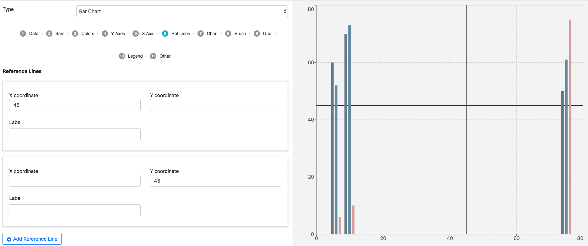
Click Add Reference Line to add more reference lines. Hover over the reference lines data entry window to reveal the trash can for deletion.
Chart
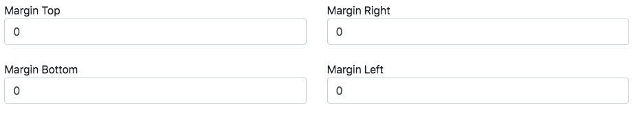
Change the graph’s margin measurements.
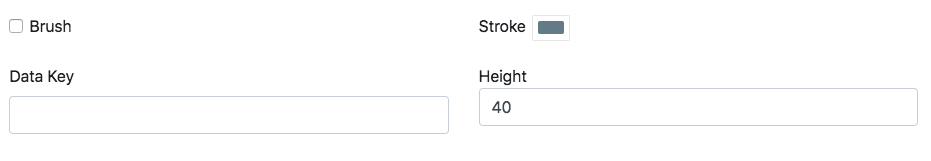
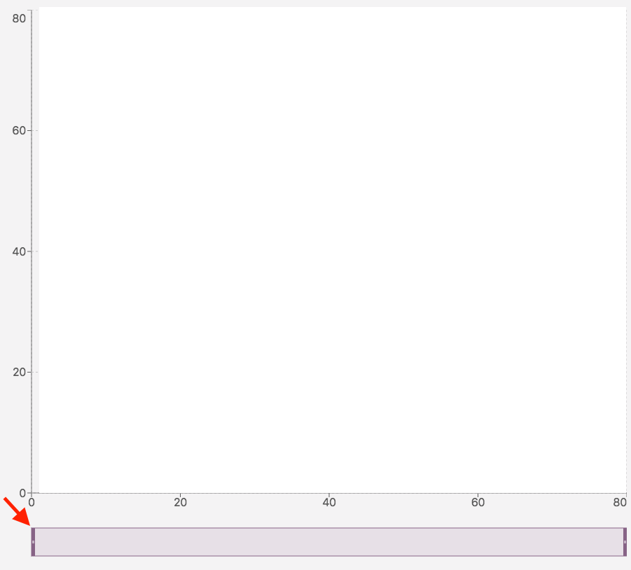
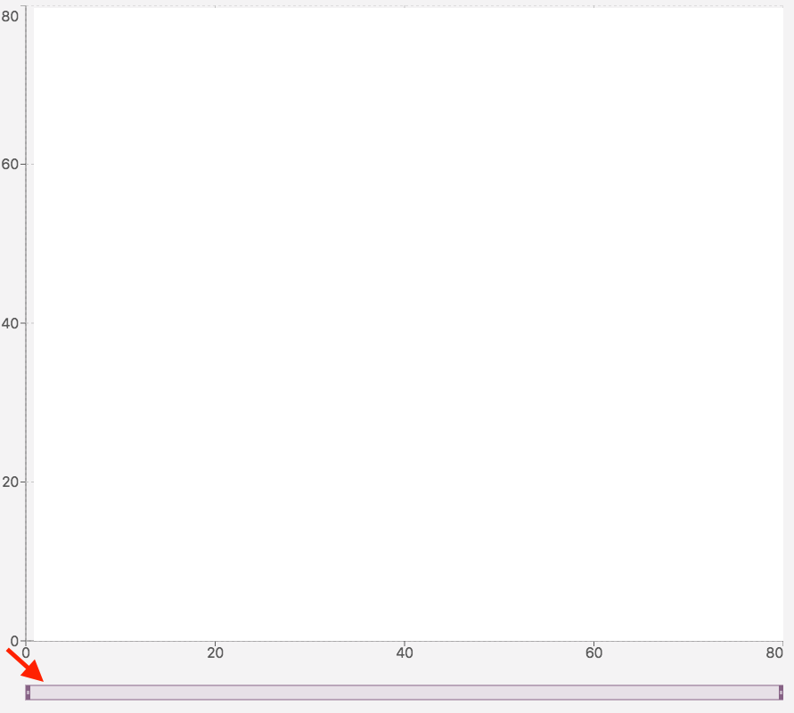
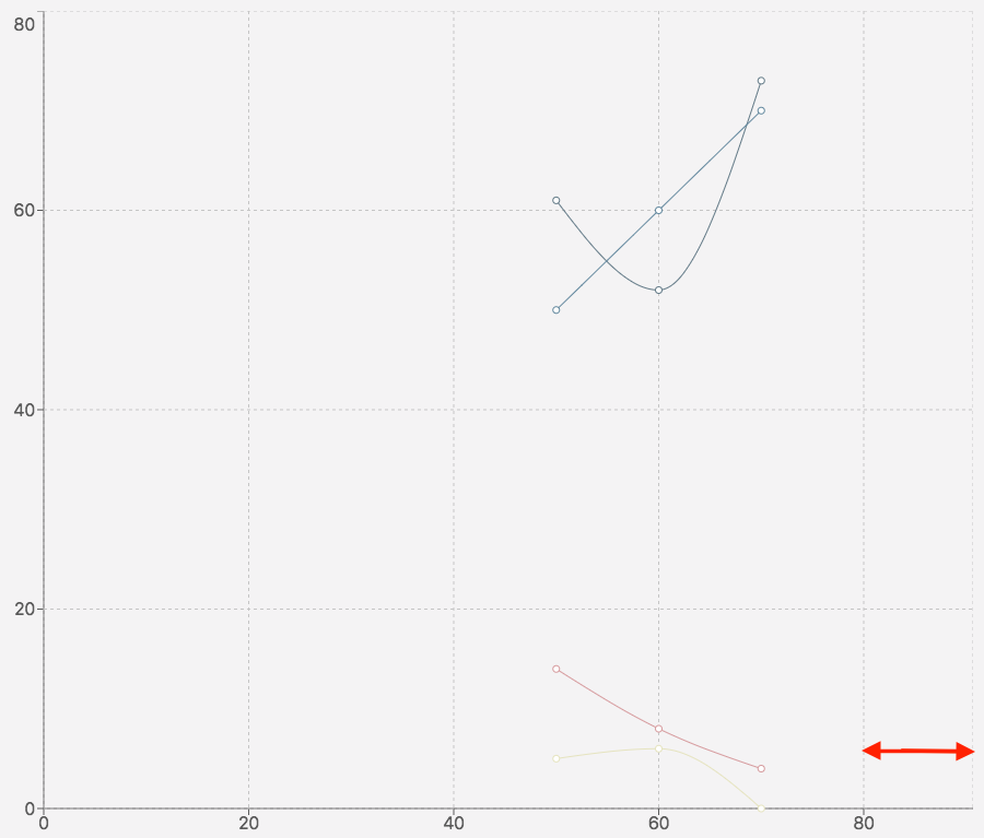
Brush
|
Key |
Description |
Example |
|---|---|---|
|
Brush |
Mark the box to appear below the graph. This is used to zoom in on a graph section |
|
|
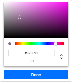
Stroke |
Change the brush color |
|
|
Data Key |
Data object property whose values correspond to the brush |
{“dataKey”:“rainfall”} |
|
Height |
Changes the brush’s height |
|
Change the brush’s size and section by dragging the sides.
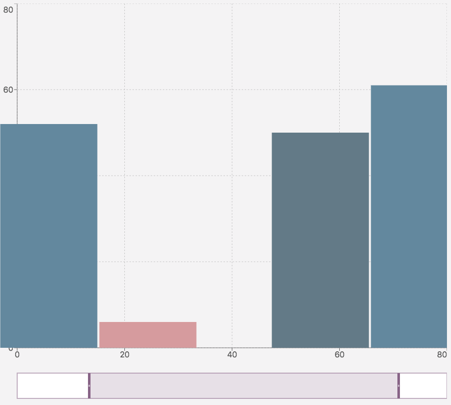
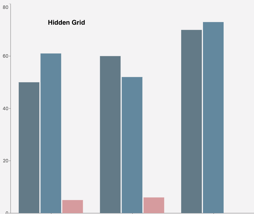
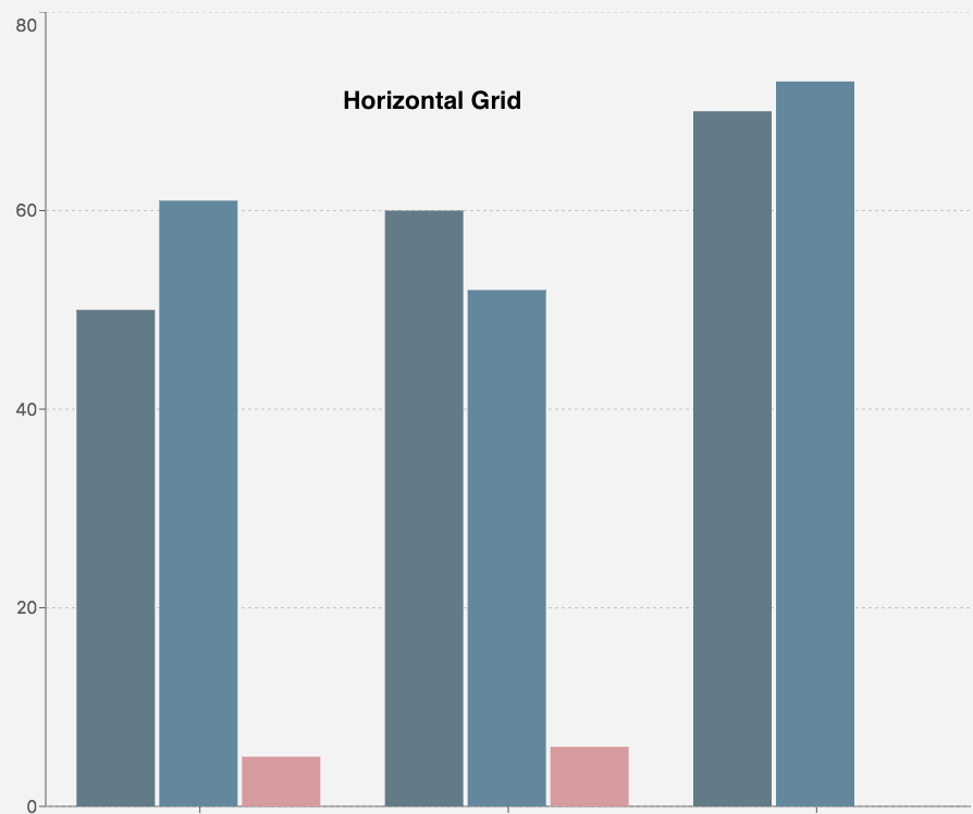
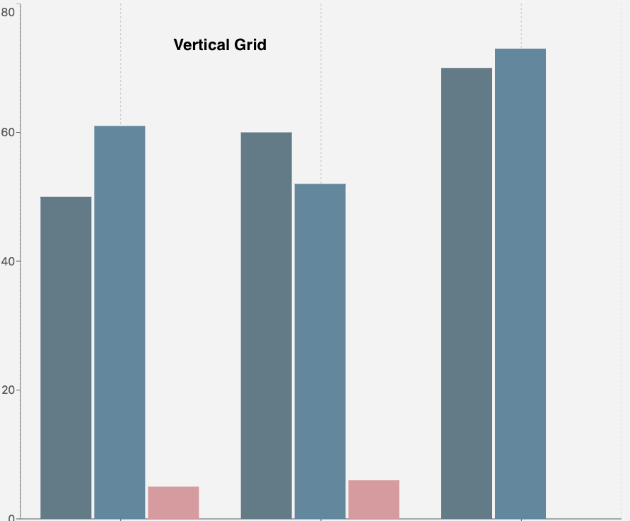
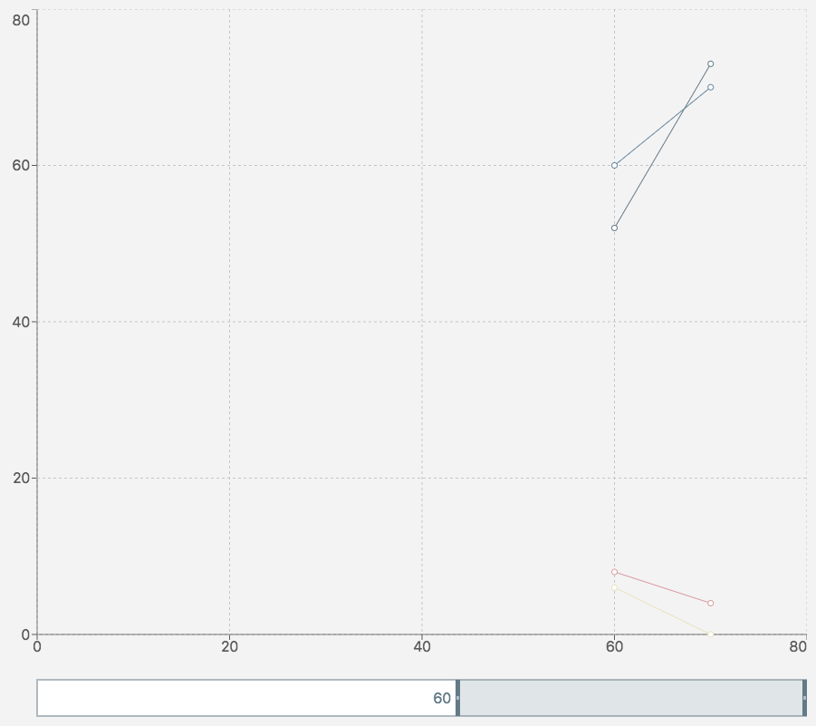
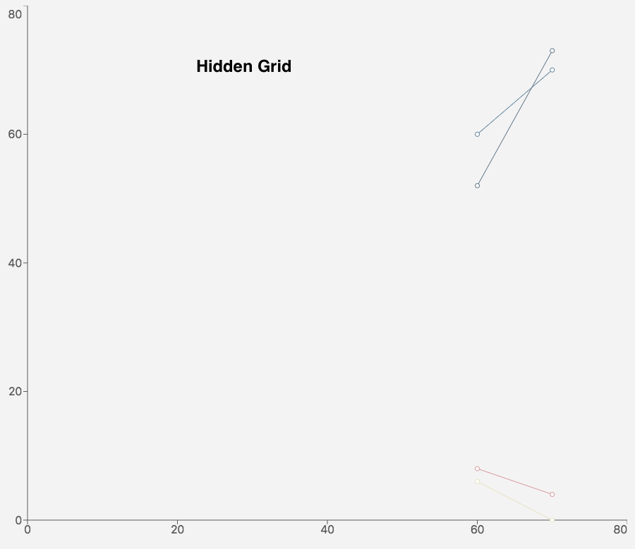
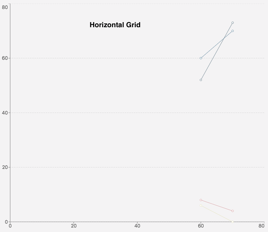
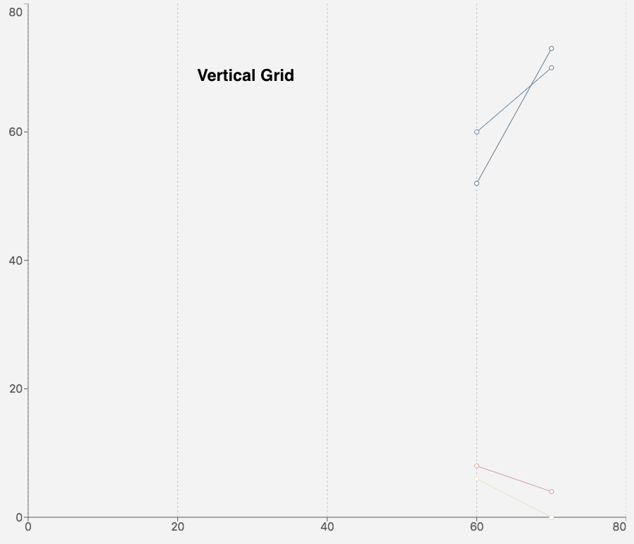
Grid
Edit the chart’s grid lines.
|
|
|
|
|---|---|---|
|
|
|
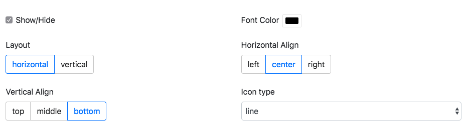
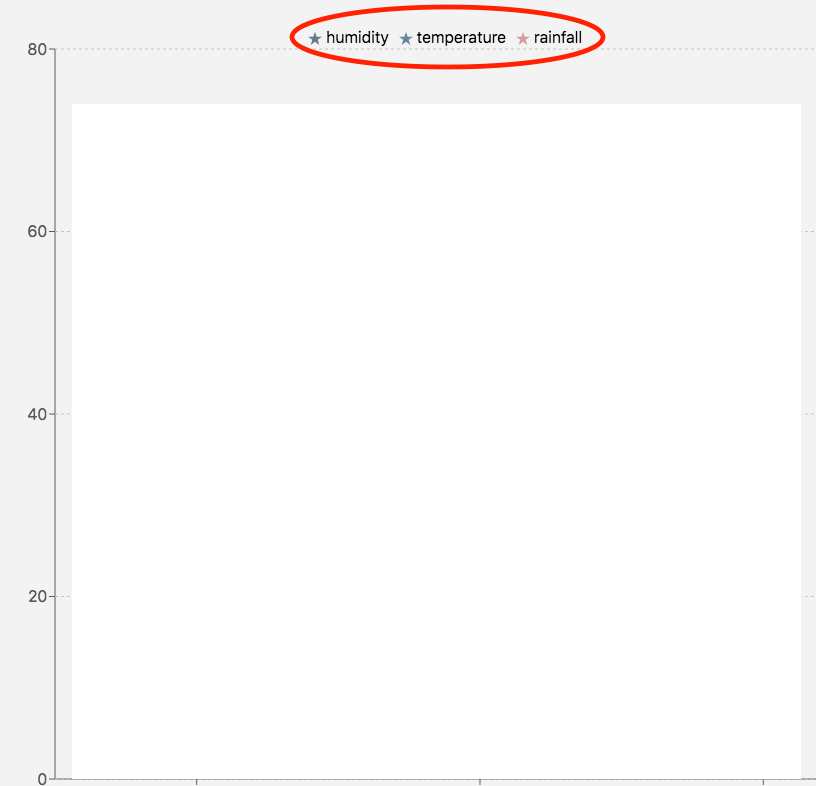
Legend
|
Key |
Description |
Example |
|---|---|---|
|
Show/Hide |
Show and hide the legend |
|
|
Font Color |
Changes the legend’s text font color |
|
|
Layout |
Changes the placement of the legend’s labels |
|
|
Horizontal Align |
Changes the legend’s horizontal placement |
|
|
Vertical Align |
Changes the legend’s vertical placement |
|
|
Icon Type |
Changes the legend labels' icon |
|
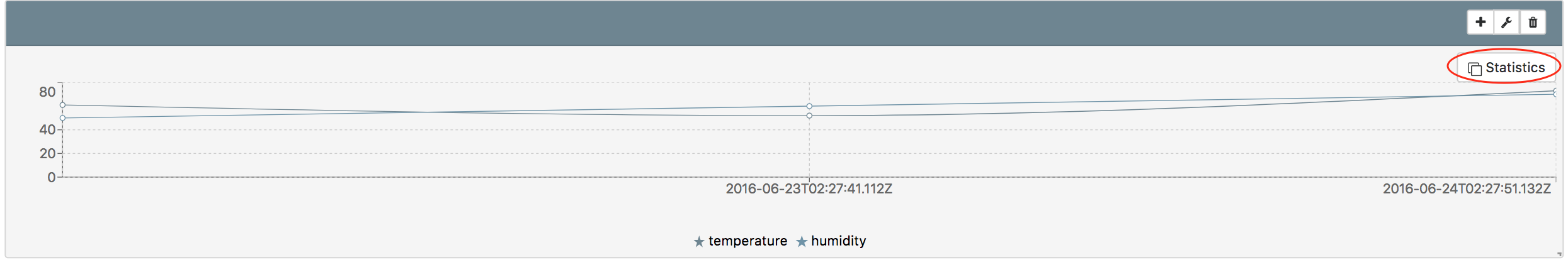
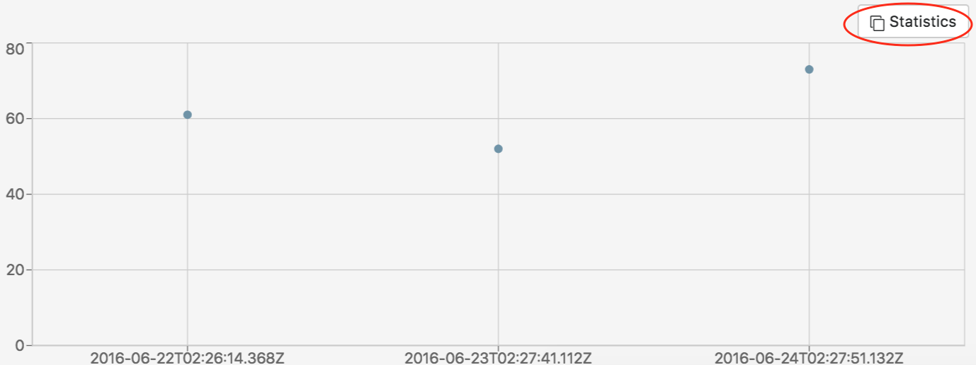
Statistics
|
Key |
Description |
Example |
|---|---|---|
|
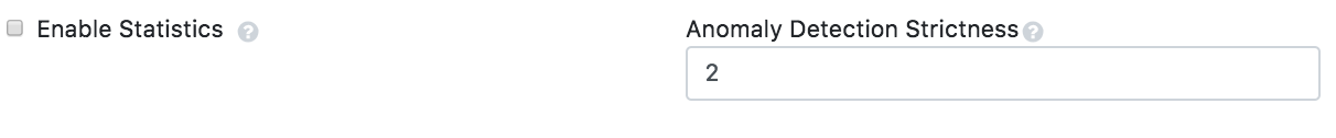
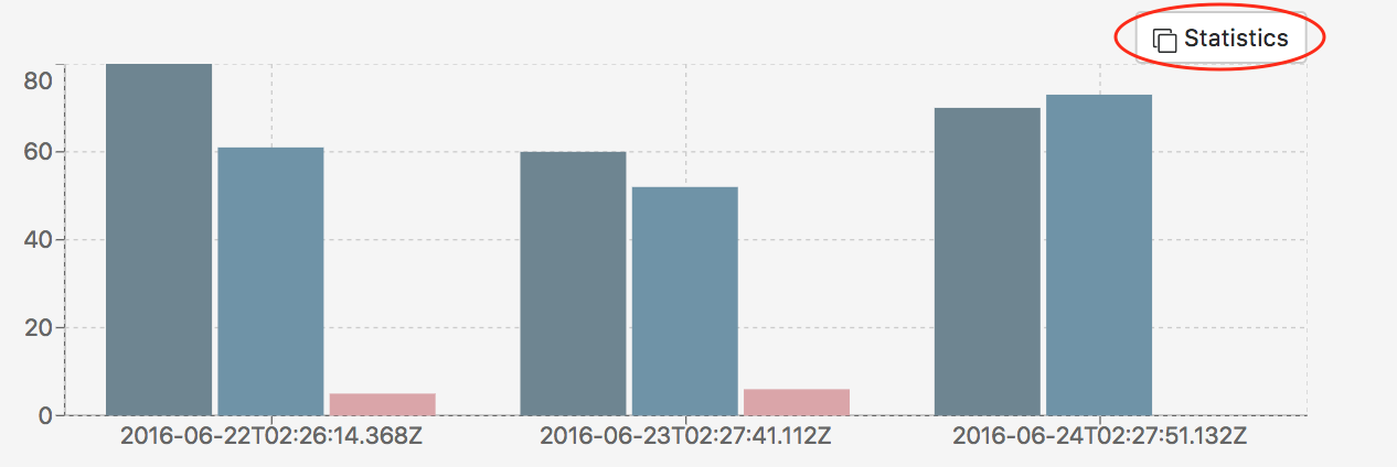
Enable Statistics |
Displays a button to open a window for graph statistics. The button is disabled while editing a widget |

|
|
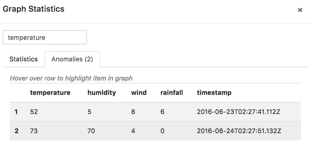
Anomaly Detection Strictness |
Number of standard deviations used to calculate and detect anomalies |
|
Other tools
|
Key |
Description |
Example |
|---|---|---|
|
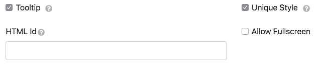
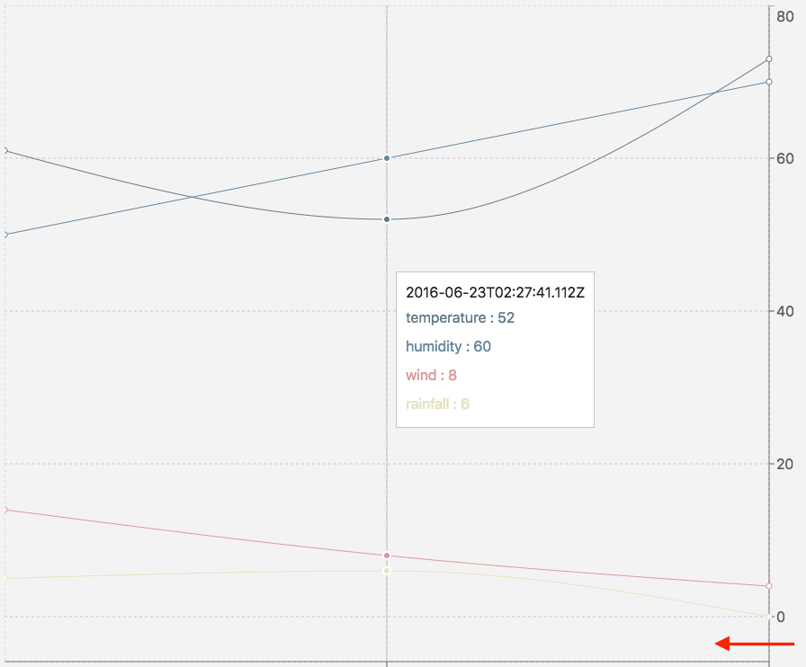
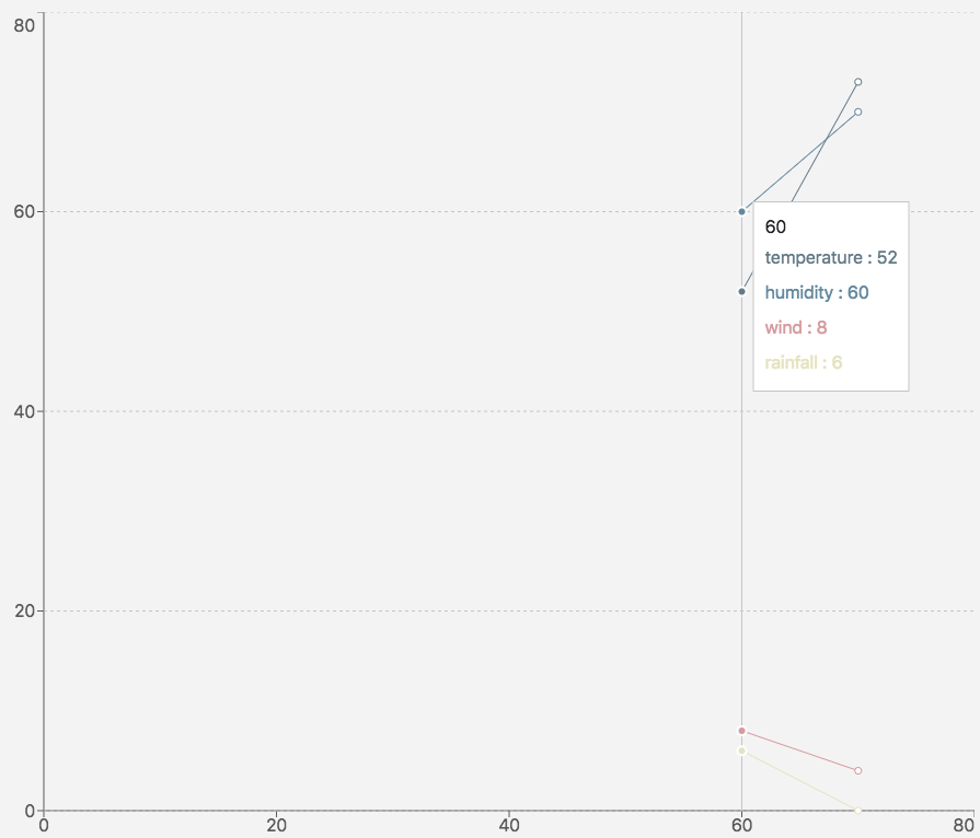
Tooltip |
Display data box on hover |
|
|
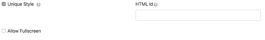
Unique Style |
Overrides the overall style settings to change a specific setting. It is automatically checked when you change a style |
|
|
HTML ID |
Used to target the DOM’s widget elements |
Add an ID to the page like this: |
|
Allow Fullscreen |
Makes the chart fullscreen |
|
Line chart
Creating a new line chart
1. Change the type to Line Chart.
2. Choose your data type and datasource. The datasources in the example below were created previously and not by default.
3. Click to automatically populate the graph with generated recommendations based on the data types.
The rest of the tabs are for editing the graph.
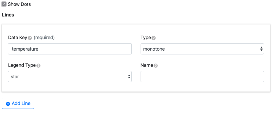
Lines
|
Key |
Description |
Example |
|---|---|---|
|
Data Key |
Data object property corresponding to a bar on the graph |
{“dataKey”:“humidity”} |
|
Type |
The interpolation line type |
|
|
Legend Type |
The icon associated with the data key |
stars |
|
Name |
The line label if it’s different from the data key |
hum (in the legend)=humidity |
Check the Show Dots box to add points to the graph. Click Add Line to add more lines. Hover over the line data entry window to reveal the trash can for deletion.
Colors
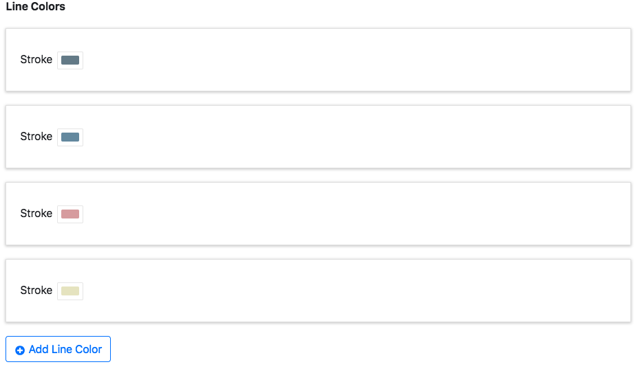
This is used to give each line a stroke color. Click Add Line Color to add more colors. Hover over colors to reveal the trash can for deletion.
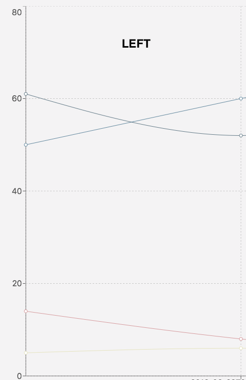
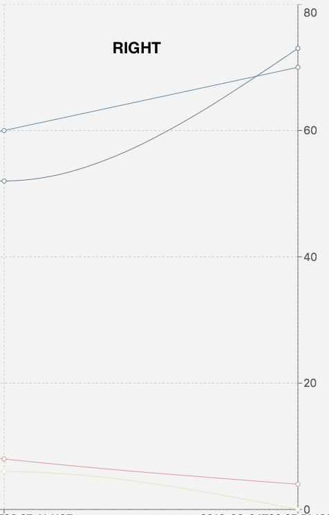
Y-axes
The multiple y-axes appear once each line has matching y-axis data.
|
Key |
Description |
Example |
|---|---|---|
|
Data Key |
Data object property whose values correspond to the y-axis ranges |
return [{“temperature”:61,“humidity”:50,“wind”:14,“rainfall”:5,“timestamp”:“2016-06-22T02:26:14.368Z”}]; |
|
Label |
Y-axis name |
|
|
Orientation |
Changes the side the y-axis is on |
|
|
Time Format |
Edits the time and date format |
|
|
Top Padding |
Creates extra spacing for the graph on the top |
|
|
Bottom Padding |
Creates extra spacing for the graph on the bottom |
|
|
Show Standard Deviation Reference Lines |
Shows standard deviation bounds |
|
|
Standard Deviations |
Number of standard deviations from the mean to render the reference line |
|
|
Line Label |
Standard deviation line name |
|
|
Lower Bound |
The lowest number on the y-axis range |
|
|
Upper Bound |
The highest number on the y-axis range |
|
|
Auto Bounds |
If marked, the bounds will automatically adjust based on the data |
|
X-axis
|
Key |
Description |
Example |
|---|---|---|
|
Data Key |
Data object property whose values correspond to the x-axis ranges |
{“dataKey”:“rainfall”} |
|
Label |
X-axis name |
|
|
Orientation |
Changes the side the x-axis is on |
|
|
Time Format |
Edits the time and date format |
|
|
Left Padding |
Creates extra spacing for the graph on the left |
|
|
Right Padding |
Creates extra spacing for the graph on the right |
|
|
Unit Type |
The unit type used to scale data on the x-axis. The graph will not appear with a number if it is a string |
|
Reference lines
X and y-axis lines can be added to define values and compare against the dataset (only one coordinate per reference line window).
Click Add Reference Line to add more reference lines. Hover over the reference lines data entry window to reveal the trash can for deletion.
Chart
Change the graph’s margin measurements.
Brush
|
Key |
Description |
Example |
|---|---|---|
|
Brush |
Mark the box to appear below the graph. This is used to zoom in on a graph section |
|
|
Stroke |
Change the brush color |
|
|
Data Key |
Data object property whose values correspond to the brush |
{“dataKey”:“rainfall”} |
|
Height |
Changes the brush’s height |
|
Change the brush size and section by dragging the sides.
Grid
Edit the chart’s grid lines.
|
|
|
|
|---|---|---|
|
|
|
Legend
|
Key |
Description |
Example |
|---|---|---|
|
Show/Hide |
Show and hide the legend |
|
|
Font Color |
Changes the legend’s text font color |
|
|
Layout |
Changes the placement of the legend’s labels |
|
|
Horizontal Align |
Changes the legend’s horizontal placement |
|
|
Vertical Align |
Changes the legend’s vertical placement |
|
|
Icon Type |
Changes the legend labels' icon |
|
Statistics
|
Key |
Description |
Example |
|---|---|---|
|
Enable Statistics |
Displays a button to open a window for graph statistics. The button is disabled while editing a widget |
|
|
Anomaly Detection Strictness |
Number of standard deviations used to calculate and detect anomalies |
|
Other tools
|
Key |
Description |
Example |
|---|---|---|
|
Tooltip |
Display data box on hover |
|
|
Unique Style |
Overrides the overall style settings to change a specific setting. It is automatically checked when you change a style |
|
|
HTML ID |
Used to target the DOM’s widget elements |
Add an ID to the page like this: |
|
Allow Fullscreen |
Makes the chart fullscreen |
|
Pie chart
Creating a new pie chart
1. Change the type to Pie Chart.
2. Choose your data type and datasource. The datasources in the example below were created previously and not by default.
3. Click to automatically populate the graph with generated recommendations based on the data types.
The rest of the tabs are for editing the graph.
Chart
Change the graph’s margin measurements.
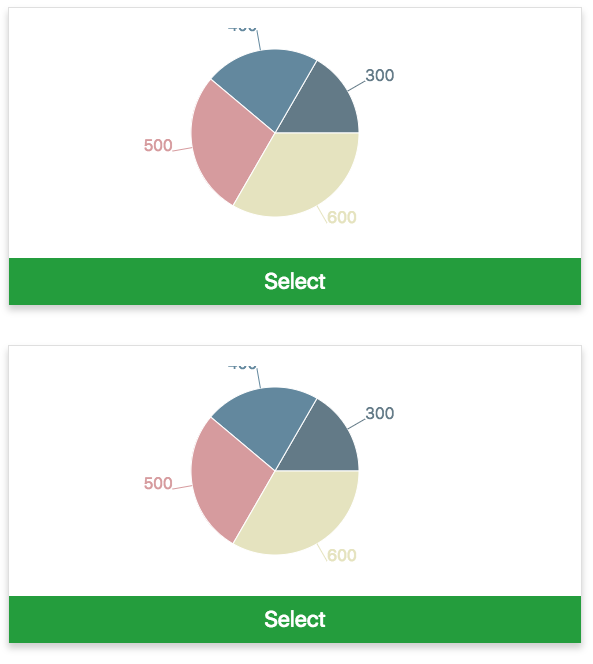
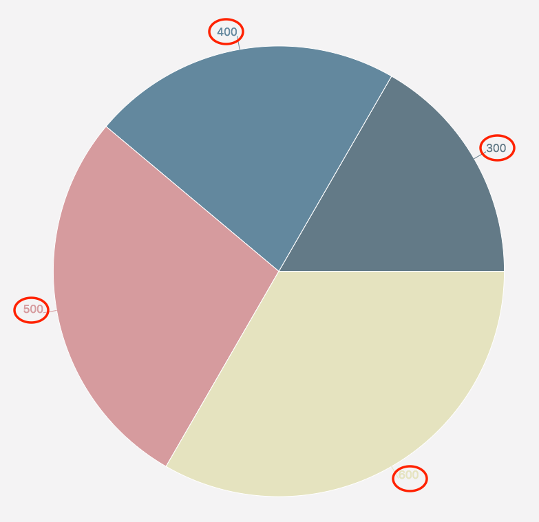
Sections
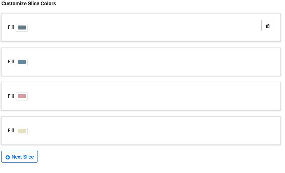
This is used to give each section a fill color. Click Next Slice to add more colors. Hover over colors to reveal the trash can for deletion.
Other tools
|
Key |
Description |
Example |
|---|---|---|
|
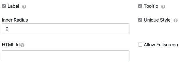
Label |
Displays labels for each section |
|
|
Tooltip |
Display data box on hover |
|
|
Inner Radius |
Creates a circle in the middle of the chart |
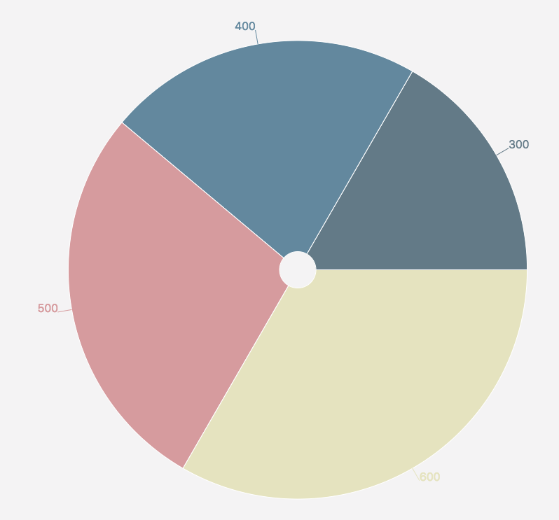
|
|
Unique Style |
Overrides the overall style settings to change a specific setting. It is automatically checked when you change a style |
|
|
HTML ID |
Used to target the DOM’s widget elements |
Add an ID to the page like this: |
|
Allow Fullscreen |
Makes the chart fullscreen |
|
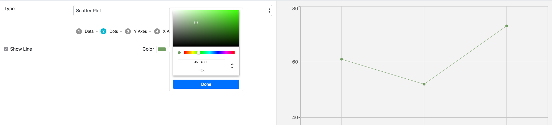
Scatter plot
Creating a new scatter plot
1. Change the type to Scatter Plot.
2. Choose your data type and datasource. The datasources in the example below were created previously and not by default.
Dots
|
Key |
Description |
Example |
|---|---|---|
|
Show Line |
Connects the points |
|
|
Color |
Colors the dots and line |
|
Y-axes
|
Key |
Description |
Example |
|---|---|---|
|
Data Key |
Data object property whose values correspond to the y-axis ranges |
return [{“temperature”:61,“humidity”:50,“wind”:14,“rainfall”:5,“timestamp”:“2016-06-22T02:26:14.368Z”}]; |
|
Label |
Y-axis name |
|
|
Orientation |
Changes the side the y-axis is on |
|
|
Time Format |
Edits the time and date format |
|
|
Top Padding |
Creates extra spacing for the graph on the top |
|
|
Bottom Padding |
Creates extra spacing for the graph on the bottom |
|
|
Show Standard Deviation Reference Lines |
Shows standard deviation bounds |
|
|
Standard Deviations |
Number of standard deviations from the mean to render the reference line |
|
|
Line Label |
Standard deviation line name |
|
|
Lower Bound |
The lowest number on the y-axis range |
|
|
Upper Bound |
The highest number on the y-axis range |
|
|
Auto Bounds |
If marked, the bounds will automatically adjust based on the data |
|
X-axis
|
Key |
Description |
Example |
|---|---|---|
|
Data Key |
Data object property whose values correspond to the x-axis ranges |
{“dataKey”:“rainfall”} |
|
Label |
X-axis name |
|
|
Orientation |
Changes the side the x-axis is on |
|
|
Time Format |
Edits the time and date format |
|
|
Left Padding |
Creates extra spacing for the graph on the left |
|
|
Right Padding |
Creates extra spacing for the graph on the right |
|
|
Unit Type |
The unit type used to scale data on the x-axis. The graph will not appear with a number if it is a string |
|
Statistics
|
Key |
Description |
Example |
|---|---|---|
|
Enable Statistics |
Displays a button to open a window for graph statistics. The button is disabled while editing a widget |
|
|
Anomaly Detection Strictness |
Number of standard deviations used to calculate and detect anomalies |
|
Other tools
|
Key |
Description |
Example |
|---|---|---|
|
HTML ID |
Used to target the DOM’s widget elements |
Add an ID to the page like this: |
|
Allow Fullscreen |
Makes the chart fullscreen |
|
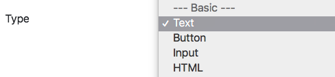
Text
Creating new text
1. Change the type to Text.
2. Choose your data type and datasource (if using Dynamic).
The datasources in the example below were created previously and not by default.
The rest of the tabs are for editing the text.
Style
|
Key |
Description |
Example |
|---|---|---|
|
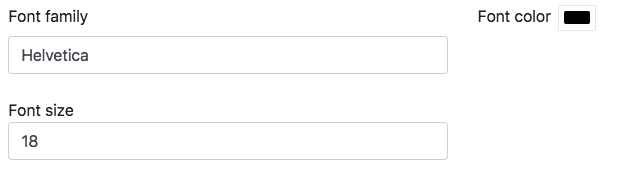
Font Family |
Type the font, and the text will change to it. The default is Helvetica |
Cursive: 
|
|
Font Color |
Changes the text color |
|
|
Font Size |
Changes the text size |
|
Other tools
|
Key |
Description |
Example |
|---|---|---|
|
Unique Style |
Overrides the overall style settings to change a specific setting. It is automatically checked when you change a style |
|
|
HTML ID |
Used to target the DOM’s widget elements |
Add an ID to the page like this: |
|
Allow Fullscreen |
Makes the widget fullscreen |
|
Button
Creating a new button
1. Change the type to Button.
2. Choose your datasource (this is the only datatype option). The datasources in the example below were created previously and not by default.
The rest of the tabs are for editing the button.
Style
|
Key |
Description |
Example |
|---|---|---|
|
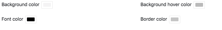
Background color |
Changes the button color |

|
|
Background hover color |
Changes the button color when the cursor is over it |

|
|
Font color |
Changes the text’s color inside of the button |

|
|
Border color |
Changes the button outline color |

|
Other tools
|
Key |
Description |
Example |
|---|---|---|
|
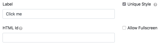
Label |
Modifies the button name |

|
|
Unique Style |
Overrides the overall style settings to change a specific setting. It is automatically checked when you change a style |
|
|
HTML ID |
Used to target the DOM’s widget elements |
Add an ID to the page like this: |
|
Allow Fullscreen |
Makes the widget fullscreen |
|
Input
Creating a new input
1. Change the type to Input.
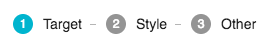
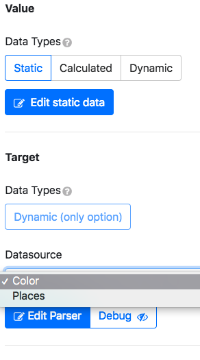
2. Choose your datatype and datasource (if using dynamic) if you are doing a value.
3. Dynamic is the only datatype option if you are doing a target. The datasources in the example below were created previously and not by default.
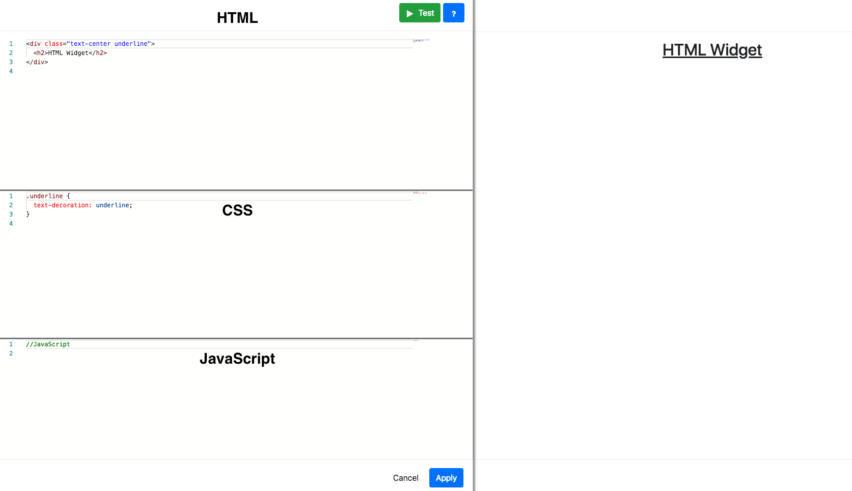
HTML
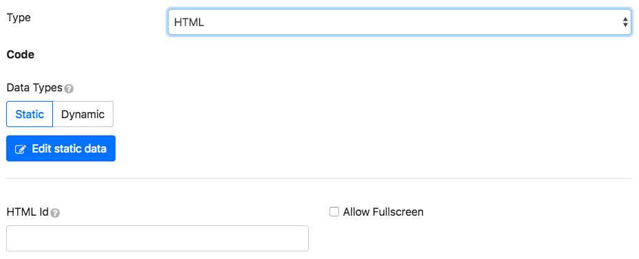
This allows you to create in the widget.
Use Static to create your code or Dynamic to upload your code.
The datasource is available within the JS section.
Edit static data:
|
Key |
Description |
Example |
|---|---|---|
|
HTML ID |
Used to target the DOM’s widget elements |
Add an ID to the page like this: |
|
Allow Fullscreen |
Makes the widget fullscreen |
|
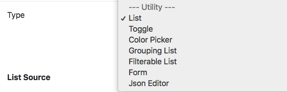
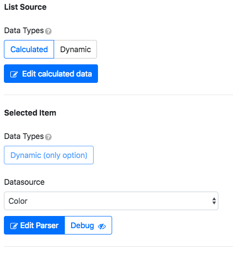
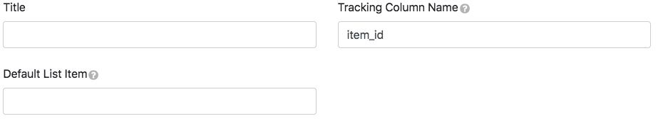
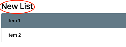
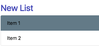
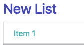
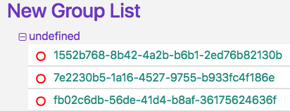
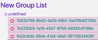
List
Creating a new list
Change the type to List.
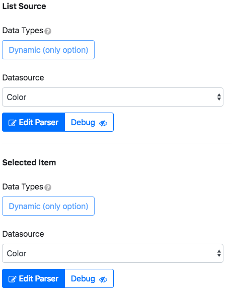
List Source: Renders incoming data.
Selected Item (dynamic only): The portal datasources to be affected by the action.
Choose your datatypes and datasources. The datasources in the example below were created previously and not by default.
The rest of the tabs are for editing the list.
Format
|
Key |
Description |
Example |
|---|---|---|
|
Title |
Gives the list a name |
|
|
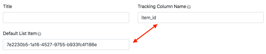
Tracking Column Name |
Gives the column name used to keep track of the active list item |
|
|
Default List Item |
Default items selected. The Tracking Column Name property determines the value |
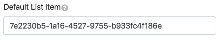
|
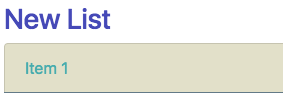
Style
|
Key |
Description |
Example |
|---|---|---|
|
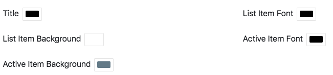
Title |
Changes the title’s color |
|
|
List Item Font |
Changes the item name’s color |
|
|
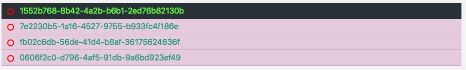
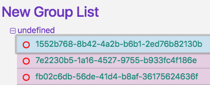
List Item Background |
Changes the item’s background color |
|
|
Active Item Font |
Changes the active item name’s color |
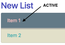
|
|
Active Item Background |
Changes the item’s active background color |
|
Other tools
|
Key |
Description |
Example |
|---|---|---|
|
Unique Style |
Overrides the overall style settings to change a specific setting. It is automatically checked when you change a style |
|
|
HTML ID |
Used to target the DOM’s widget elements |
Add an ID to the page like this: |
|
Allow Fullscreen |
Makes the widget fullscreen |
|
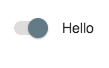
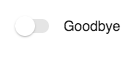
Toggle
Creating a new toggle
Change the type to Toggle.
Value: Renders incoming data.
Event Target (dynamic only): Portal datasources to be affected by an action.
Choose your datatypes and datasources. The datasources in the example below were created previously and not by default.
The rest of the tabs are for editing the toggle.
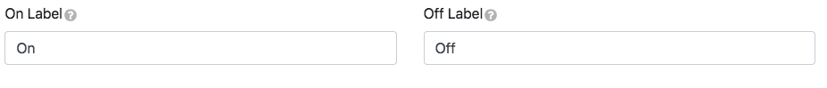
Labels
|
Key |
Description |
Example |
|---|---|---|
|
On Label |
True value label |
|
|
Off Label |
False value label |
|
Style
|
Key |
Description |
Example |
|---|---|---|
|
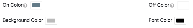
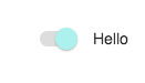
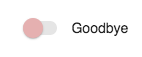
On Color |
Changes true value colors |
|
|
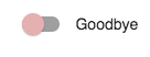
Off Color |
Changes false value colors |
|
|
Background Color |
Changes the toggle’s background color |
|
|
Font Color |
Changes the labels' color |
|
Other tools
|
Key |
Description |
Example |
|---|---|---|
|
Unique Style |
Overrides the overall style settings to change a specific setting. It is automatically checked when you change a style |
|
|
HTML ID |
Used to target the DOM’s widget elements |
Add an ID to the page like this: |
|
Allow Fullscreen |
Makes the widget fullscreen |
|
Color picker
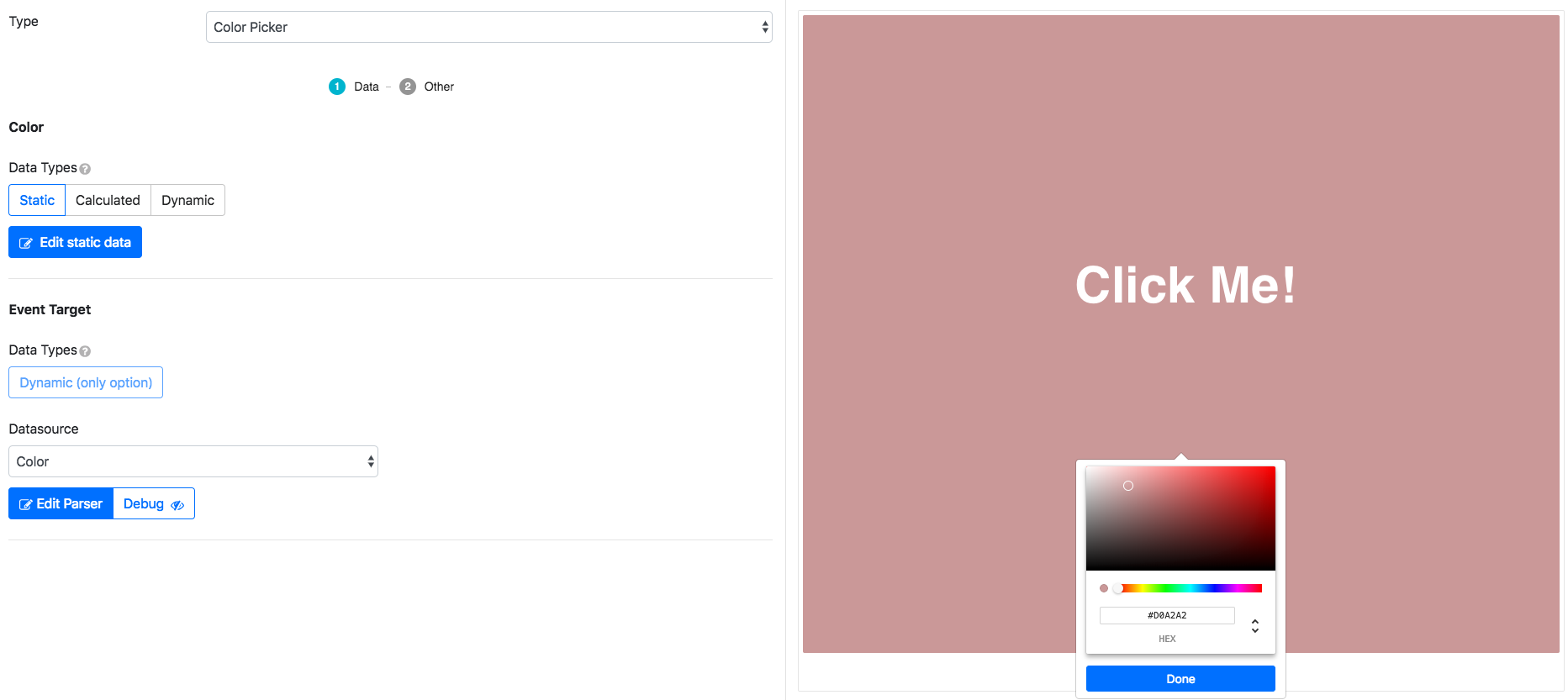
This allows you to create in the widget.
Use Static to create your code or Dynamic to upload your code.
Other tools
|
Key |
Description |
Example |
|---|---|---|
|
HTML ID |
Used to target the DOM’s widget elements |
Add an ID to the page like this: |
|
Allow Fullscreen |
Makes the widget fullscreen |
|
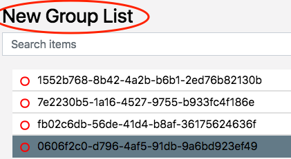
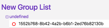
Grouping list
Creating a new grouping list
Change the type to Grouping List.
List Source (dynamic only): Renders incoming data.
Selected Item (dynamic only): Portal datasources to be affected by the action.
Choose your datasources. The datasources in the example below were created previously and not by default.
The rest of the tabs are for editing the list.
Format
|
Key |
Description |
Example |
|---|---|---|
|
Title |
Gives the list a name |
|
|
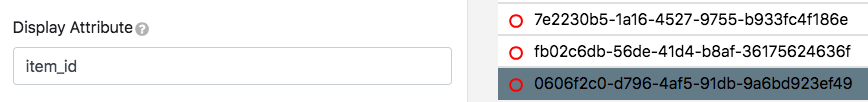
Display Attribute |
Property type displayed for list items |
|
|
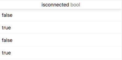
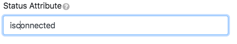
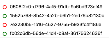
Status Attribute |
A property with a boolean value to create active/inactive icons |
|
|
Default List Item |
Default items selected. Value determined by the Tracking Column Name property |
|
|
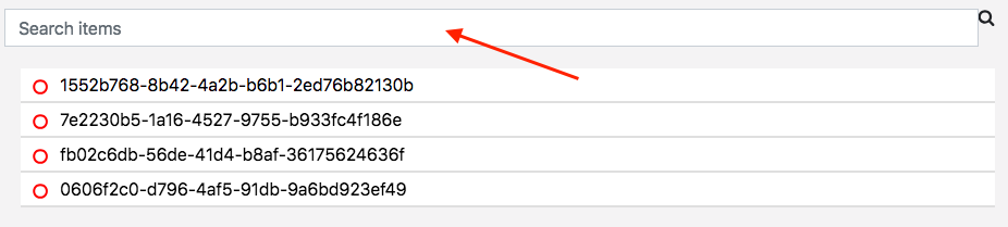
Allow Search |
Displays search bar to search a specific item |
|
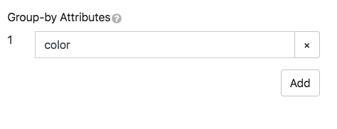
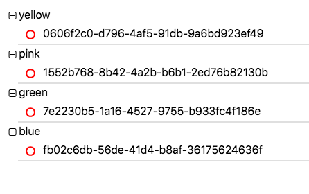
Groups
Items can be grouped by their properties.
Style
|
Key |
Description |
Example |
|---|---|---|
|
Title |
Changes the title’s color |
|
|
List Item Font |
Changes the item name’s color |
|
|
List Item Background |
Changes the item’s background color |
|
|
Active Item Font |
Changes the active item name’s color |
|
|
Active Item Background |
Changes the active item’s background color |
|
Other tools
|
Key |
Description |
Example |
|---|---|---|
|
Unique Style |
Overrides the overall style settings to change a specific setting. It is automatically checked when you change a style |
|
|
HTML ID |
Used to target a DOM’s widget elements |
Add an ID to the page like this: |
|
Allow Fullscreen |
Makes the widget fullscreen |
|
Filterable list
Creating a new filterable list
Change the type to Filterable List.
List Source (dynamic only): Renders incoming data.
Selected Item (dynamic only): Portal datasources to be affected by an action.
Choose your datatypes and datasources. The datasources in the example below were created previously and not by default.
The rest of the tabs are for editing the list.
Format
|
Key |
Description |
Example |
|---|---|---|
|
Title |
Gives the list a name |
|
|
Display Attribute |
Property type displayed for list items |
|
|
Status Attribute |
A property with a boolean value to create active/inactive icons |
|
|
Tracking Column Name |
Makes the used column name track the active list item |
|
|
Default List Item |
Default items selected. The Tracking column name property determines the value |
|
|
Allow Search |
Displays search bar to search a specific item |
|
|
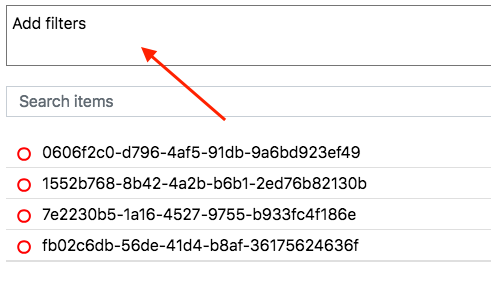
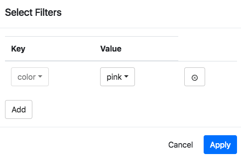
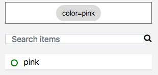
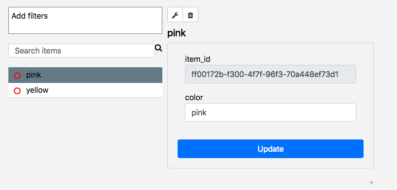
Allow Filters |
Displays and choose filters |
|
Style
|
Key |
Description |
Example |
|---|---|---|
|
Title |
Changes the title’s color |
|
|
List Item Font |
Changes the item name’s color |
|
|
List Item Background |
Changes the item’s background color |
|
|
Active Item Font |
Changes the active item name’s color |
|
|
Active Item Background |
Changes the active item’s background color |
|
Other tools
|
Key |
Description |
Example |
|---|---|---|
|
Unique Style |
Overrides the overall style settings to change a specific setting. It is automatically checked when you change a style |
|
|
HTML ID |
Used to target the DOM’s widget elements |
Add an ID to the page like this: |
|
Allow Fullscreen |
Makes the widget fullscreen |
|
JSON editor
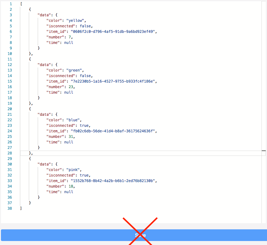
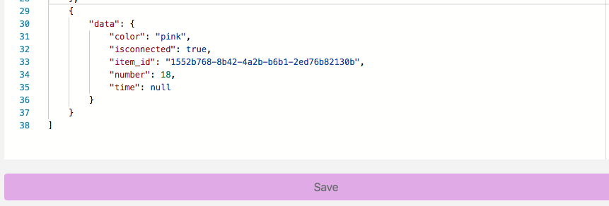
Data
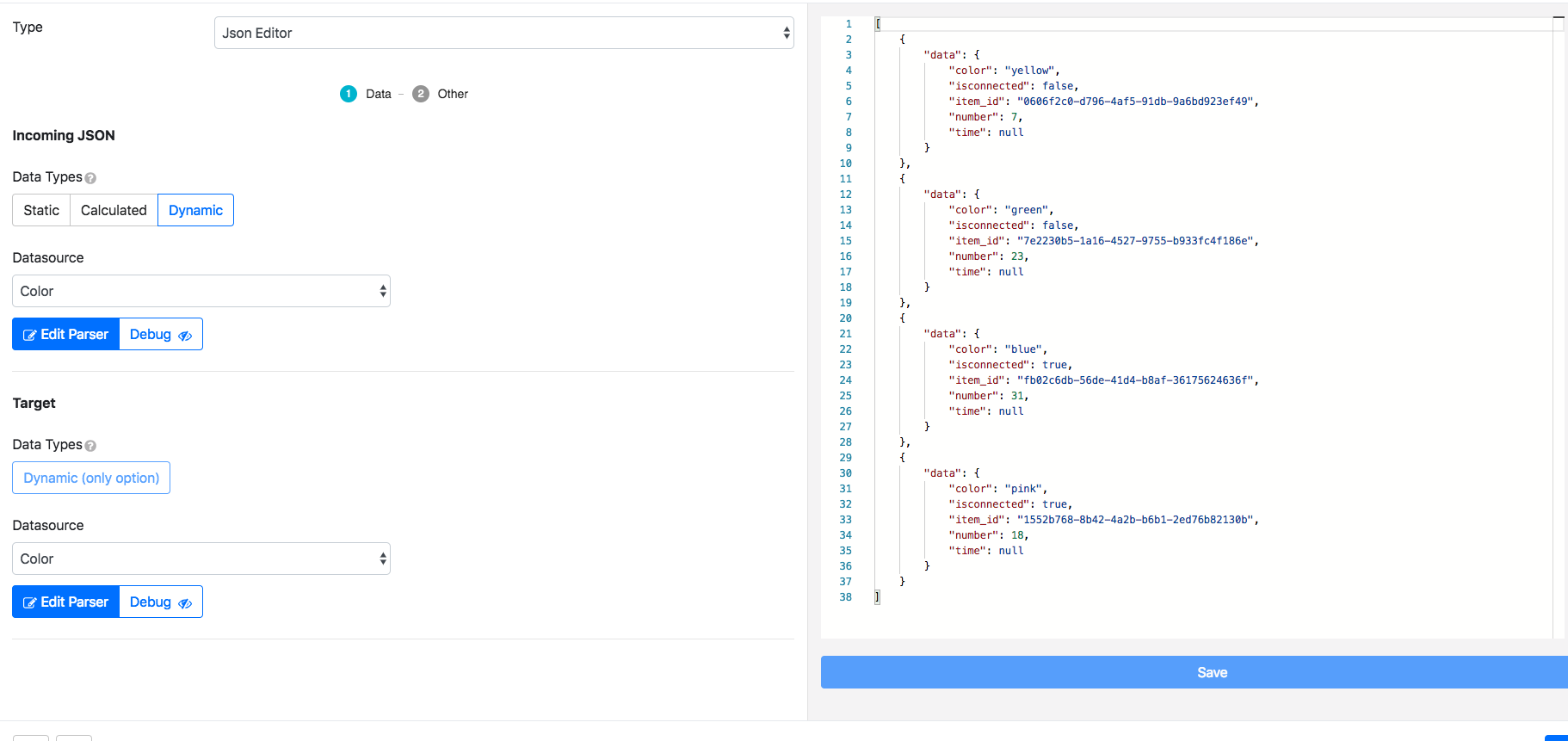
JSON assigns data to a label, whether from the collection or in parser editing. Data in the example has been previously created and is not by default.
Other
|
Type |
Description |
Example |
|---|---|---|
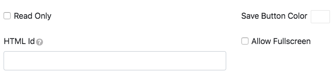
|
Read Only |
Does not allow you to save edits. The Save button disappears |
|
|
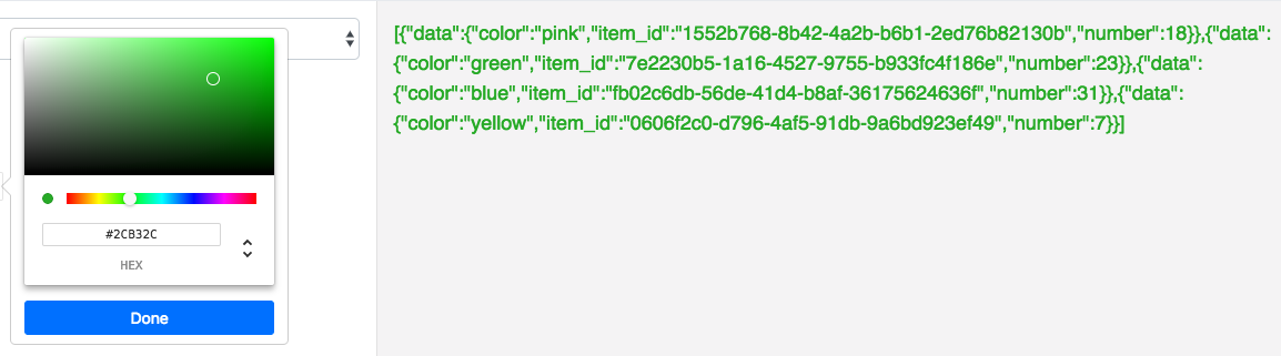
Save Button Color |
Changes the Save button color |
|
|
HTML ID |
Used to target the DOM’s widget elements |
Add an ID to the page like this: |
|
Allow Fullscreen |
Makes the widget fullscreen |
|
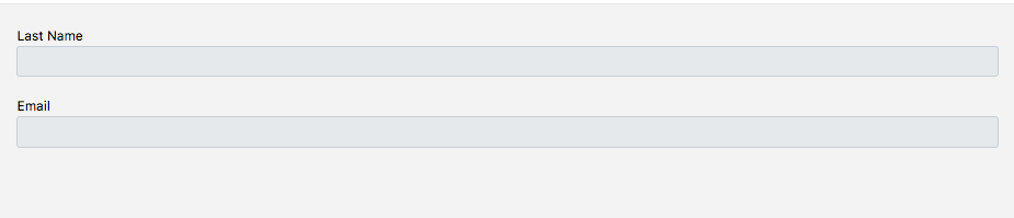
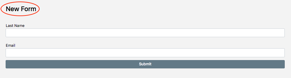
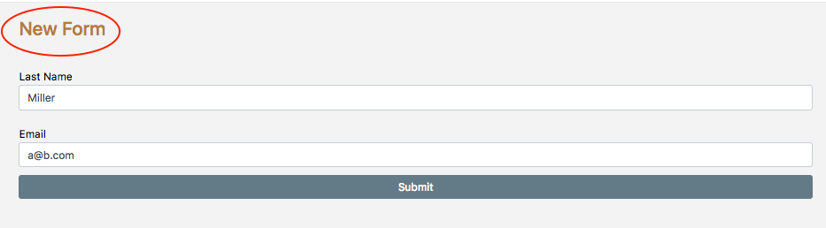
Form
Creating a new form
Change the type to Form.
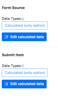
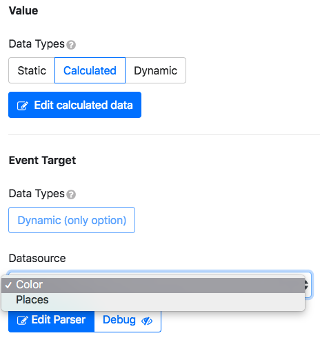
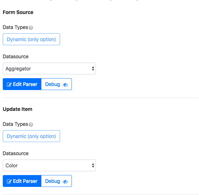
Form Source: Renders incoming form data.
Submit Item: Portal datasources to be affected by an action.
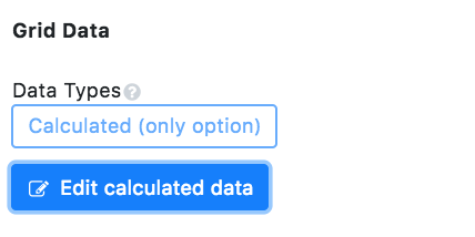
The only option available is Calculated. To edit what information type is returned, click Edit calculated data.
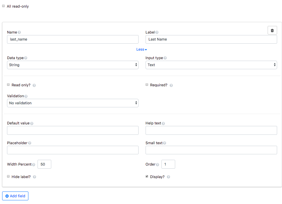
Fields
|
Key |
Description |
Example |
|---|---|---|
|
All read-only |
Makes all fields uneditable. It also removes the submit button |
|
|
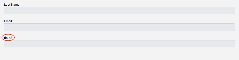
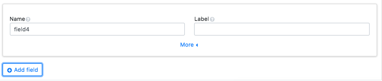
Name |
Internal name to use as a parser key |
|
|
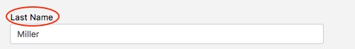
Label |
Item name that will appear on the form |
|
|
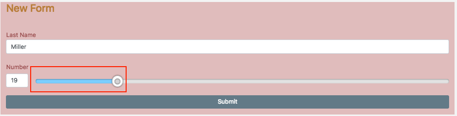
Data type |
Choose what data type can be inputted into the form |
String: 
|
|
Input type |
Choose what can be inputted based on the data type |
Password: 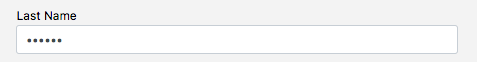
|
|
Read only |
Make field uneditable |
|
|
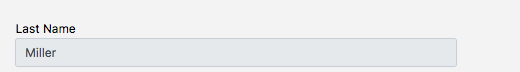
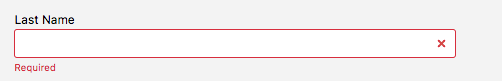
Required |
An error message appears when a required field is empty |
|
|
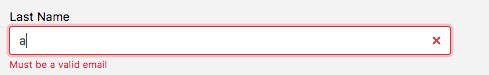
Validation |
An error message when validation is not in the correct format |
|
|
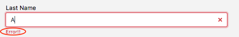
Error text |
Customize error message for validation |
|
|
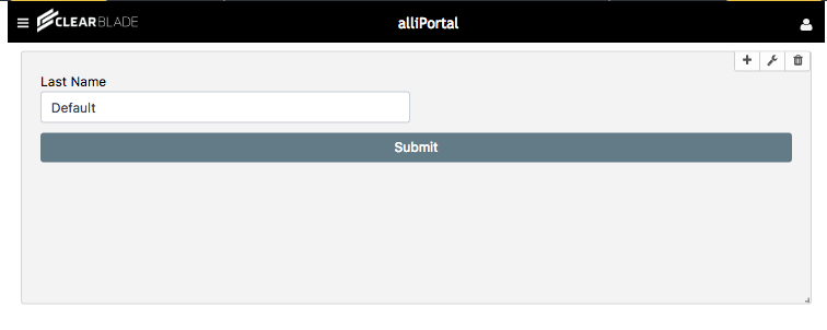
Default value |
Adds a default value to the field. The value can be overridden by using the parser |
|
|
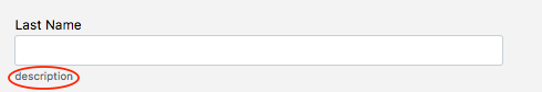
Help text |
Adds a help text icon next to the field label |
|
|
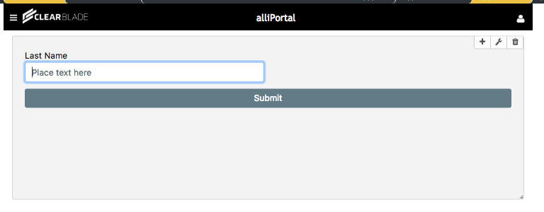
Placeholder |
Helper text that is shown in the field |
|
|
Small text |
Subtext below field |
|
|
Width Percent |
Changes field size |
100%: 
|
|
Order |
Changes field placement |
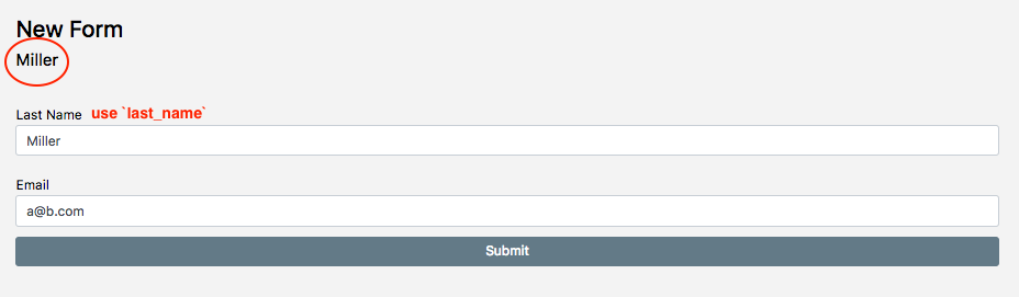
Last name = 2: 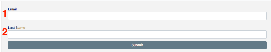
|
|
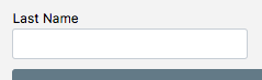
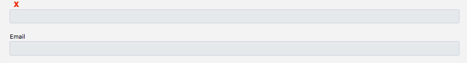
Hide label |
Hides the field label |
|
|
Display |
Removes field if unchecked |
|
|
Add field |
Adds another field to the form |
|
Form text
|
Key |
Description |
Example |
|---|---|---|
|
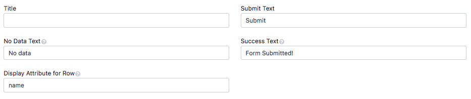
Title |
Gives the form a title |
|
|
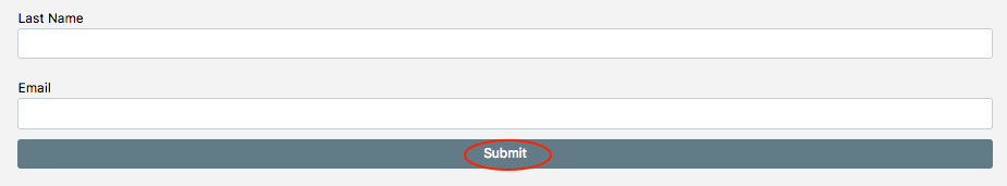
Submit Text |
The submit button’s text |
|
|
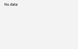
No Data Text |
Appears when data is not returned in the parser |
|
|
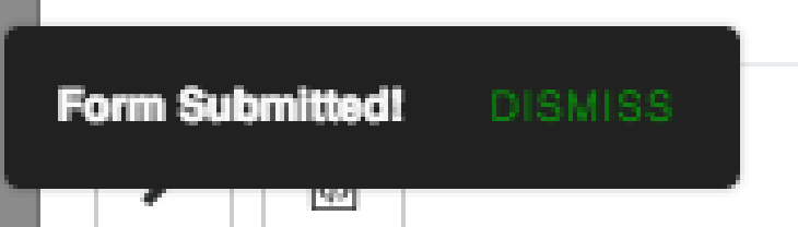
Success Text |
Appears on the left side of the page when the form has been submitted |
|
|
Display Attribute for Row |
Uses data returned from a key as a subtitle |
|
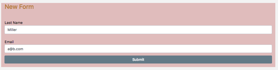
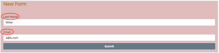
Form style
|
Key |
Description |
Example |
|---|---|---|
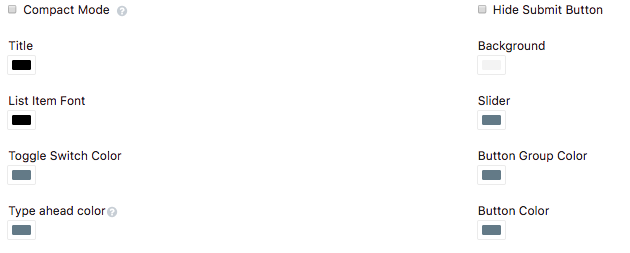
|
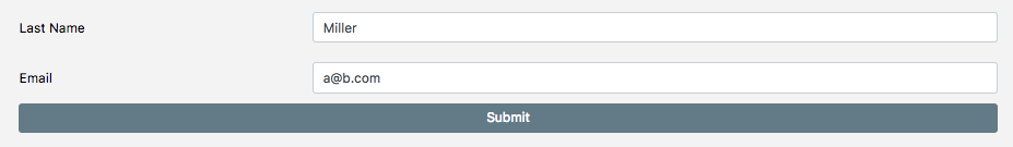
Compact Mode |
Changes format to inline style |
|
|
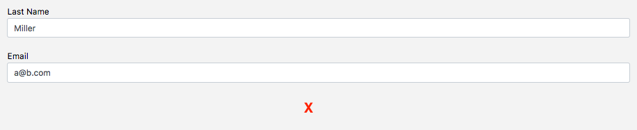
Hide Submit Button |
Removes the submit button |
|
|
Title |
Changes the title color |
|
|
Background |
Changes the form’s background color |
|
|
List Item Font |
Changes the item name’s color |
|
|
Slider |
Changes the slider’s color if available |
|
|
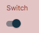
Toggle Switch Color |
Changes the toggle switch’s color when it’s set to true if available |
|
|
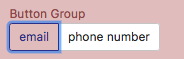
Button Group Color |
Changes the selected button outline’s color if available |
|
|
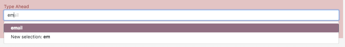
Type Ahead Color |
Changes the highlighted item for type ahead color if available |
|
|
Button Color |
Changes the submit button’s color |

|
Form other tools
|
Key |
Description |
Example |
|---|---|---|
|
Unique Style |
Overrides the overall style settings to change a specific setting. It is automatically checked when you change a style |
|
|
HTML ID |
Used to target the DOM’s widget elements |
Add an ID to the page like this: |
|
Allow Fullscreen |
Makes the widget fullscreen |
|
Advanced section
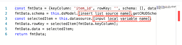
You can create a dynamic form widget using a list widget, a local variable datasource, and an aggregator datasource.
Target local variable datasource:
1. Add a local variable datasource.
2. Add a list widget whose target is the local variable.
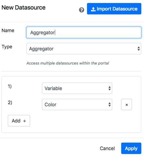
3. Create a datasource aggregator that aggregates the local variable and datasource providing data for the form widget.
4. Create a new form widget whose incoming datasource is the aggregator. A parser error will display.
5. The default parser should look different when re-opening it.
6. Fill in the datasource names corresponding to the bracket labels in the designated areas.
7. The form dynamically displays whichever item is selected in the list.
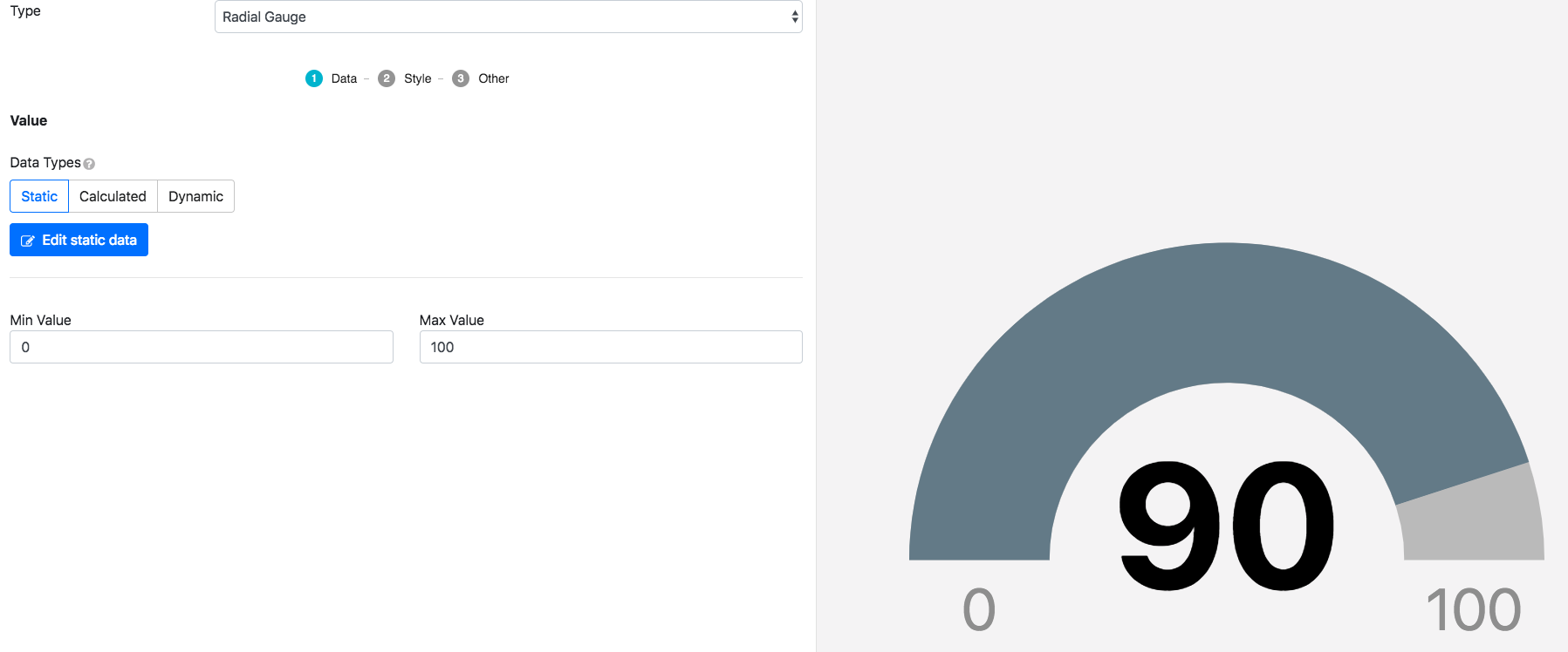
Radial gauge
Data
|
Type |
Description |
|---|---|
|
Static |
Can type a plain text number to measure in a gauge |
|
Calculated |
A JavaScript function not bound to any datasources |
|
Dynamic |
A JavaScript function that will be updated as the corresponding datasource gets updated |
|
Min Value |
The gauge range’s minimum number |
|
Max Value |
The gauge range’s maximum number |
The rest of the tabs are for editing the gauge appearance.
Style
|
Type |
Description |
Example |
|---|---|---|
|
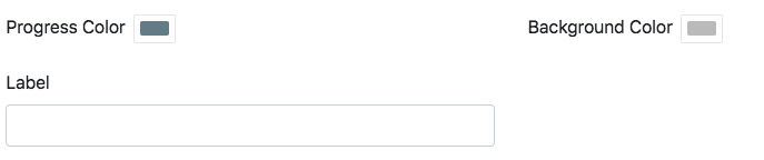
Progress Color |
Changes the progress bar’s color |
|
|
Background Color |
The gauge’s color |
|
|
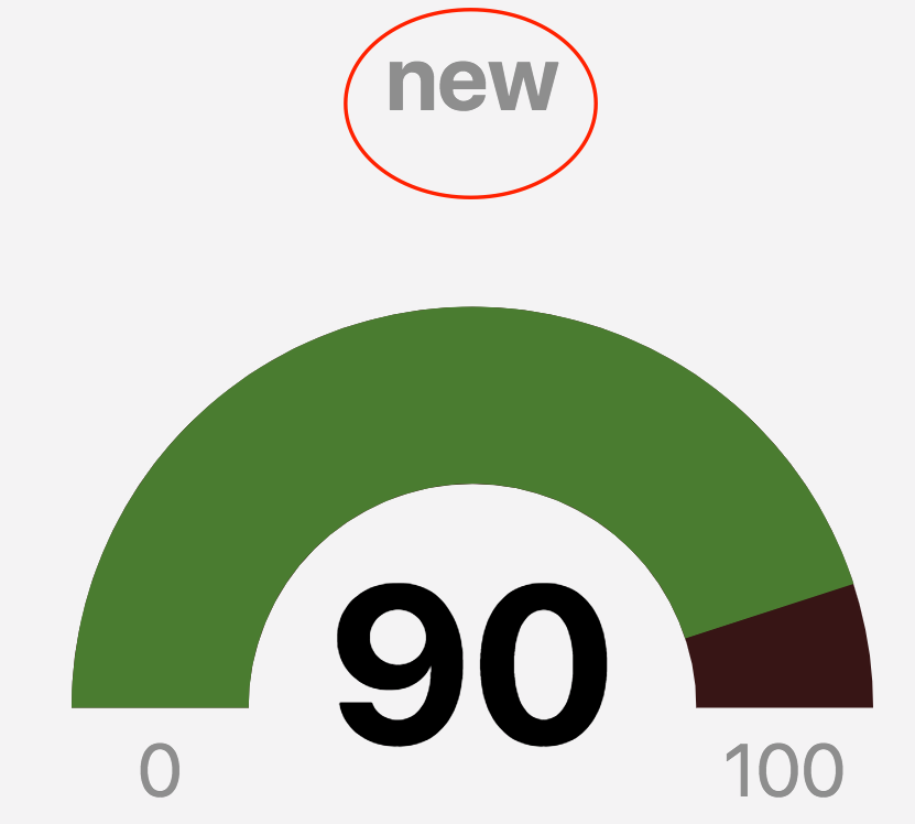
Label |
The gauge’s title |
|
Others
|
Key |
Description |
Example |
|---|---|---|
|
Unique Style |
Overrides the overall style settings to change a specific setting. It is automatically checked when you change a style |
|
|
HTML ID |
Used to target the DOM’s widget elements |
Add an ID to the page like this: |
|
Allow Fullscreen |
Makes the widget fullscreen |
|
Speedometer
Data
|
Type |
Description |
|---|---|
|
Static |
Can type a plain text number to measure in the meter |
|
Calculated |
A JavaScript function not bound to any datasources |
|
Dynamic |
A JavaScript function that will be updated as the corresponding datasource gets updated |
|
Min Value |
The meter range’s minimum number |
|
Max Value |
The meter range’s maximum number |
The rest of the tabs are for editing the meter appearance.

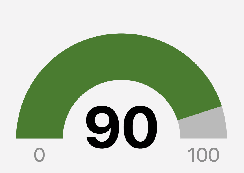
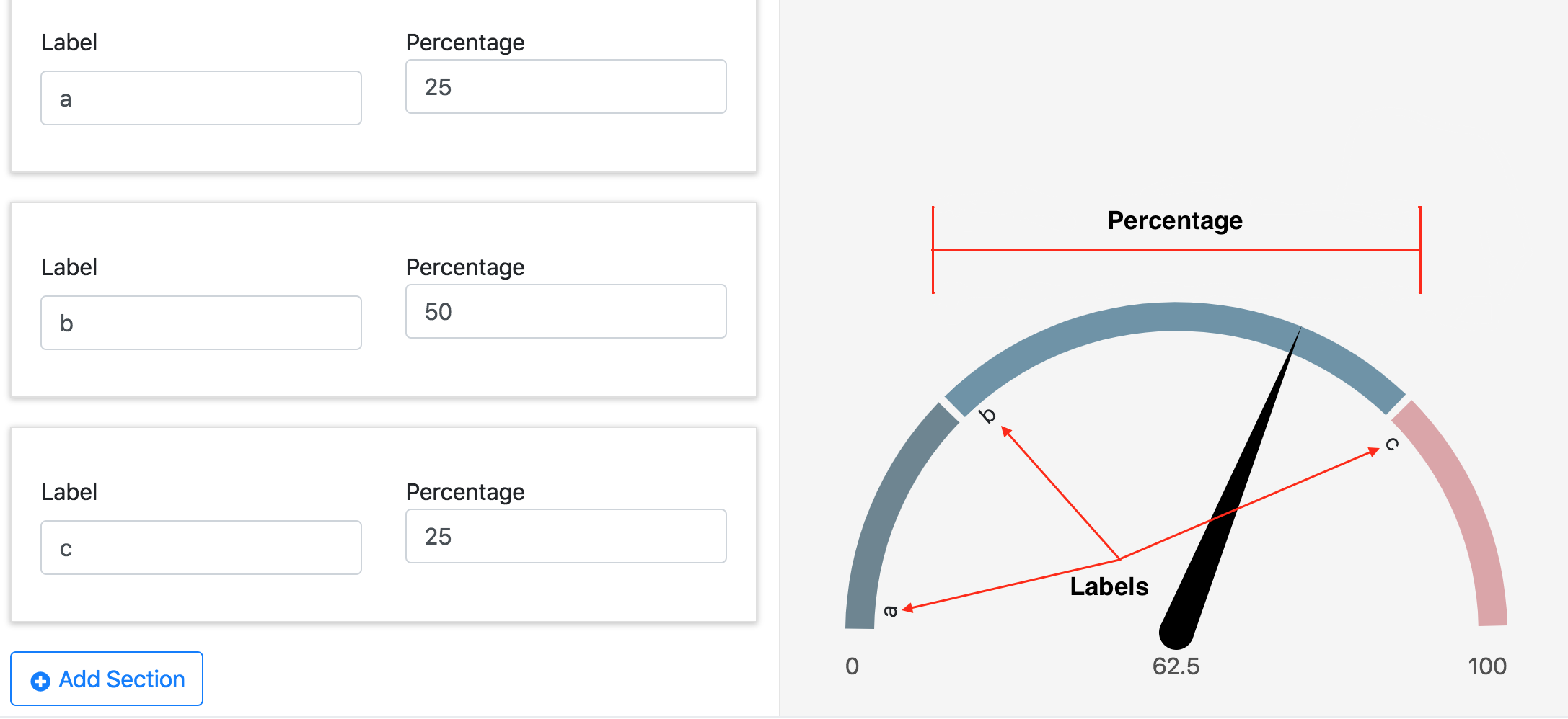
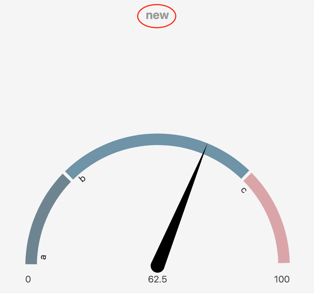
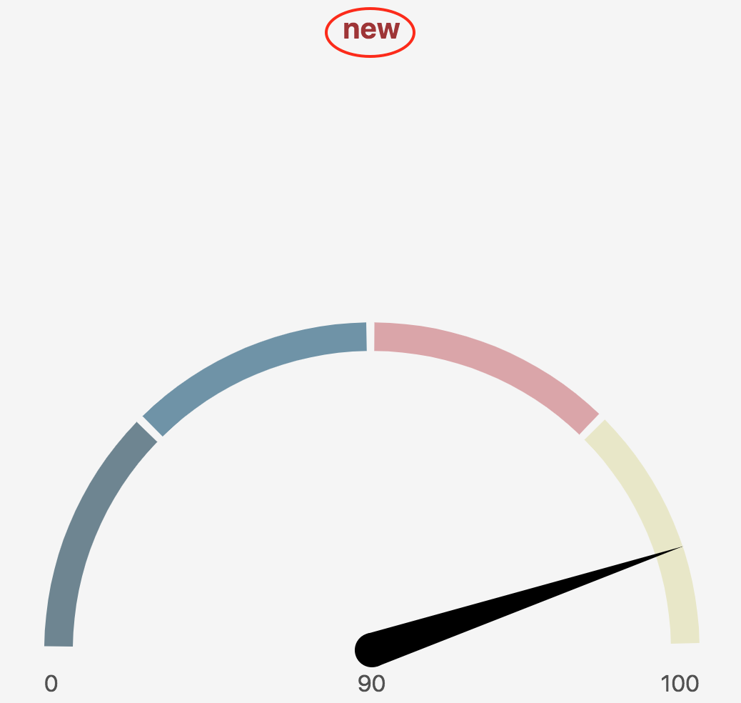
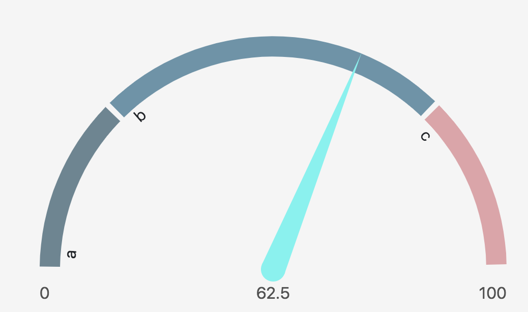
Sections
Click Add Section to add more sections. Hover over the bar data entry window to reveal the trash can for deletion. The percentages are not cumulative.
Colors
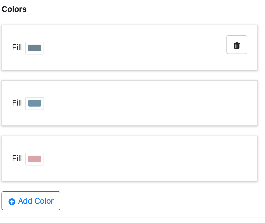
This is used to give each section a fill color. Click Add Color to add more colors. Hover over colors to reveal the trash can for deletion.
Style
|
Type |
Description |
Example |
|---|---|---|
|
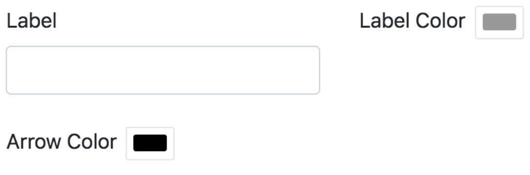
Label |
The meter’s title |
|
|
Label Color |
Changes the label’s color |
|
|
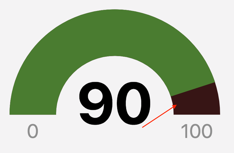
Arrow Color |
The arrow’s color |
|
Others
|
Key |
Description |
Example |
|---|---|---|
|
Unique Style |
Overrides the overall style settings to change a specific setting. It is automatically checked when you change a style |
|
|
HTML ID |
Used to target the DOM’s widget elements |
Add an ID to the page like this: |
|
Allow Fullscreen |
Makes the widget fullscreen |
|
Google Maps
Data
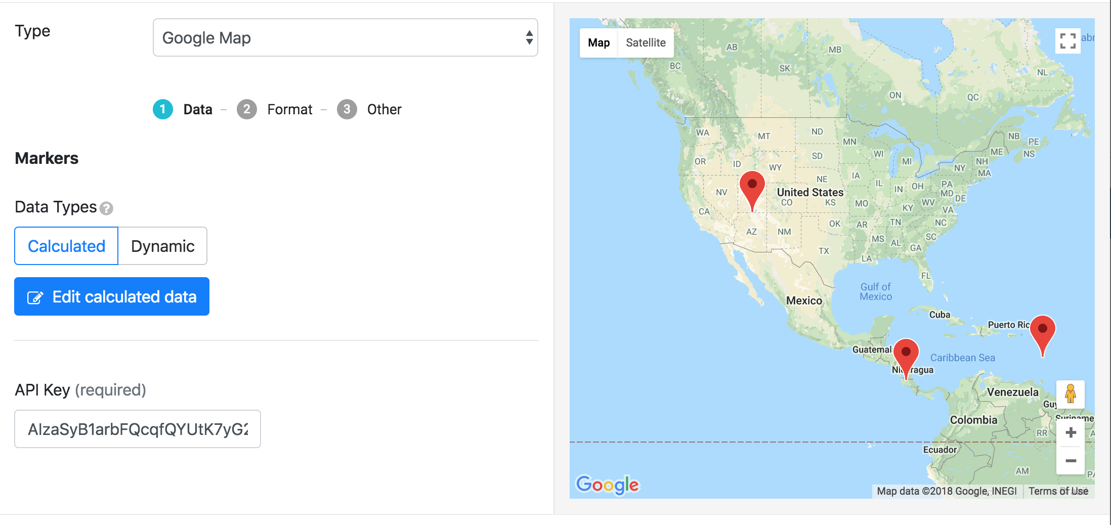
The data on the map is default. To change locations, go to Edit Calculated Data. Retrieve the API Key from your Google Maps account.
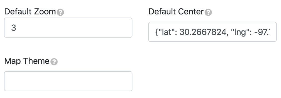
Format
|
Key |
Description |
Example |
|---|---|---|
|
Default Zoom |
Creates the map’s default size when you see it in the pane |
@1: 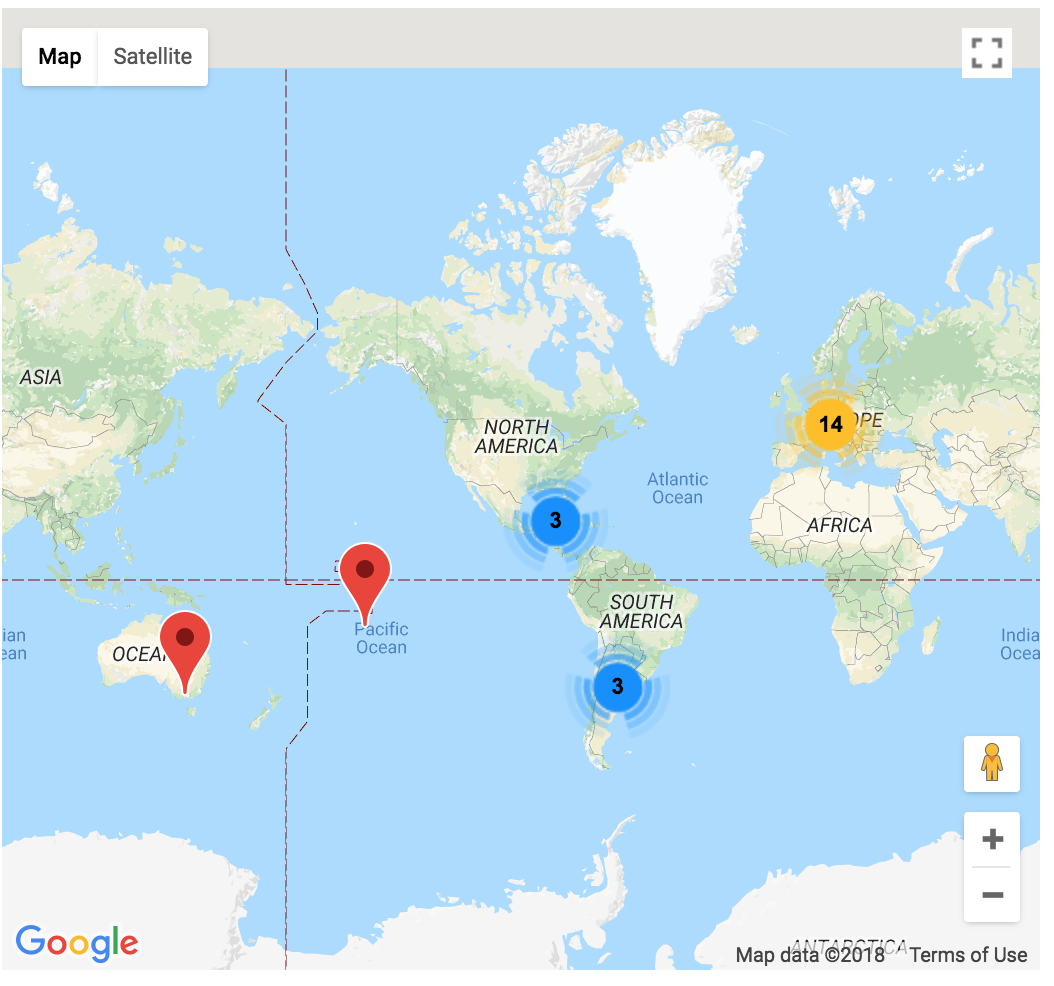
@10: 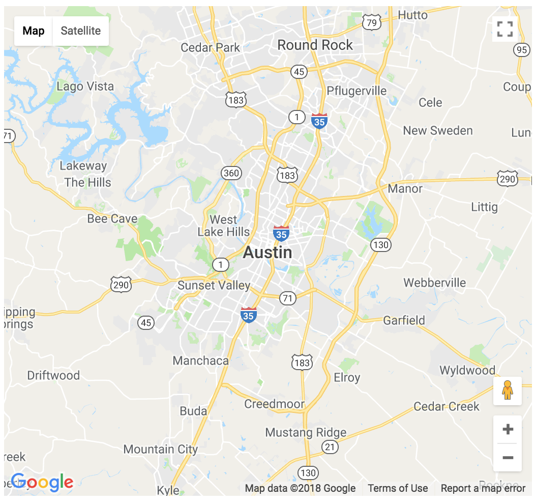
|
|
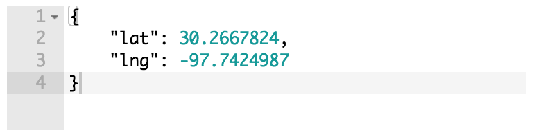
Default Center |
The map’s default location |
|
|
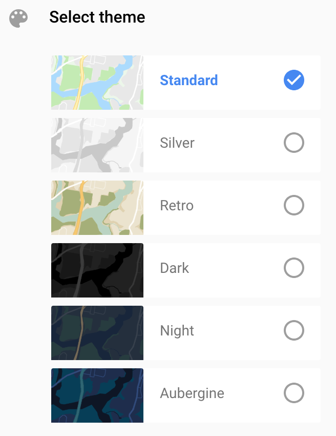
Map Theme |
Get theme from Google Maps |
|
Other tools
|
Key |
Description |
Example |
|---|---|---|
|
Unique Style |
Overrides the overall style settings to change a specific setting. It is automatically checked when you change a style |
|
|
HTML ID |
Used to target the DOM’s widget elements |
Add an ID to the page like this: |
|
Allow Fullscreen |
Makes the widget fullscreen |
|
Rule builder
Edit widget window
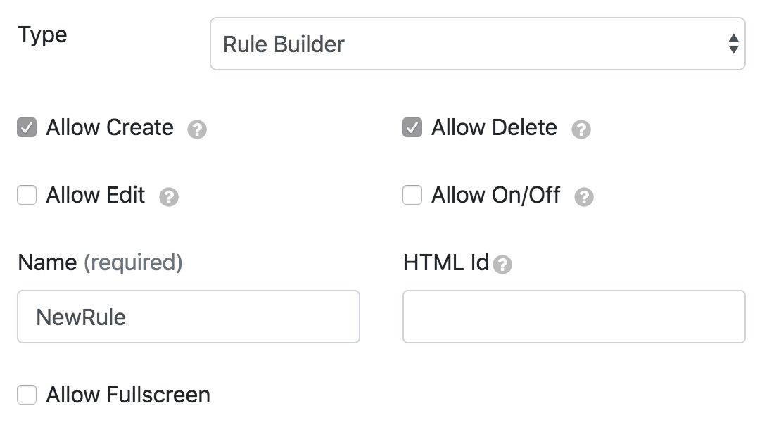
|
Type |
Description |
Example |
|---|---|---|
|
Allow Create |
Allows users to define new widget rules |
|
|
Allow Delete |
Allows users to delete rules |
|
|
Allow Edit |
Allows users to modify rules by clicking the rule and going to settings |
|
|
Allow On/Off |
Allows users to enable/disable widget rules |
|
|
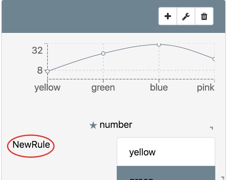
Name |
Rule builder label |
|
|
HTML ID |
Used to target the DOM’s widget elements |
Add an ID to the page like this: |
|
Allow Fullscreen |
Makes the widget fullscreen |
|
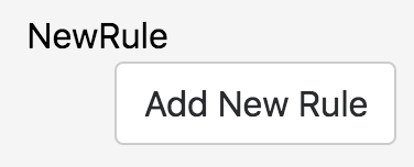
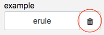
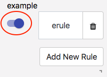
Save to add a new rule.
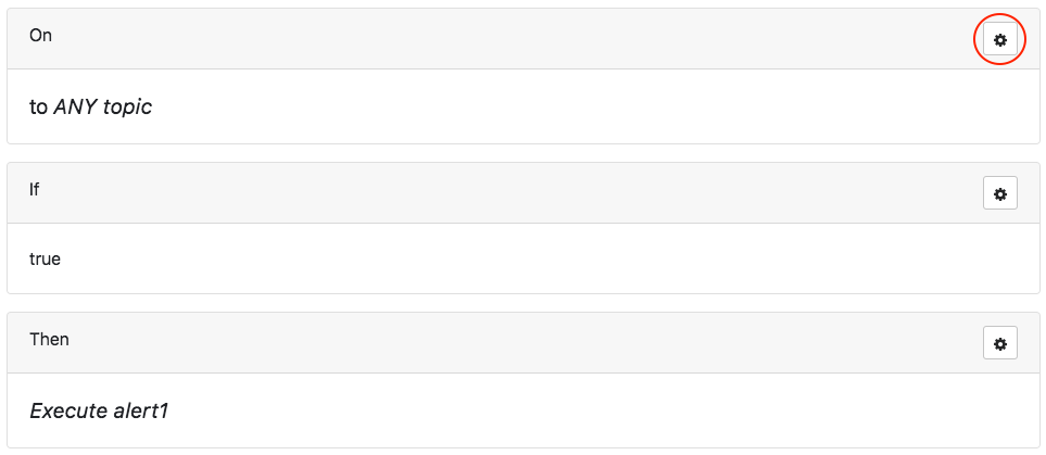
Add a new rule window
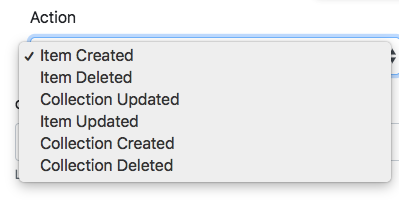
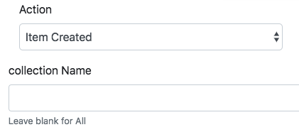
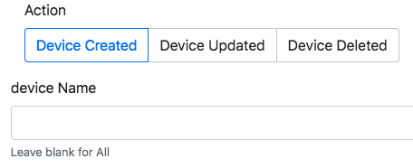
The user needs code, roles, and trigger permissions before using this widget.
Go to the widget window and click Add New Rule.
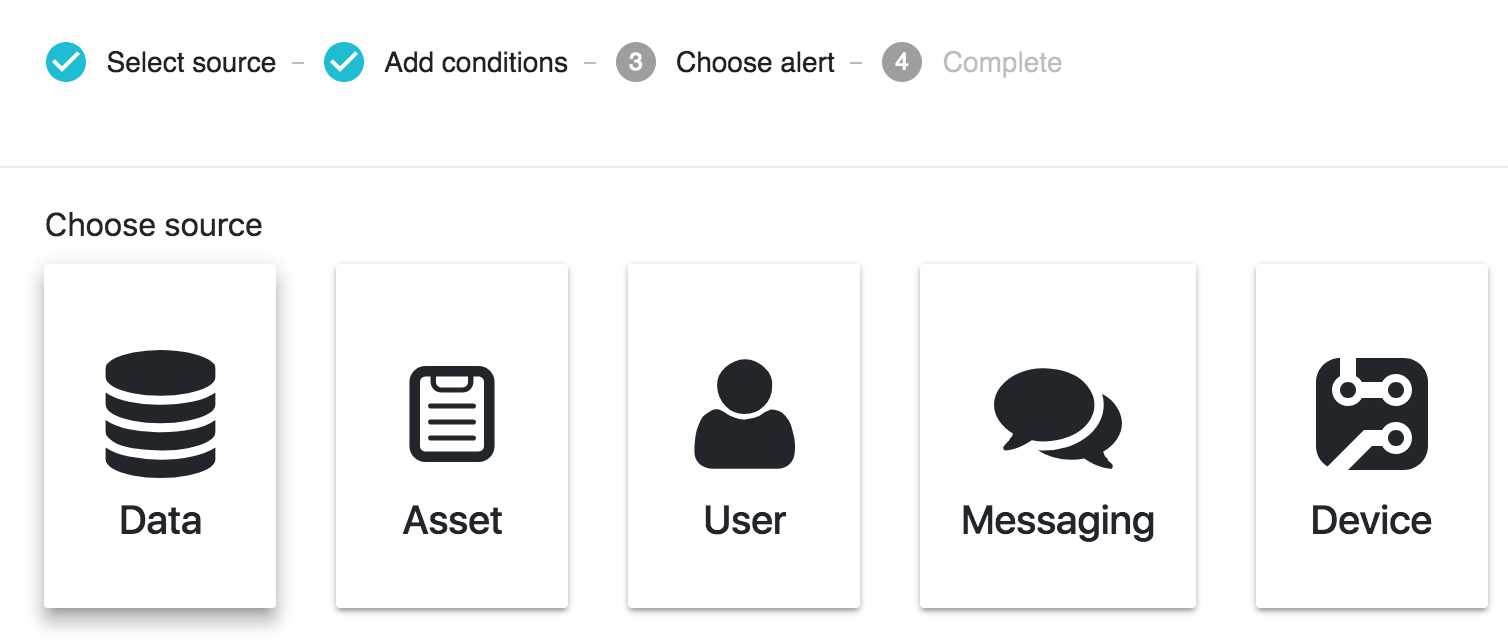
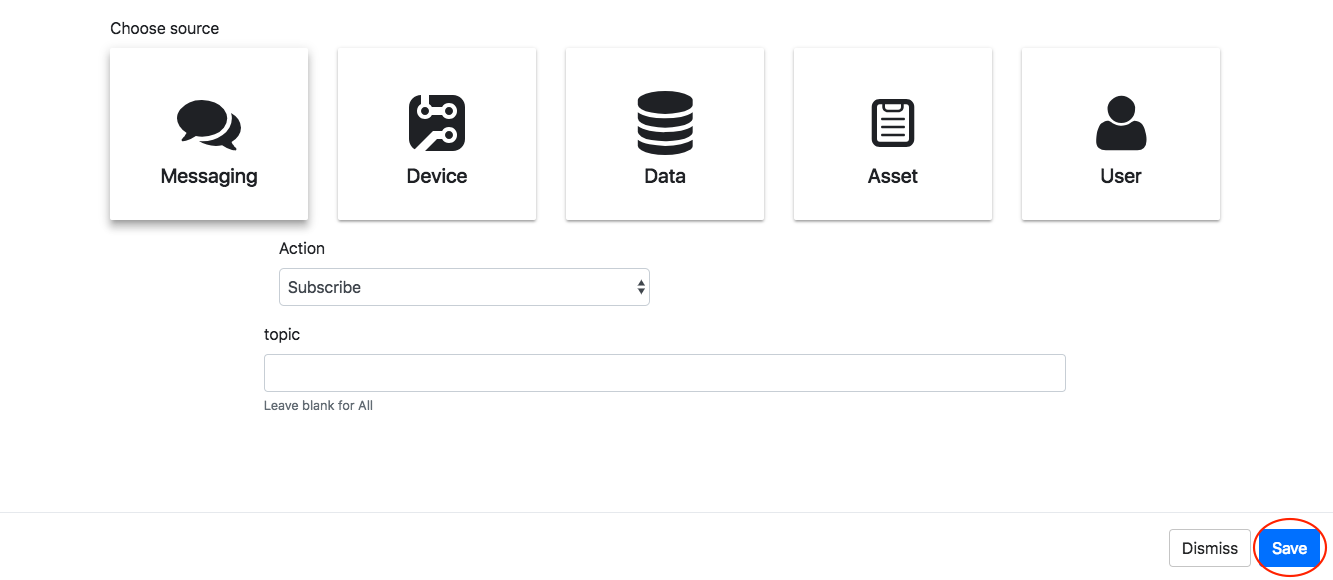
|
Type |
Setting |
|---|---|
|
Data |
|
|
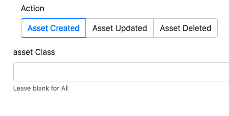
Asset |
|
|
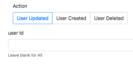
User |
|
|
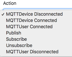
Messaging |
|
|
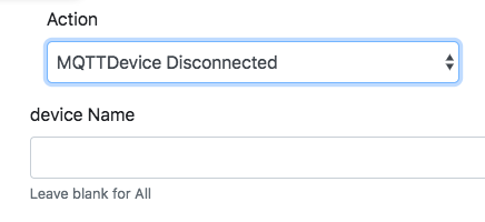
Device |
|
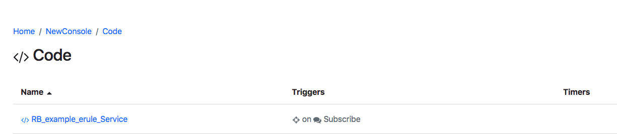
Code
The final rule will appear in the console’s code tab.
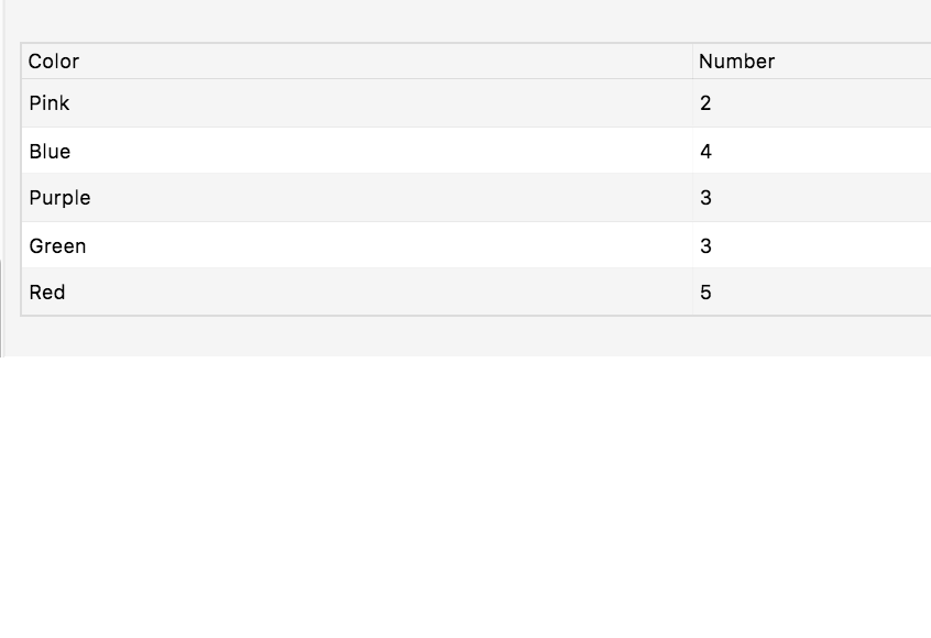
CRUD Grid
CRUD Grid allows the end user to create, read, update, and delete elements in a collection or given dataset.
Data
|
Data |
Description |
|---|---|
|
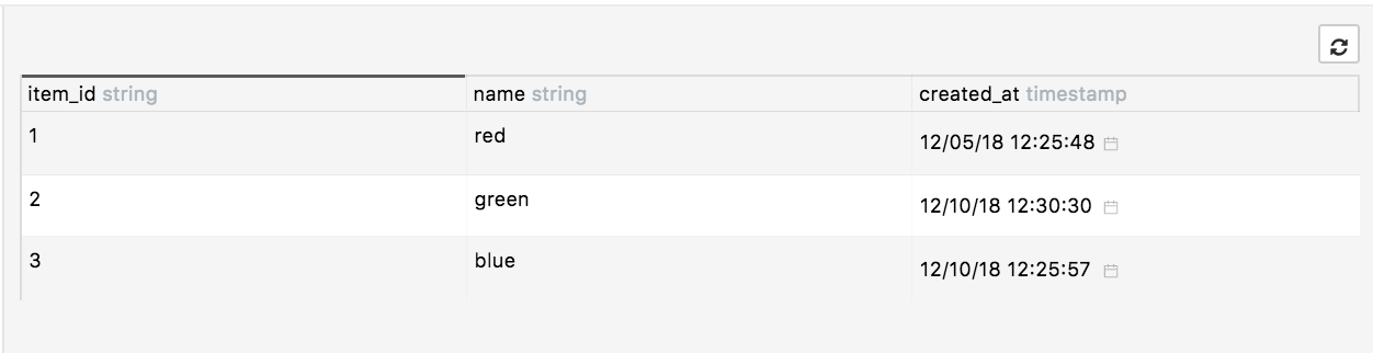
Choose the incoming data type to render. Expected format: 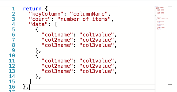
|
|
Retrieve a datasource’s data |
|
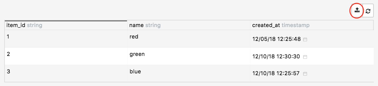
Create the option to export grid items |
|
Affect the ability to add datasource items |
|
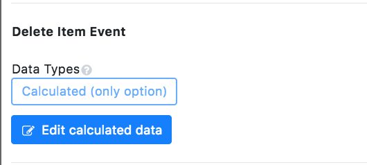
Affect the ability to delete datasource items |
|
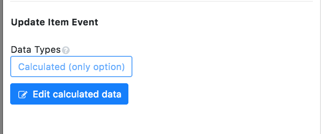
Affect the ability to edit datasource items |
|
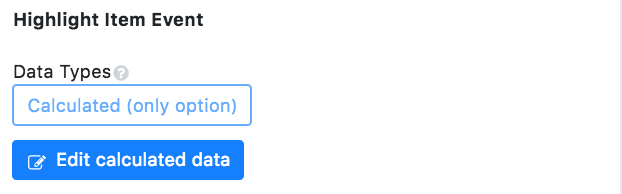
Create the option to highlight grid items |
Capabilities
|
Key |
Description |
Example |
|---|---|---|
|
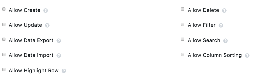
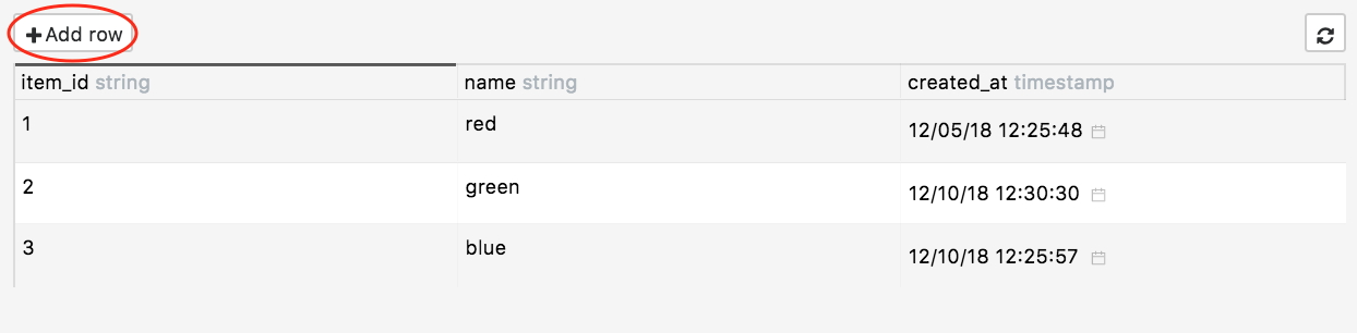
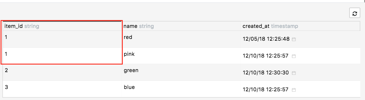
Allow Create |
Users can add rows |
|
|
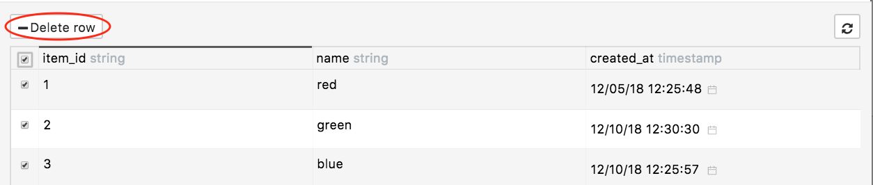
Allow Delete |
Users can delete rows |
|
|
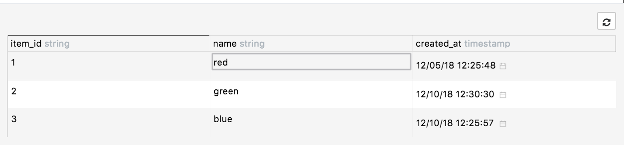
Allow Update |
Users can edit rows. The changes made here are also made in the original datasource |
|
|
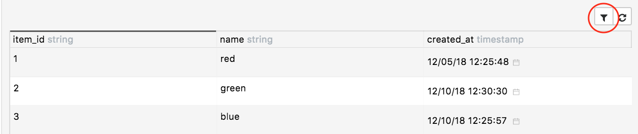
Allow Filter |
Users can filter tables |
|
|
Allow Data Export |
Users can export tables |
|
|
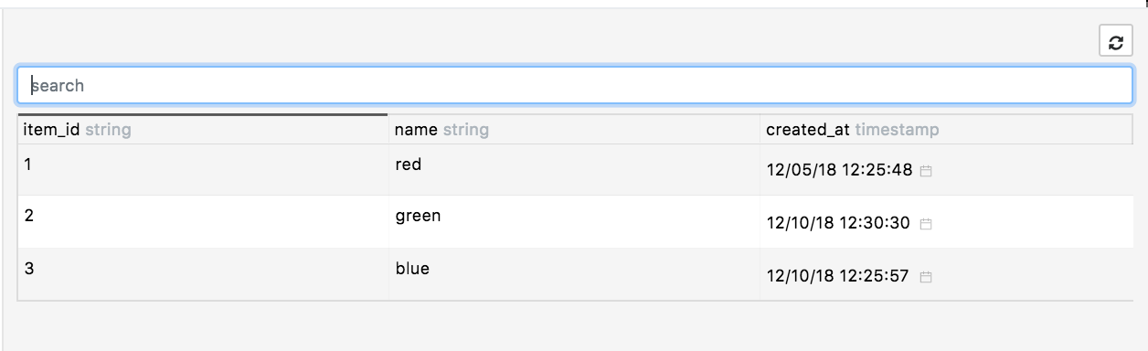
Allow Search |
Users can search for a specific item |
|
|
Allow Data Import |
Users can import tables |
|
|
Allow Column Sorting |
Sort items by column data |
|
|
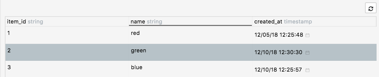
Allow Highlight Row |
Highlight items by clicking them |
|
Fields
|
Key |
Description |
Example |
|---|---|---|
|
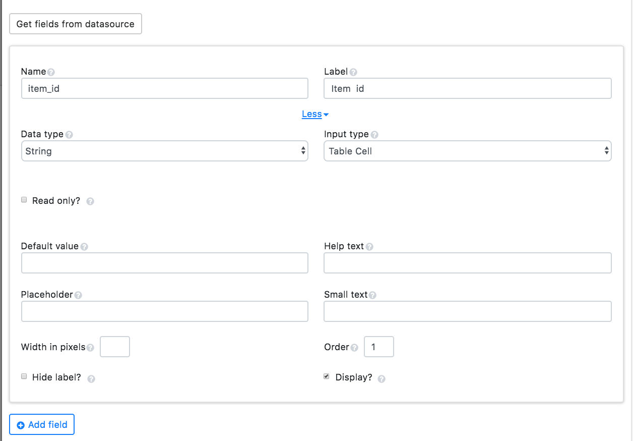
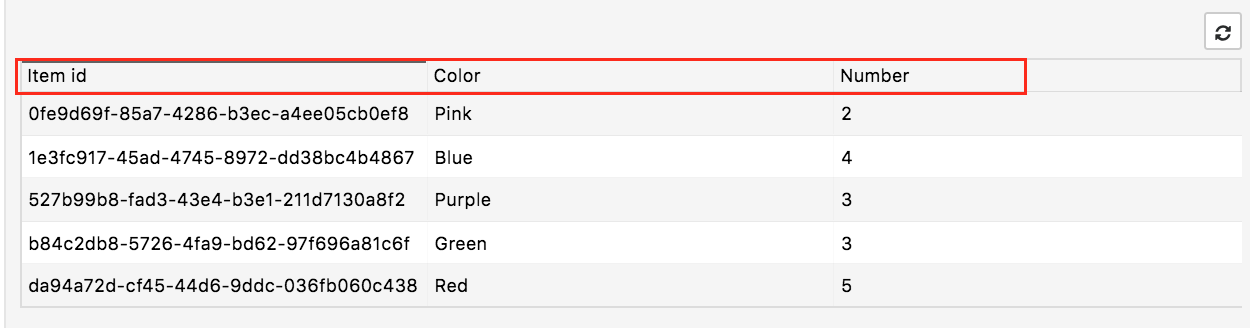
Get fields from datasource |
Retrieves datasource column information |
|
|
Name |
Internal name to use as a parser key |
|
|
Label |
The column’s name |
|
|
Data Type |
Choose what data type will be retrieved and shown |
Integer: 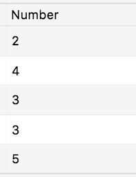
|
|
Input Type |
Choose how the data should be displayed |
Radial gauge: 
|
|
Read Only |
The field cannot be editable |
|
|
Help Text |
Adds a help text icon next to the field label |
|
|
Small Text |
The subtext below the field label |
|
|
Width in pixels |
Changes the field size |
|
|
Hide label |
Hides the field label |
|
|
Display |
Hides the field if checked |
|
|
Add field |
Adds empty field |
|
Style
Other
|
Key |
Description |
Example |
|---|---|---|
|
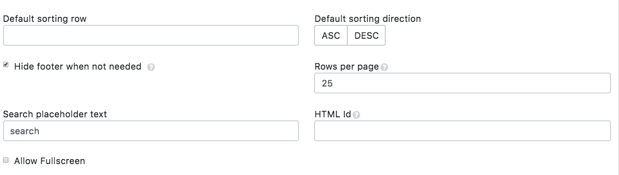
Default sorting direction |
Orders fields in ascending or descending order |
|
|
Hide Footer |
Shows page and count when unchecked |
|
|
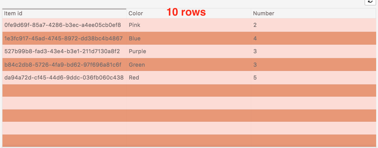
Rows per page |
Change the number of rows displayed |
|
|
HTML ID |
Used to target the DOM’s widget elements |
Add an ID to the page like this: |
|
Allow Fullscreen |
Makes the widget fullscreen |
|